Negative Binomial Factor Analysis by SGD

Principal component analysis works on the assumption that residual error from the linear model is Gaussian. To satisfy this in e.g. the case of scRNA-seq gene expression counts, it is common to log transform the counts with a "pseudocount" added to keep expression positive and deal with 0's.

Count models are fundamentally different from normally distributed models in that there is a relation between empirical mean and variance.

It is well known that a negative binomial noise model is appropriate for RNA-Seq sequencing counts. Previously I wrote about ZINB-WaVE by Risso et al, a factor analysis method which has a zero-inflated negative binomial noise model. The negative binomial distribution has two parameters, \( \mu \) - the mean of the disitribution - and \( \phi \), the overdispersion. If \( y \sim NB(\mu, \phi) \) then \( \mathbb{E}(Y) = \mu \) and \( \text{Var}(Y) = \mu + \frac{1}{\phi} \cdot \mu^2 \). The likelihood of this model is $$ \mathcal{L}_{NB}(y | \mu, \phi) = {{y + \phi - 1} \choose {y}} \cdot \left( \frac{\mu}{\mu + \phi} \right)^y \cdot \left( \frac{\phi}{\mu + \phi} \right)^\phi. $$

If we make the simplifying assumption \( \phi = 1 \) then the log likelihood simplifies to $$ \log \mathcal{L}_{NB}(y | \mu, 1) = y \cdot \log(\mu) - (y + 1) \cdot \log(\mu + 1) $$

From available datasets, it looks like this assumption might be a sensible thing. Let's look at the empirical mean variance relation for four representative datasets.

The mean variance relation seem to hold for a large number of genes, but not all. I think one way to deal with this is to consider a factor model similar to PCA for the \( \mu \) parameter, which should explain additional variance on top of the expected technical variance. Say that each gene \( g \) and cell \( c \) has its own mean \( \mu_{g, c} \). In matrix form, $$ \mu = \exp ( W x + E + \log(T) + S), $$ where \( W \) is a \( G \times N \) matrix of gene weights, \( x \) is an \( N \times C \) matrix of latent factors, \( E \) is a \( 1 \times C \) vector of cell specific scaling "efficencies", \( T \) is a \( 1 \times C \) vector of known cell specific scale factors, in this case the total number of counts in a cell, and \( S \) is a global scaling factor. (Here we pretend matrix-vector addition "broadcasts" like in NumPy / TensorFlow code.)

This can be fitted with stochastic gradient descent using TensorFlow as I wrote about in the case of PCA before. The full implementation is available here, but besides the data reading and mini-batching code, the key snippet of the TensorFlow model is the following:

...

## Model ##

W = tf.Variable(np.random.randn(G, N), name='weights')
x = tf.Variable(np.random.randn(N, S), name='PCs')
E = tf.Variable(np.random.randn(S), name='Efficiency')
S = tf.Variable(np.array([0.]), name='Scaling')

sample_idx = tf.placeholder(tf.int32, shape=[None])
variable_idx = tf.placeholder(tf.int32, shape=[None])
T_ = tf.placeholder(tf.float64, shape=[None])
y_ = tf.placeholder(tf.float64, shape=[None])


W_ = tf.gather(W, variable_idx)
x_ = tf.gather(tf.matrix_transpose(x), sample_idx)
eta_ = tf.reduce_sum(W_ * x_, 1)
E_ = tf.gather(E, sample_idx)

mu_ = tf.exp(eta_ + tf.log(T_) + E_ + S)

LL = tf.reduce_sum(y_ * tf.log(mu_) - (y_ + 1) * tf.log(mu_ + 1))

...

Performing the SGD model fitting takes about 20 seconds for datasets with several thousands of cells, using the top 3,000 expressed genes. Applying it to the data presented in the plot above using 2 hidden factors per cell, we get these results:

I like that in this model you can just provide UMI counts without any need to log transform or in other way Gaussianize the data. Though in practice, the results from performing regular PCA on log transformed counts give pretty similar results in a fraction of the time.

Different runs of the model also give slightly different results, though large scale patterns are pretty conserved between runs.

Here we are not enforcing any independence between the hidden factors, which should be a next step. Additionally, some way of selecting the number of factors like variance explained in PCA would be useful.

Simple and interpretable supervised machine learning of scRNA-seq cell types

The scRNA-seq field has reached a second wave, were the first initial systems under investigation are getting repeated. Either to ask more specific questions, or to get better data with the newer technologies available. This is highlighted in particular in a recent paper by Kiselev & Hemberg. They point out that we need to start thinking about cell type references similar to how there are genome references, and we need a way to map data to this reference.

I was wondering how a stereotypical machine learning multi-class classification model would perform for this task. Since the online scmap tool from the K&H paper comes with a couple of well annotated example data sets of pancreatic cells, this ended up being quite straightforward.

What we will do is train a machine learning model to predict cell types using one of the data sets, and predict cell types of cells from the other dataset with it.

The most basic multi-class classification model is Logistic regression, and we will use the implementation in scikit-learn. The entire analysis is in a notebook on Github, but let's walk through the key parts here.

To train the model, we will use the data from Segerstolpe et al, consisting of 3,500 cells annotated with 15 cell types. We want to predict the cell types of the samples using the gene expression values. First we split up the data so we can evaluate the model afterwards.

from sklearn.model_selection import train_test_split

X_train, X_test, y_train, y_test = \
train_test_split(s_exprs, s_sample_info['cell_type1'], test_size=.2)

Next we initiate the model.

from sklearn.linear_model import LogisticRegression

lr = LogisticRegression(C=0.05, penalty='l1', n_jobs=-1)

First of all, we use L1 penalty in the model. This means we are favoring sparsity. That is, we believe only a small number of the genes determine the cell types, and we favor many genes having 0 weights. The C parameter determines how strongly we enforce sparsity. I picked 0.05 after trying a couple of different values.

Next we train and investigate the model, this takes about 5 seconds.

lr.fit(X_train, y_train)

LogisticRegression(C=0.05, class_weight=None, dual=False, fit_intercept=True,
        intercept_scaling=1, max_iter=100, multi_class='ovr', n_jobs=-1,
        penalty='l1', random_state=None, solver='liblinear', tol=0.0001,
        verbose=0, warm_start=False)

lr.classes_

array(['MHC class II', 'PSC', 'acinar', 'alpha', 'beta', 'co-expression',
    'delta', 'ductal', 'endothelial', 'epsilon', 'gamma', 'mast',
    'not applicable', 'unclassified', 'unclassified endocrine'], dtype=object)

lr.coef_.shape

(15, 23171)

The cell types we want to be able to predict gets stored in the lr.classes_ field. Logistic regression works by predicting a probability of a sample coming from a given class. In the standard version in sklearn, this is done by making oen binary logistic regression for each class, where logistic regression depends on a linear combination of weights times gene expression values. The class with highest probability gets assigned as the predicted class when evaluating the model on a new observation. The weights for each gene for each cell type is stored in lr.coeff_.

First let's have a look at the performance of the model

lr.score(X_train, y_train)

0.98256848096762717

lr.score(X_test, y_test)

0.92887624466571839

I think this is pretty good. For the data used for training, the model is 98% accurate, while it is 92% accurate for the held out testing data. It should be noted that this might not be the best metric here, because the cell types are very different in number of representatives.

To predict using our model, we just use the lr.predict method.

y_hat = lr.predict(X_train)
y_hat

array(['ductal', 'alpha', 'not applicable', ..., 'not applicable', 'beta',
    'not applicable'], dtype=object)

The most straightforward way to investigate how the model is doing is by making a matrix of how different cell types get predicted.

from sklearn import metrics
pd.DataFrame.from_records(metrics.confusion_matrix(y_train, y_hat),
                          index=lr.classes_)


In particular we notice that some of the not applicable and unclassified cells get predicted as other cell types.

A particularly nice thing with linear model such as logistic regression is how interpretable they are. The weights of the genes directly relate to how the the cell types are predicted. Let's assign each gene as a marker for the cell type it's the strongest predictor of.

marker_genes = pd.DataFrame({
    'cell_type': lr.classes_[lr.coef_.argmax(0)],
    'gene': X_train.columns,
    'weight': lr.coef_.max(0)
})

marker_genes.query('weight > 0.').shape
(628, 3)

The final row tells us that of the ~23,000 genes we used as input, only 628 are used in predicting the cell types. Let's print out the top predictive genes for each cell type.

top_markers = \
marker_genes \
    .query('weight > 0.') \
    .sort_values('weight', ascending=False) \
    .groupby('cell_type') \
    .head(6) \
    .sort_values(['cell_type', 'weight'], ascending=[True, False])

figsize(10, 20)
for i, m in enumerate(top_markers.cell_type.unique()):
    plt.subplot(10, 3, i + 1)
    g = top_markers.query('cell_type == @m')
    plt.title(m, size=12, weight='bold')
    for j, gn in enumerate(g.gene):
        plt.annotate(gn, (0, 0.2 * j), )

    plt.axis('off')
    plt.ylim(6 * 0.2, -0.2)

plt.tight_layout()

We wrote before that logistic regression predicts the probability of each cell type. This can also be used as a visualization. After sorting the cells according to the known cell type, we can predict the probability, then plot the probability of each cell type for each cell.

shift_idx = y_train.argsort()
sorted_idx = y_train.sort_values().index
y_prob = lr.predict_log_proba(X_train.loc[sorted_idx])

Now let's finally get to the task at hand: treat this model as a reference, and predict cells from another dataset. The second dataset is from Muraro et al. This is 2,100 cells annotated with 10 cell types, the interesting point is to see if these cell types gets predicted in a reasonable way by our model.

Something we need to make sure of is that the genes in the new dataset are in the same order as in the previous. If a gene is not present in the new dataset, we set those values to 0.

X_new = m_exprs.T.loc[X_train.columns].T.fillna(0)
m_sample_info['predicted_cell_type'] = lr.predict(X_new)

m_sample_info \
    .groupby(['cell_type1', 'pred_cell_type']) \
    .count().iloc[:, [0]] \
    .unstack().T \
    .fillna(0)

This is pretty nice I think! We didn't do any normalisation or batch correction etcetera, but the results still seems consistant. Based on this I think it's pretty easy to envision servers with models for cell types based on huge amounts of data that can be used by researchers to query new samples against.

I think clustering and cell type annotation will be considered similarly to transcriptome assembly and annotation in the future. An application which is certainly feasible, but a level more advanced than most users will need.

Again, this sort of analysis is pretty straight forward, and the notebook is available here

Approximate PCA by mini-batch SGD using TensorFlow

In machine learning you usually define a model which has a cost function which you minimize to learn parameters from the data. A very powerful way to do this with large amounts of data is mini-batch stochastic gradient descent (SGD). This means iteratively looking at small random subset of your data, then update parameters using that subset (mini-batch).

I think it's pretty intuitive why this works well; you both need less memory to evaluate the cost function on the mini-batch; and by constantly changing the data we should reach less overfitted results.

This strategy is very well used in supervised classification and regression. Unfortunately in our field of single cell gene expression analysis, these are not the sorts of problems we have. A problem we do have is to learn low-dimensional representations of the data, for example through principal component analysis (PCA).

There are a couple of reasons why mini-batch SGD doesn't make sense for this. Firstly, just making batches over the observations will not help much, because we usually have rather few (hundreds) observations (cells) of many (tens of thousands) variables (genes). Secondly, we need to learn parameters for every observation, so no information would be shared between batches! We would just end up solving many independent problems.

Usually data is represented as a table with observations vs variables. Another way to represent the data is by "long" or "database-style" encoding. (Also known as "tidy" in the R world). Here we store records of values, and indexes for each record indicating which observation and variable the value belongs to. In this formatting it actually makes some sense batching the data!

Recall that in PCA, we want to represent our data \( Y \) by \[ Y = W \cdot X, \] where W contains a weight for each variable, and \( X \) has a representative value for each observation. Say that we learn the \( W \) and \( X \) by batching the long form of the data \( Y \).

From the animation, we notice that the weights for each variable will be learned after each other. So in the beginning of optimization the model will fit the first variable alone. A solution to this is to shuffle the long form of the data.

Now we see there isn't any bias which variables are trained.

I made an implementation of this strategy in TensorFlow. It's not strictly PCA, because the cost function is simply \[ || y_b - w_b x_b || \cdot \frac{1}{B}, \] where the \( b \) subscript indicates that it's from within a batch, and \( B \) is the size of the batch. The complete implementation is available here, but the main functional TensorFlow part is the following

N = 2  # Latent space dimensionality

W = tf.Variable(np.random.randn(G, N), name='weights')
x = tf.Variable(np.random.randn(N, S), name='PCs')

sample_idx = tf.placeholder(tf.int32, shape=[None])
variable_idx = tf.placeholder(tf.int32, shape=[None])
y_ = tf.placeholder(tf.float64, shape=[None])

W_ = tf.gather(W, variable_idx)
x_ = tf.gather(tf.matrix_transpose(x), sample_idx)
y_hat = tf.reduce_sum(W_ * x_, 1)

cost = tf.nn.l2_loss(y_ - y_hat) / batch_size

The main point is to use the tf.gather functions to get the sub-tensors for the current batch.

For startars, we apply this to the Iris data:

We see that the cost is going down, and we get a 2-dimensional representation. If we compare to the normal solution to PCA, we see that the our solution finds roughly the same features.

Can we use this for real and interesting data? We evaluate this by considering a dataset by Zeisel et al, consisting of 3,005 single cells from mouse brain. We look at the 3,000 top variable genes, so the long form representation has about nine million rows. Using a batch size of 10,000, we get fairly good results in about 10 seconds.

Again, comparing to the typical solution, here using scikit-learn, we see the same general features.

It should be noted that the scikit-learn PCA is instant for this dataset, it really doesn't make sense to use this mini-batch SGD version in practice. But I think it is interesting because it does show we can use the mini-batch SGD concept for tasks like these. The model we use here could be extended to include known covariates, or it could be used for clustering.

How to read PCA plots

Over the years I have been looking at hundreds of Principal Component Analysis (PCA) plots of single cell RNA-seq data. PCA is an extremely useful technique for initial exploration of data, it is easy to interpret and fast to run.

I have noticed some general patterns across datasets and studies. These I have seen either in papers or presentations, or by analysing our own or public data. Sketches of these patterns are shown on the right. I thought it would be useful to list out potential causes for these patterns. I'll do this here by simulating data to generate them.

To try to be concrete, we will consider 100 "genes", and throughout we will generate 600 "cells" from two "cell types". Different ways of generating these cell types will lead to different patterns in the PCA plot.

First, let us say that expression for all genes is generated at random (normally), but with different global means for each cell type. An expression matrix would look like below.

The first 300 cells are from cell type A, and the last 300 cells from cell type B. If we run a PCA on this, and color the cells by cell type, we get the following plot.


We get a pretty clear seperation between the cell types in PC1, and random variation in PC2. This is not a particularly realistic model for cell types however.

In stead, let us consider a cell type to be defined by a limited set of expressed markers. We assign 20 genes to cell type A, and 20 other genes to cell type B.

This way of generating the data gives rise to the same style of PCA pattern: two clear blobs.

This assumes all the marker genes have independently increased expression level for their respective cell type. The variability of each gene is independent. Consider instead a system where an underlying gene module determine cell type. This gene module consists of a collection of genes which increase or decrease expression together. The genes expression are correlated.

As an illustration, let us say that the 20 marker genes are only correlated in their respective cell type, and in the other cell type they only correspond to random noise. We simulate the data with multivariate normal distributions, with two different block structured covariance matrices, which only have covariance for the marker genes in the corresponding cell type.

In this type of data the PCA finds the two independent "modules", one as PC1 and the other as PC2.

Now we add the additional propoerty of increasing the mean expression of the cell type modules for the corresponding cell type.

Now we get a V shape, which is quite common in real data. The two cell type clusters meet when both module's average expression are low. This could be interpreted as a trajectory, and I guess in one way it is? But note that we only simulated the data with two distinct cell types in mind.

Now, let us add a global mean shift for one of the cell types.

10.png

In this type of data we get a T shape, it is also quite common in real data. Why would this happen? We said we don't think global means shifts are reasonable in the beginning! Well, it could be that one cell type has less RNA, causing systematically lower counts. Or there could be a technical effect causing systematic differences between the cell type. What we see though, is that the combination of these types effect creates T shaped PCA plots. A particular danger here is that it is tempting to interpret this as a bifurcation in the data.

Finally, let us consider a different scenario. Say a number of genes are correlated in both cell types, but in one cell type, some marker genes are shifted.

These slanted clusters are very common in real data too. Most likely, these happen because the shift in marker genes is a real effect, but some common technical factor is causing expression values of expressed genes to be globally correlated.

There are probably other ways to generate these typical patterns, but these were the first ones I stumbled on that made some sense. I've tried to keep the simulated expression matrices as simple as possible.

I haven't tried looking at this in the context of more cell types. In this setting with two types, we can get the patterns we see often.

The code to produce these figures and analysis is available here

Learning multiple single cell trajectories with OMGP


A fundamental concept in cellular biology is that progenitor cells can differentiate into different kinds of specialized cells performing particular functions. Recently, the ability to study this using single-cell RNA-sequencing has gotten extremely popular. How to learn this from individual snaphsots rather than tracked cells?

In the immune system, naive T-helper cells differentiate into different types of cells depending on the kind of infection. In particular, in the system we studied in Lönnberg, Svensson, James, et al Science Immunology 2017, naive Th cells respond by differentiating into either Th1 cells or Tfh cells.

If we perform measurements on these cells, the problem is that we don't know the labels for the cells. That is, what trjectory are they part of: 1) Naive -> Th1 or 2) Naive -> Tfh?

When we observe only a single trajectory over time, a good way to model a measurement over the trajectory time points is by Gaussian Process (GP) Regression.

\[ X_n = f(t_n) + \varepsilon, \]

where we say the function \( f \sim \mathcal{GP}(0, k(t_n, t_m) \) is Gaussian process distributed.

Observing data which seem to come from two separate trends, we can think of each data point as being generated by

\[ X_n = z_{1, n} \cdot f_1(t_n) + z_{2, n} \cdot f_2(t_n) + \varepsilon \]

Here \( z_n \) is a binary vector which can only have one element as 1, indicating which function the point \( X_n \) is generated from.

In our case, we do not know \( z \) for the data points. We need to learn these values from the data. As a probabilistic model, what we are interested in is the assignment of each sample to a given trajectory.

\[ p(X | t) = \prod_{n=1}^N \prod_{c=1}^2 \mathcal{N}(X_n | 0, K_c)^{z_{c, n}} \]

What we can infer from the data is the posterior probability of the \( z \) function indicators: \[ \phi_{c, n} = p(z_{c, n} | X, F, t) \]

It turns out that you can learn these probabilites, and it was published as the Overlapping Mixture of Gaussian Processes (OMGP) in Lázaro-Gredilla et al 2013 Pattern Recognition.

I want to highlight here that the observations, \( X \), can have any dimensionality. A single measure like the expression of a particular marker gene, or multiple genes at once. In my examples here, I let \( X \) be two-dimensional, intuitively corresponding to two marker genes. The model works with any number of trends \( C \), not only the case \( C = 2 \) in the equation above.


We implemented this model in the package GPClust, using a sophisticated inference method underlying that package which I won't go into here. In our implementation, we extended the model to use a Dirichlet Process (DP) for the indicators \( z \). This allows the number of trajectories \( C \) to be determined from the data. (Though there is still a parameter \( \alpha \) which will affect this).

To illustrate this, I created some 2D data with four trends, and used diffusion pseudotime to define the \( t \) values for the data. Then I initiate the model and animate the process of learning the trend assignments, plotting 10 trends.

We see that during inference, the model learns that four trends are sufficient to explain the data.

At the same time we can visualise the \( \phi \) values of the data points for a couple of the trends.

This illustrates how the tree structure in the data is captured. The structure is not explicitly modeled, which is a limitation of this model. The probability of trends being ambiguous can however be interpreted as a common branch.

We applied this to the single-cell RNA-seq data of the immune cells in our study, to learn about the bifurcation of cell types happening during the malaria immune response.

This way we learned about the relation between the branching of cell types, and the time from infection.

We were also able to use the model to perform hypothesis testing on all genes in the data, and identify new genes corresponding to the bifurcating development. See our paper for further details!

The OMGP model has probably so far been the favourite thing I've worked with during my PhD. I can still very vividly remember reading the original OMGP paper and the GPclust related papers on a train ride through Austria and started working on the application.

Reverse Differential Expression for cell type markers

Differential Expression

If you have two types of cells, you might want to find what molecular features distinguish them from each other. A popular assay for this is RNA-sequencing. If you measure the RNA from different genes in the two cell types, you can identify which RNAs are more abundant in one cell type or the other. This is known as differential expression (DE) analysis, and we usually say that genes are upregulated or downregulated depending if they are more or less abundant. (I'd argue "enriched" or "depleted" would be better terms, because "regulated" suggests some causality you're not measuring.)

Abstracting away many details about normalisation and data noise, say \( x^g \) is the gene expression, and \( y \) be and indicator of cell type such that \( y = 1 \) for one, and \( y = -1 \) for the other. In differential expression analysis, for every gene \( g \) we investigate the relation $$ x^g = \beta_0^g + \beta_1^g \cdot y + \varepsilon $$

with regards to the data, and ask the question of whether \( \beta_1^g \) is different from zero in a meaningful way.

To make the example more concrete, let's consider the data from Velten et al, where the authors studied mES cells (\( N = 96 \)) and NS cells (\( N = 48 \)). Say that \( y = 1 \) for mESC, and \( y = -1 \) for NSC. For example, if \( \beta_1^g \) is postive the gene is more abundant in mESCs, and the magnitude of \( \beta_1^g \) is the effect size.

For this simple example, let's investigate 200 genes from the data (selected by having high variance) with expression on a log scale. For the sake of simplicity, let's assume normal distributed noise \( \varepsilon \sim \mathcal{N}(0, \sigma^2_g) \).

The model described above can be implemented in Stan in the following way

data {
  int<lower=0> N;
  int<lower=0> G;
  matrix[N, G] X;
  vector[N] y;
}
parameters {
  vector[G] beta0;
  vector[G] beta;
  real<lower=0> sigma[G];
}
model {

  beta ~ normal(0, 1.);
  beta0 ~ normal(0, 1.);

  for (i in 1:G) {
    col(X, i) ~ normal(beta0[i] + y * beta[i], sigma[i]);
  }

}

(To keep it simple, we collect all the genes in a matrix and analyse them all at once).

Running the model, we obtain samples from the posterior distribution of the Effect size of each gene (\( \beta_1^g \)). We plot the mean of this, with 95% confidence intervals (CI).

Several of the 200 genes have effect sizes such that the CI is far away from 0. A handy way to quantify the uncertainty of the effect sizes is to invsetigate the probability of the effect size being 0, let's call this a P-value. A simple way to do that in this setting is $$ P = \min( p(\beta_1^g < 0 | y, x^g), p(-\beta_1^g < 0 | y, x^g) ). $$

In other words, we just count how many of the posterior samples are on the wrong side of 0 for the effect size. Comparing the effect size with the P-value is known as a volcano plot.

In this case we drew 2,000 samples, which puts a limit to the smallest P-value we can observe as 1 / 2,000, causing the plateau in the figure.

Reverse Differential Expression

The reason I'm writing about this, is that I had a conversation with Tomás about this in relation to our notion of cell types.

It's kind of backwards!

We had the cell types, and then investigated which genes were expressed in the cells. In essence, from a machine learning perspective, we are assessing if the cell type label can predict the gene expression. But what we want to do is investigate how gene expression predicts cell type!

So can we do it the other way around? Keeping the notation like above, we want to investigate $$ y = \beta_0 + \sum_{g=1}^G \beta^g \cdot x^g + \varepsilon. $$

Now, if \( \beta^g \) is positive, the gene will be a predictor for mESC identity, and the magnitude of this will inform about how important it is for determining the cell type. (I think we can still call this effect size in a meaningful way.)

Let's refer to this as reverse differential expression, and implement it in Stan in this way:

data {
  int<lower=0> N;
  int<lower=0> G;
  matrix[N, G] X;
  real y[N];
}
parameters {
  real beta0;
  vector[G] beta;
  real<lower=0> sigma;
}
model {

  beta ~ normal(0, 1.);
  beta0 ~ normal(0, 1.);

  y ~ normal(beta0 + X * beta, sigma);
}

After sampling, we can plot the effect sizes of the genes like above.

The results are not exactly stellar. All effect sizes are quite small, and very uncertain! The P-values illustrate this as well.

Well, negative results are also results.

Sparse Reverse Differential Expression

Can we improve this somehow? We can think a little about the expected biology. While biology is complex and intricite, and everything interacts with everything, the results of this way of thinking might not be very actionable. What we expect (or rather hope) is that a small number of key genes determine cell type.

In the statistical sense, it means our prior expectation on the effect sizes is that most of the time they are 0. Allen Riddell wrote an excellent post about this concept and the "Horseshoe prior" here. Based on the code in the post, we can make a sparse version of the reverse DE in the following way

data {
  int<lower=0> N;
  int<lower=0> G;
  matrix[N, G] X;
  real y[N];
}
parameters {
  real beta0;
  vector[G] beta;
  vector<lower=0>[G] lambda;
  real<lower=0> tau;
  real<lower=0> sigma;
}
model {
  lambda ~ cauchy(0, 1);
  tau ~ cauchy(0, 1);
  for (i in 1:G) {
    beta[i] ~ normal(0, lambda[i] * tau);
  }

  beta0 ~ normal(0, 1.);

  y ~ normal(beta0 + X * beta, sigma);
}

Again, we perform the sampling and plot the effect sizes.

Now the uncertainty is not very large for most of the genes! A small number of the genes have larger effect sizes, though with pretty large CI's. We can look at the volcano plot to get a clearer summary.

Three of the genes have particularly small P-values, in order: mt-Nd2, Dppa5a, Ckb.

I'm not really expecting very relevant results from this analysis, because the noise models are very crude, and I haven't corrected for any technical factors. But Dppa5a is a well known mESC pluripotency marker, and Ckb is known to be highly abundant in brain (NSC's are neural stem cells). While not very scientific, it's fun that it "makes sense".

I just wanted to explore Bayesian thinking in differential expression, and give some small Stan examples on how to investigate small conceptual ideas of this.

This post is available as a notebook here, with all analysis and code.

Mapping a malaria infection response by GPLVM

Introduction

If you have ever looked at the definition of cell types in flow cytometry images, you might be used to seeing relatively faint signals under a large portion of noise. In flow cytometry, abundance of a small number of proteins is measured in hundreds of thousands of cells. A representative example can be seen for example here.

Even so, it is known that if a population of cells is sorted out from a global population, they have different functions and potentials.

Each cell type or 'cluster' will however have a lot of observed variability. This could be either due to technical measurement factors, or because of intrinsic biological properties. The takeaway though is that not all variability is interesting. Cells do however need to end up in the state which defines it as a distinct cell type from another cells. There is a starting state, and something happens, and cells in an end state are produced. It is reasonable to argue, that if you measure gene expression of cells representing the entire process of going from one state to another, we should see a continuum of cells.

Imagine we do experiment were we sample and measure two marker genes a population of cells at a number of time points.

While there is a lot of noise, there is little bit of structure in each time point. We would attribute this to some cells being "ahead" of others in differentiation. If we had a magical flow cytometer that could track the levels in the cells in real time, we might see something like this

What do we mean by this? We are essentially believing that for both gene A and B, there is a pattern of expression change which is going on over time as the population of cells are differentiating.

Learning from snapshots

In single cell RNA-sequencing experiments, usually we sampels ~100 cells from each time, and then we want to figure out this underlying trajectory the cells are going through.

Here, we are arguing that there is an underlying process, representing differentiation, and genes are changes expression levels over the course of this process. If we only make the physical assumption that the changes in expression level is smooth, and we knew the fine grained differentiation state, but no further assumptions, we can model the expression patterns using Gaussian Processes.

\[ y_g = f_g(t) + \varepsilon \]

The function \( f_g \) is distributed by a Gaussian Process, an infinte dimensional version of a multivariate normal distribution. And \( \varepsilon \) corresponds to observational noise.

If we have multiple genes \( G \) that we say that we want to model in this way, we can actually learn the differentiation trajectory values! This is done by using the Gaussian Process Latent Variable Model. I wrote a bit about this before.

\[ \begin{pmatrix} y_0 \\ \vdots \\ y_G \end{pmatrix} = \begin{pmatrix} f_0(t) \\ \vdots \\ f_G(t) \end{pmatrix} + \varepsilon \]

We used this method on our Thrombocyte development paper, Macauley, Svensson, Labalette, et al Cell Reports 2016. This way we could order the cells according to the most likely transcriptional trajectory, and then analyze for example how genes behave over the course of development. We also used it to study transition of mouse embryonic stem cells to a specific cell state of interest in Eckersley-Maslin et al Cell Reports 2016.

Normally, we used the implementation in GPy to fit the latent time values, but there are also a number of GPLVM implementations, some of which are explicitly aimed at scRNA-seq data.

Malaria immune response

In our recent paper, Lönnberg, Svensson, James, et al Science Immunology 2017, we applied Bayesian GPLVM to a time course of immune cells from mice reactingto malaria infection.

When animals have an immune response, the natural course is to go back to the healthy state after finishing combatting the infection. The expression profiles of the cells therefore exhibit a cyclic behavior. This causes a problem when inferring a single pseudotime, not practically, but in terms of visual interpretation. To deal with this we consider informed priors on the \( t \) values, \( p(t_i) = \mathcal{N}(\text{day}_i, \sigma_p^2 ) \), inspired by the DeLorean implementation. This allows us to make full use of the time course, and the seven mice we sacrificed for this purpose.

The inference of the pseudotime can be visualized like in the example above, but for real data.

This way we could obtain a high-resolution time course of the immune response to Malaria infection, which we could use in downstream analysis to create a timeline of the events that happen after infection. See the paper for our findings!

ZINB-WaVE in Stan for scRNA-seq analysis

Recently Risso et al published a paper where they define a pretty much complete model for single cell RNA-sequencing. It has all the components you would want, and addresses pretty much all problems you get asked about when giving scRNA-seq talks.

The model is called ZINB-WaVE (Zero-Inflated Negative Binomial-based Wanted Variation Extraction), and if you have and expression matrix \( y \) of \( I \) cells and \( J \) genes written out in its complete form, it looks like this

\[ \begin{align} \text{ZINB}(y_{i, j} | \mu_{i, j}, \theta_{i, j}, \pi_{i, j}) &= \pi_{i, j} \cdot \delta_0(y_{i, j}) - (1 - \pi_{i, j}) \cdot \text{NB}(y_{i, j} | \pi_{i, j}, \theta_{i, j}) \\ \ln(\mu_{i, j}) &= (X \beta_\mu + (V \gamma_\mu)^\top + W \alpha_\mu + O_\mu)_{i, j} \\ \text{logit}(\pi_{i, j}) &= (X \beta_\pi + (V \gamma_\pi)^\top + W \alpha_\pi + O_\pi)_{i, j} \\ \ln(\theta_{i, j}) &= \zeta_j \end{align} \]


This model handles over-dispersed count noise by using the negative binomial likelihood. It handles the dropouts in scRNA-seq data by making a zero-inflated version of the likelihood. The expression level (\( \mu \)) and dropout probability (\( \pi \)) are both modeled by linear regression. The factor \( X \beta \) is linear regression based on known sample covariates. This means you can directly include a term for e.g. batches or cDNA quality. Similarly, the \( V \gamma \) term is a regression with known gene covariates, which means you can include information about e.g. gene length or GC content to mitigate amplification biases.

Now, the \(W \alpha \) factor is a latent decomposition of the remaining variance after the two regression models. Similarly to what I wrote about in the RCA post, we need to learn both the entries in \(W \) and \( \alpha \). (I haven't understood the point of the offset matrices \( O \)). If we pre-determine \( W \) to have 2 columns, we will find a 2D representation of the data while also correcting for all the different biases which causes issues with standard methods such as PCA.

In particular, my facourite part of this model is that by requiring intercept terms to be part of both \( X \) and \(V \), the expression levels of different genes will be automatically normalised to the fact that different cells have different sequencing library sizes. There's a huge number of cross-sample normalisation strategies for this kind of data, any of which further need to be variance-stabalised and standard scaled in order for PCA to make sense.

To me this looks nice but sounds like it would be impossible to find a good fit for. But Risso et al show in their paper that they have come up with a strategy to do the inference, and claim it runs in a few minutes for normal data sets. In particular, they select the top 1,000 genes in terms of variance when performing analysis, which help a lot with the number of parameters in the model.

Stan implementation

I wanted to try this out, so I implemented ZINB-WaVE in Stan, the full implementation looks like this:

```
data {
    int<lower=0> N; // number of data points in dataset
    int<lower=1> P; // number of known covariates
    int<lower=1> K; // number of hidden dimensions
    int<lower=1> G; // number of observed genes
    int<lower=1> C; // number of observed cells

    vector[P] x[N]; // Covariates, including intercept.
    int y[N];      // Expression values (counts!)
    int<lower=1, upper=G> gene[N]; // Gene identifiers
    int<lower=1, upper=C> cell[N]; // Cell identifiers

    }
    parameters {
    // Latent variable model
    matrix[G, K] alpha_mu;
    matrix[G, K] alpha_pi;

    matrix[K, C] w;

    // Cell regression weights
    matrix[G, P] beta_mu;
    matrix[G, P] beta_pi;

    // Gene regression weights
    // (For now only do intercept)
    matrix[G, 1] gamma_mu;
    matrix[G, 1] gamma_pi;

    // Dispersion
    real zeta[G];

    }
    model {
    row_vector[1] mu;
    row_vector[1] pi_;
    real theta;

    // Priors
    to_vector(w) ~ normal(0, 1);

    // likelihood
    for (n in 1:N){
        mu = exp(beta_mu[gene[n]] * x[n] + gamma_mu[gene[N]] + alpha_mu[gene[n]] * col(w, cell[n]));
        pi_ = beta_pi[gene[n]] * x[n] + gamma_pi[gene[N]] + alpha_pi[gene[n]] * col(w, cell[n]);
        theta = exp(zeta[gene[n]]);

        if (y[n] > 0) {
            target += bernoulli_logit_lpmf(0 | pi_) + neg_binomial_2_lpmf(y[n] | mu, theta);
        }
        else {
            target += log_sum_exp(bernoulli_logit_lpmf(1 | pi_),
                                    bernoulli_logit_lpmf(0 | pi_) + neg_binomial_2_lpmf(y[n] | mu, theta));
        }
    }
}
```


Here I'm using a long-form ("tidy") representation of the data, but the likelihood is just essentially what I wrote in the equation above. It took me a while to get the zero-inflation working correctly, but the rest was pretty straight forward. I didn't include the per-gene covariates beyond the intercept for normalisation.

Application to stem cell data

I grabbed some data from Velten et al which I had previously processed using our umis tool for our methods comparison.

The consists of single-cell RNA-seq UMI counts using the BATSeq method. They sequenced mESC's from different culture conditions (Serum and 2i), as well as NSC's.

I performed some quick quality assessment of the data by investigating the relation between the number of genes with at least one count, and the total UMI count in a given cell for all genes.

Based on this I filtered the samples based on some thresholds, and picked out the 100 genes which had the highest log count variance. (Stan is not as fast as Risso et al's implementation, 1,000 genes takes too long to run for my taste).

The Velten et al data contains reads from ERCC spike-ins. We might observe variation in the data which is due only to differences in relative spike-in abundance. Cells with more RNA will have less reads assigned to spike-ins, so globally, this will affect expression of all genes in a non-interesting sense. To retain interesting variation in the data, we can use the \( X \beta \) factor to account for variation due to ERCC content. So one columns of \( X \) is \( 1 \) (intercept), and the second column of \( X \) will be log(ERCC counts) for each cell.

After a slightly messy data-conversion to the long-form format I made the Stan model for, I ran ADVI for the data until convergence (~2,500 iterations) which took a minute or two. The quantities we are interested in are the two columns of \(W \) which represent variation in the data.

4.png

We note that NSC's seperate clearly from mESC's, and based on this there might be more heterogeneity in Serum mESC's than 2i mESC's.

Notebook of the analysis available here.

Extensions

So what can we use this for? The Stan implementation is slower and less immidiately user-friendly than the R package by Risso et al. However, the Stan model provides us with a sort of canvas which can be used to prototype variations of this model. Just editing a few lines, we can compare the results of ZINB-WaVE with e.g. results from using the drop-out model in ZIFA.

Something I'm interested in is whether the model can be extended to get a notion of "% variance explained" from the \( W \) factors using Automatic Relevence Determination. I'm not completely sure, but I think this means making the model hierarchical with \[ \log(\mu) \sim \mathcal{N}(X \beta_\mu + (V \gamma_\mu)^\top + W \alpha_\mu + O_\mu, \sigma^2) \] and then put priors on the columns of \( W \).

Explaining variance by technical factors in scRNA-seq data using ARD-MLR in Stan

I was recently rereading the ADVI paper by Kucukelbir et al and noted a couple of things I didn't know. First of all, their Stan implementation of Probabilistc PCA (PPCA) in the paper is far better than the implementation I made. Secondly, they implement a version of PPCA with Automatic Relevence Determination (ARD). This gives the ability to extract "fraction variance explained" of the principal components similar to the Singular Value Decomposition based implementatoins.

In PPCA we seek matrices \( W \) and \( Z \) so that

\[ \begin{align} X_n & \sim \mathcal{N}(W \cdot Z_n + \mu, \sigma^2) \\ Z_{i,j} & \sim \mathcal{N}(0, 1) \\ W_{i,j} & \sim \mathcal{N}(0, \sigma^2) \end{align} \]

The modification that allows the ARD is to introduce a hyper-prior \( \alpha \) for the prior on the weights \( W \).

\[ W_{i,j} \sim \mathcal{N}(0, \alpha_j \cdot \sigma^2) \]

Now the posterior of \( \alpha \) will indicate the proportion of variation of a given column of \( Z \) explains the variance of \( X \).

This seem to work really nicely, and applies directly to the Residual Component Analysis model I described in an earlier post.

This idea of putting the hyper-prior on the variance solve another thing I've been trying to do though, which I'll describe below.

When I get a new single-cell RNA-seq dataset, I usually try to figure out what known factors are contributing to variation in the data. We usually have a table with technical and experimental information, as well as a gene expression matrix for each gene in each sample.

For now the RCA is really too slow to be applicable to scRNA-seq data. My general workflow goes like this:

  1. Perform PCA
  2. Correlate PCs with technical factors
  3. Regress out correlating technical factors
  4. Perform PCA on the residuals
  5. Repeat step 2-4 until you understand the data for proper analysis

This gives me a handle on which factors are responsible to alot of variation, and various average effect sizes and groupings. It does not however give me quantitative information about how much of the variation in the data is explained by the different factors! I've been a bit frustrated with this since the PC's do come with this information, so I've felt it should be possible to get this information in a supervised way. I know it something which can be done, but I haven't found the correct Google terms, which I guess should be something like "variance explained in multivariate multiple linear regression".

In the ARD-PPCA model above though, I saw a clear strategy to get the values I want to know. Perform Multiple Linear Regression with an ARD hyper-prior!

I made a Stan implementation which takes multivariate data and a design matrix assumed to include an intercept.

data {
  int<lower=0> N; // number of data points in dataset
  int<lower=0> D; // dimension

  int<lower=0> P; // number of known covariates
  vector[D] x[N]; // data
  matrix[P, N] y; // Knwon covariates

}
parameters {
  real<lower=0> sigma;
  matrix[D, P] w_y;
  vector<lower=0>[P] beta;
}
model {
  // priors
  for (d in 1:D){
    w_y[d] ~ normal(0, sigma * beta);
  }
  sigma ~ lognormal(0, 1);
  beta ~ inv_gamma(1, 1);

  // likelihood
  for (n in 1:N){
    x[n] ~ normal (w_y * col(y, n), sigma);
  }
}

Then I grabbed a data set I had lying around (with 96 samples). Below is a snipped of the kind of sample information available.

21681_1#18 21681_1#32 21681_1#48 21681_1#58 21681_1#12
detection_limit inf inf inf inf inf
accuracy -inf -inf -inf -inf -inf
ERCC_content 0 0 0 0 0
num_genes 7092 6990 469 6056 1025
MT_content 72193.3 82527.8 77319.3 97045.6 99507.8
rRNA_content 68.1274 41.7641 1905.97 41.2784 0
num_processed 680970 7287104 975356 3726116 27173
num_mapped 501237 6106642 670644 3081850 2018
percent_mapped 73.6063 83.8007 68.7589 82.7094 7.42649
global_fl_mode 321 1000 309 276 283
robust_fl_mode 321 280 309 276 283
Supplier Sample Name SCGC--0894_B06 SCGC--0894_C08 SCGC--0894_D12 SCGC--0894_E10 SCGC--0894_A12
sample_type sc sc sc sc sc
LB_type A B B B B
merge sc_A sc_B sc_B sc_B sc_B
well B06 C08 D12 E10 A12
row 2 3 4 5 1
column 6 8 12 10 12

Using the patsy Python package, we can generate a design matrix which we use to model the values in the expression matrix.

Y = patsy.dmatrix('np.log(num_genes) + np.log(num_mapped) + LB_type + sample_type + percent_mapped', sample_info, return_type='dataframe')

While the ADVI in Stan is fast, I didn't have the patiance to run the model on the full expression matrix. In stead I sampled 1,000 genes and ran the model on that, just as a prookf of concept.

partial_logexp = logexp.sample(1000, axis=0)

N, D = partial_logexp.T.shape
N, P = y.shape
data = {
    'N': N,
    'D': D,
    'x': partial_logexp.T,
    'P': P,
    'y': y.T
}

v = model.vb(data=data)

As you might see from the Stan code, the ARD parameter is \( \beta \), so we extract these for the different columns of the design matrix \( Y \).

Note that the one-hot encoding for the categorical variables is spreading variance in to multiple columns. To get a final fraction we can sum over all the variance for a given categorical variable.

We see that the majority of variance in the data is due to sample_type, which indicate whether a sample is proper, or positive control or negative control. After this the LB_type parameter explains the second most amount of variance. (Which is a sample condition for this data, but it's not very important exactly what it is in the proof of concept).

It seems pretty stable for sub-samples of genes during my experimentation. I think this might be a neat way to quickly assess your data. I'm not sure how fast it will run for more samples though, even when sampling only 1,000 genes.

A notebook of this can be found here.

I really like how quickly problems can be solved, at least to the prototype stage, using probabilistic programming like with Stan. This short model solves a problem in an intuitive way. And the conciseness of the language meant I could write the entire model on the bus home from work.

Coffee Concentration and Color

I used to get a coffee beans from a terrific vendor in the Cambridge Market. One of the issues with working at the Wellcome Genome Campus is that it's hard to get the time to reach the town center while the market is still open. After having missed the opportunity too many times, I decided to start a coffee subscription. Along with some nice coffee, the beans came with suggested brewing instructions, and something that surprised me was the concentration of coffee suggested (coffee:water ratio). My coffee maker is 355 ml, and the suggested weight of coffee for this volume is 30g. Normally I make coffee with 14g, so this was far more than I'd considered using!

To check if I could get a better tasting cup of coffee, I started trying random weights between 10g and 30g, checking the taste. I also thought I could use this opportunity to test something else with the data this would generate.

When I get good coffee at nice coffee places, it tend to have a particular red-brown color, a color which is different from when I make it myself. I was wondering what the relation was between coffee concentration (grams of coffee in ml of water) and the color.

The coffee I was drinking the week I did these measurements was Honduras Guaimaca Miravalle.

I set up a rig to take a pictures of a sample of the coffee for each weight I tried. A benefit of being in a small office with no windows to the outside is that the light levels on the coffee should be constant throughout the day. I tried 10 different weights from 200g of coffee.

I took the pictures head on, and once I'd run out of coffee I aligned and cropped the images to make quantitative comparisons.

I read in the files in Python using scikit-image, and extracted the red channels from the images.

To quantify the dependence on weight, we need to summarize the images somehow. First I looked at the mean red channel values over the length of the images between the white bars indicated above.

It seems the minimum of these values could be a good representation of the color intensity. To make sure we're not capturing some outlier pixel value for one of the weights, I smooth the data by fitting a 2nd degree polynomial to the intensity values over the pixels using statsmodels.

Now we summarize the curves by taking the minimum. Finally, we try to predict the weight of coffee used from the color using simple linear regression.

With an R-squared of 0.923, we see that the weight is well predicted by the color.

The analysis is available in a Jupyter notebook here.

Regarding the flavour, I think I ended up liking a weight of ~20g the best, for this lighter coffee.

PCA with batch effects in Stan

In Principal Component Analysis (PCA), we wish to find a simple linear model that explain multidimensional data. If we have \( G \) variables:

\[ \require{color} \begin{align} y^g &= {\color{red} w_1^g} \cdot {\color{red} x_1} + {\color{red} w_2^g} \cdot {\color{red} x_2} + {\color{red} \mu^g} + \varepsilon \\ \varepsilon &\sim \mathcal{N}(0, {\color{red} \sigma^2}) \\ g &\in \{1, \ldots, G\} \\ (x_1, x_2) &\sim \mathcal{N}(0, I) \end{align} \]

The red parts of the formula indicate quantities we need to infer from the data.

(In a previous version of this post I hadn't specified the multivariate normal prior on \( X \). Mike Love pointed out that without it, the components will not be orthogonal.)

Let us look at an example and a simple implementation.

As an illustratory data set, let us use the classical Iris data set. This consists of 150 observations of four measurements (sepal length, sepal width, petal length, and petal width) of three species of Iris flowers (I. setosa, I. versicolor, and I. virginica).

To implement PCA, we use Stan, a probabilistic programming language, where you just write out the model, and the inference is handled automatically. In the C++ based notation of Stan, the PCA model described above is written in the following way:

data {
    int<lower = 1> N;  // Number of samples
    int<lower = 1> G;  // Number of measured features

    vector[G] Y[N];    // Data
}
transformed data{
    vector[2] O;
    matrix[2, 2] I;

    O[1] = 0.;
    O[2] = 0.;

    I[1, 1] = 1.;
    I[1, 2] = 0.;
    I[2, 1] = 0.;
    I[2, 2] = 1.;
}
parameters {
    vector[2] X[N];
    vector[G] mu;
    matrix[G, 2] W;

    real<lower = 0> s2_model;
}
model {
    // "For every sample ..."
    for (n in 1:N){
        X[n] ~ multi_normal(O, I);
    }

    for (n in 1:N){
        Y[n] ~ normal(W * X[n] + mu, s2_model);
    }
}

The typical way to use Stan is Bayesian analysis, where you define your model in Stan along with your priors (which by default, like here, will be uniform) and use Stan to draw samples from the posterior. We will do this, then plot the mean of the posterior \( X \) values.

From this we can see that I. setosa is quite different from the other two species, which are harder to separate from each other.

Now imagine that the iris data was collected by two different researchers. One of of them has a ruler which is off by a bit compared to the other. This would cause a so called batch effect. This means a global bias due to some technical variation which we are not interested in.

Let us simulate this by randomly adding a 2 cm bias to some samples:

batch = np.random.binomial(1, 0.5, (Y.shape[0], 1))
effect = np.random.normal(2.0, 0.5, size=Y.shape)
Y_b = Y + batch * effect

Now we apply PCA to this data set Y_b the same way we did for the original data Y.

We see now that our PCA model identifies the differences between the batches. But this is something we don't care about. Since we know which researcher measured which plants, we can include this information in model. Formally, we can write this out in the following way:

$$ \begin{align} y^g &= {\color{red} v^g} \cdot {z} + {\color{red} w_1^g} \cdot {\color{red} x_1} + {\color{red} w_2^g} \cdot {\color{red} x_2} + {\color{red} \mu^g} + \varepsilon \\ \varepsilon &\sim \mathcal{N}(0, {\color{red} \sigma^2}) \\ g &\in \{1, \ldots, G\} \\ (x_1, x_2) &\sim \mathcal{N}(0, I) \end{align} $$

In our case, we let \( z \) be either 0 or 1 depending on which batch a sample belongs to.

We can call the new model Residual Component Analysis (RCA), because in essence the residuals of the linear model of the batch is being further explained by the principal components. These concepts were explored much more in depth than here by Kalaitzis & Lawrence, 2011.

Writing this out in Stan is straightforward from the PCA implementation.

data {
    int<lower = 1> N;
    int<lower = 1> G;
    int<lower = 0> P;  // Number of known covariates

    vector[G] Y[N];
    vector[P] Z[N];    // Known covariates
}
transformed data{
    vector[2] O;
    matrix[2, 2] I;

    O[1] = 0.;
    O[2] = 0.;

    I[1, 1] = 1.;
    I[1, 2] = 0.;
    I[2, 1] = 0.;
    I[2, 2] = 1.;
}
parameters {
    vector[2] X[N];
    vector[G] mu;
    matrix[G, 2] W;
    matrix[G, P] V;

    real<lower = 0> s2_model;
}
model {
    for (n in 1:N){
        X[n] ~ multi_normal(O, I);
    }

    for (n in 1:N){
        Y[n] ~ normal(W * X[n] + V * Z[n] + mu, s2_model);
    }

}

We apply this to our data with batch effects, and plot the posterior \( X \) values again.

Now we reconstitute what we found in the data that lacked batch effect, I. setosa separates more from the other two species. The residual components \( X_1 \) and \( X_2 \) ignores the differences due to batch.

Discussion

Note that the batch effect size \( v^g \) here is different for each feature (variable). So this would equally well apply if e.g. the second researcher had misunderstood how to measure petal widths, causing a bias in only this feature. There is also nothing keeping us from including continuous values as known covariates.

Typically when batch effects are observed, at least in my field, a regression model is first applied to the data to "remove" this effect, then further analysis is done on the residuals from that model.

I think this kind of strategy where the known information is added to a single model is a better way to do these things. It makes sure that your model assumptions are accounted for together.

A weird thing I see a lot is people trying different methods to "regress out" batch effects, and then perform a PCA of the result to confirm that their regression worked. But if your assumption is that PCA, i.e. linear models, should be able to represent the data you can include all your knowledge of the data in the model. The same goes for clustering.

In a previous version of this post, I estimated the parameters with the penalized likelihood maximization available in Stan. But estimation of the principal components in this way is not very good for finding the optimial fit. There are lots of parameters (2 * 150 + 4 * 3) and it's very easy to end up in a local optimum. Principal component analysis is very powerful because it has a very well known optimal solution (eigendecomposition of covariance matrix).

However, writing the models in Stan like this allows you to experiment with different variations of a model, and the next step would then be to try to find a good fast and stable way of inferring the values you want to infer.

The code for producing these restults is available at https://github.com/Teichlab/RCA.

The first steps in RNA-seq expression analysis (single-cell and other)

Recently a colleague asked me if I know of any good online tutorials on analysing single-cell RNA-seq data. There are a number of great resources for this. However, they all start from having obtained your expression matrix already (See this https://github.com/davismcc/workshop-scRNAseq-oxford-sep2016 or this https://f1000research.com/articles/5-2122/v1 ). If you get your data delivered from a facility, you still need to know what to do. Charlotte Sonesson recently published a set of slides with an overview of modern RNA-Seq workflows. But I think it skims through the practical parts a bit briefly. So here I will focus on those practical bits, and hopefully this will be informative to anyone who received some sequence data and want to analyse it.

Reference - What did you measure?

This a step you can do before you get your data. When you are performing an RNA-seq experiment, you are measuring cDNA of RNA in your sample (sometimes poly-A RNA, sometimes all the RNA). A sequence reference in this case will be a list of cDNA sequences you expect to measure. For your biological sample, I think the simplest resource for this is Ensembl Biomart. The reason to use Biomart rather than transcriptome reference files is that it is updated more often, and offers filtering of genes (which we will ignore here). It also seems more things are considered “genes” there. In your index you want everything which make generate cDNA in your samples.

When you go to Biomart, you want to use the Ensembl Genes X database, where X is the current version (at writing 85) (1-A). The Ensembl gene annotation version updates about four times per year, so you want to do this procedure whenever you get new data.

Next you need to pick your organism. For this example we’ll use Mus musculus (1-B).

As discussed above, since we are measuring cDNA in the samples, we want to get this data from the Ensembl annotation. Click Attributes (2-A), then change from ‘Features’ to ‘Sequences’ (2-B). The sequences you want are ‘cDNA sequences’, so select these (2-C).

By default the headers of these sequences have the gene ID in them, but we just want the transcript ID. Scroll down to “Header Information” and unclick “Ensembl Gene ID” (3-A).

To download the reference file, go to Results (4-A), export results as FASTA (4-B) and click ‘Go’ (4-C).

This will download a file called ‘mart_export.txt’, which is about 200 MB large.

We rename this file to something informative so we don’t mix it up with other mart_export.txt files. For me, the informative bits are the genome assembly version and the Ensembl version. As well as an indicator that this is cDNA.

$ cd reference
$ mv mart_export.txt Mus_musculus_GRCm38.p4_E85_cdna.fasta

In many implementation of single cell rna-sequencing spike-ins are added. In this case I am making this example from, we are expecting reads from the ERCC spike ins. These must be added to the reference. Beyond a way to assess success of the experiment, it will also inflate some % reads mapped which is usually used as a quality control metric.

These sequences can be downloaded from https://tools.thermofisher.com/content/sfs/manuals/ERCC92.zip. This is a zip containing ERCC92.fa and ERCC92.gtf, and for this workflow we will only need ERCC92.fa.

The two sequence references files needs to be combined, and this is really simple for FASTA files, you simply catenate them.

$ cat Mus_musculus_GRCm38.p4_E85_cdna.fasta ERCC92.fa > Mus_musculus_GRCm38.p4_E85_cdna_ERCC.fasta

At this point I just want to mention that this might not be enough to cover the cDNA you should expect in a sample. In many cases repeat regions are expressed and gets converted to cDNA. We looked at RNA of repeats in our recent paper in Cell Reports.

There might be other sources of cDNA you might want to add to the reference, like potential contaminants. This can help explain low mapping rates.

In this example I am using Salmon. I would also recommend Kallisto, but at the moment Salmon has the ability to model more biases.

Make sure you have Salmon installed. You can download the binary from github, or install it with Homebrew/Linuxbrew.

To keep track of indices, I like make a directory for the kind of index I am making, then create the index in there.

$ mkdir salmon

Keeping the name the same makes it easier to relate back to what you ran the samples against.

$ salmon index -t Mus_musculus_GRCm38.p4_E85_cdna_ERCC.fasta -i salmon/Mus_musculus_GRCm38.p4_E85_cdna_ERCC.fasta

This takes about 5 minutes.

Salmon can take a ‘genemap’ to summarise expression to the gene level (by summing the expression of transcripts arising from a given gene). The ‘genemap’ is a simple TSV table with gene and transcript name. We get this from biomart as well, to match the cDNA index.

The simplest way to generate this is to go to ‘Features’ (5-A) in the Attributes (5-B) of Biomart. The table need to be ordered (transcript, gene). So unclick ‘Ensembl Gene ID’ (5-C), then click it again, so the order is correct (5-D).

Go to Results (6-A) and download the file as TSV (6-B) by clicking ‘Go’ (6-C).

Rename this text file to something memorable. Again, I like to match the name of this file with the FASTA file to keep track of these belonging together.

$ mv mart_export.txt Mus_musculus_GRCm38.p4_E85_cdna.genemap.tsv

We need to add the ERCC names to this list though. To make a “genemap” from the ERCC FASTA file you can run the following command:

$ grep '>' ERCC92.fa | tr -d '>' | sed 'p' | paste -d '\t' - - > ERCC92_genemap.tsv

Now we can simply merge the mouse cDNA genemap and the ERCC genemap

$ cat Mus_musculus_GRCm38.p4_E85_cdna.genemap.tsv ERCC92_genemap.tsv > Mus_musculus_GRCm38.p4_E85_cdna_ERCC.genemap.tsv

Expression quantification - processing the data

Now let us move to the actual expression quantification. I am going to assume you have a directory with one pair of FASTQ files per sample (one forward and one reverse file per sample). You probably don’t, but the way data is delivered from sequencing facilities is so heterogeneous, you will just have to figure out how to reach this stage. For example, at the Wellcome Trust Sanger Institute, sequencing data is delivered in CRAM files, which need to be converted.

I find it easiest to organise things so that in a data directory of a project, I have one directory with FASTQ files, and make another directory with Salmon outputs, called ‘salmon’. (Or similar for any other program that solves a problem.)

$ cd ..
$ ls fastq/ | head
sc1_cell10_1.merged.fastq
sc1_cell10_2.merged.fastq
sc1_cell11_1.merged.fastq
sc1_cell11_2.merged.fastq
sc1_cell1_1.merged.fastq
sc1_cell12_1.merged.fastq
sc1_cell12_2.merged.fastq
sc1_cell1_2.merged.fastq
sc1_cell13_1.merged.fastq
$ mkdir salmon
$ cd salmon

Now we have everything you need to run Salmon on any given sample. However, this will be tedious, so you should write some script which will do this for you. A very portable way to do this is by using GNU Make. A more intuitive alternative for this sort of processing is to use Snakemake. Below I’m pasting in an example Snakemake file.

$ cat Snakefile
import glob

FASTQS = glob.glob('../fastq/*_1.merged.fastq')

rule all:
   input: [os.path.basename(fq).replace('_1.merged.fastq', '_salmon_out') for fq in FASTQS]

rule salmon:
   input:
       index='../reference/salmon/Mus_musculus_GRCm38.p4_E85_cdna_ERCC.fasta',
       genemap='../reference/salmon/Mus_musculus_GRCm38.p4_E85_cdna_ERCC.genemap.tsv',
       fwd='../fastq/{sample}_1.merged.fastq',
       rev='../fastq/{sample}_2.merged.fastq'
   output:
       '{sample}_salmon_out'
   shell: '''salmon quant -i {input.index} \
                          -l IU \
                          -g {input.genemap} \
                          -1 {input.fwd} \
                          -2 {input.rev} \
                          -o {output} \
                          --posBias \
                          --gcBias
          '''

This Snakefile just runs one command on each sample, which is ‘salmon quant’. Here we provide the reference and the genemape with the -i and -g flags. For Salmon you also need to specify the library type, regarding strand specificity, which is one factor used to judge the mapping locations of read pairs. For ‘normal’ samples this ‘-l’ flag will be IU, but check the documentation to be sure this corresponds to your samples. We also provide some flags to calculate bias parameters. By running ‘snakemake’ in the ‘salmon’ directory you can execute ‘salmon quant’ for all samples. If you have access to a cluster you can run hundreds of these at once by doing e.g. (if you have LSF)

$ snakemake --cluster "bsub -M 10000 -R 'rusage[mem=10000]'" --jobs 200

Once this finishes, you will have expression values for all your samples.

Bringing the data together

What we described above will get you one resulting Salmon directory per sample. To compare these samples, you need to combine the results to a table. As I work mostly in Python, I made a little helper package to combine these to useful tables.

%pylab inline

import readquant

sample_info = readquant.read_qcs('salmon/*_salmon_out', version='0.7.2')

This command parses technical information from the Salmon results which are useful for quality control of the samples. Next read in the expression values per gene in the samples.

tpm = readquant.read_quants('salmon/*_salmon_out')
tpm.iloc[:5, :3]

salmon/sc1_cell35_salmon_out

salmon/sc1_cell24_salmon_out

salmon/sc2_cell55_salmon_out

Name

ERCC-00158

90.6392

0.00000

0.0

ERCC-00154

35.6046

21.19100

0.0

ERCC-00150

43.4815

0.00000

0.0

ERCC-00143

12.7487

6.95937

0.0

ERCC-00142

0.0000

0.00000

0.0

Now, when we are working on gene level, it is good to generally have an annotation of the genes we are interested in. We have been going back to Biomart a lot but this is the last one! Go Attributes (7-A), then Features (7-B), unclick Ensembl Transcript ID (7-C), then click everything you might be interested in on gene level.

A must is the Associated Gene Name which will allow you to relate the gene id to something recognizable. Chromosome Name is useful for e.g. filtering MT genes. I like the ability to check the rough location of a gene using the Gene Start (bp), for example, if a number of genes are highly correlated, I can quickly check if they are at they share a locus. If there is anything you think you might be interested in relating to the genes you might find, just add it. When you’re done, go to Results (8-A), and download the table as a CSV (8-B) by clicking ‘Go’ (8-C).

Again rename this annotation file so you can relate it to the rest of the files.

$ cd ..
$ mv /Users/vale/Downloads/mart_export\ \(1\).txt reference/Mus_musculus_GRCm38.p4_E85_gene_annotation.csv

Read in this annotation file in the Python you are running

import pandas as pd
gene_annotation = pd.read_csv('reference/mus-musculus/Mus_musculus_GRCm38.p4_E85_gene_annotation.csv', index_col=0)

Beyond the purely technical information, some QC information can be generated based on the abundance estimates. Firstly, the ERCC spike-ins gives some relative information about the mRNA amount captured from a cell. A note is to also remove ERCCs from expression abundances, since this will mask differences in relative mRNA abundance in each cell. Finally, two common metrics for QC are the number of detected genes, as well as the relative abundance of mitochondrially encoded genes.

qc_info = pd.DataFrame(tpm.loc[tpm.index.str.startswith('ERCC-')].sum(), columns=['ERCC_content'])
etpm = tpm.loc[~tpm.index.str.startswith('ERCC-')]
etpm = etpm / etpm.sum(0) * 1e6
qc_info['num_genes'] = (etpm > 1).sum()
qc_info['MT_content'] = etpm.loc[gene_annotation['Chromosome Name'] == 'MT'].sum()
sample_info = sample_info.join(qc_info)
sample_info.head().T

salmon/sc1_cell35_salmon_out

salmon/sc1_cell24_salmon_out

salmon/sc2_cell55_salmon_out

num_processed

6454761

3848929

2753898

num_mapped

4915485

2605536

1380493

percent_mapped

76.1529

67.6951

50.1287

global_fl_mode

68

57

80

robust_fl_mode

100

100

175

ERCC_content

612303

339921

514.417

num_genes

9575

12073

9005

MT_content

116475

67066.2

3395.65

Now everything is processed, and we can save the files and move on to downstream analysis.

etpm.to_csv('salmon_etpm.csv')
sample_info.to_csv('salmon_sample_info.csv')

From this point, you have expression values and sample information which can be used in the tutorials mentioned above.

As an example, and to end with an actual plot, we could investigate things like mapping rate and number of detected genes:

plt.xscale('log')
plt.scatter(sample_info.num_processed, sample_info.num_genes, c='k');

Swedish School Fires by Gaussian Process Regression

My former colleague Mikael Huss recently published an interesting data set on Kaggle which indicates the school fires reported in Swedish municipalities over last few years. This is coupled with some predictors for the towns over the same years, with aim to see if some predictors associate with an increase in school fires.

The data set is published along with some initial analysis. I was surprised at the poor performance when normalising the fire counts by population, to obtain a frequency.

Partially I got curious about why that was, but also was wondering if I could formulate a nice non-linar model for the data using Gaussian Process Regression.

I registered and downloaded the data from Kaggle. First I read in the fire cases.

%pylab inline
import pandas as pd
import seaborn as sns
Populating the interactive namespace from numpy and matplotlib
fires = pd.read_csv('school_fire_cases_1998_2014.csv')
sns.set_style('ticks')
sns.set_color_codes()
sns.set_context('talk')

Now let's see how these counts relates to population in municipalities

figsize(6, 4)
plt.loglog()
plt.scatter(fires.Population, fires.Cases, c='k', s=30);
sns.despine()
plt.xlabel('Population'), plt.ylabel('Cases');

There seem to be a relation, though it looks a bit binary, more clear at the high end where there are around 10 cases. These seem like a bit too few cases per town to beat out stochastic noise. To picture the underlying generative process a bit better, we ignore the time-dimension we have, and just consider the total number of cases in each town in this region.

sum_fires = pd.DataFrame(fires.groupby('Municipality').sum()['Cases']) \
.join(fires.groupby('Municipality').max()['Population'])
plt.loglog()
plt.scatter(sum_fires.Population, sum_fires.Cases, c='k', s=30);
sns.despine()
plt.xlabel('Population'), plt.ylabel('Cases');

Now the relation between the cases of school fires and the population of a town is much clearer!

This indicates that we should be able to normalise the cases succesfully in to a frequency. However, I would prefer putting the population as part of the model, which we will get into later.

First, let us look at our predictors per town. These are referred to as Key Performance Indicators in the data set.

indicators = pd.read_csv('simplified_municipality_indicators.csv')
indicators.columns
Index(['code', 'name', 'medianIncome', 'youthUnemployment2010',
       'youthUnemployment2013', 'unemployment2010', 'unemployment2013',
       'unemploymentChange', 'reportedCrime', 'populationChange',
       'hasEducation', 'asylumCosts', 'urbanDegree', 'satisfactionInfluence',
       'satisfactionGeneral', 'satisfactionElderlyCare', 'foreignBorn',
       'reportedCrimeVandalism', 'youngUnskilled', 'latitude', 'longitude',
       'population', 'populationShare65plus', 'municipalityType',
       'municipalityTypeBroad', 'refugees', 'rentalApartments', 'governing',
       'fokusRanking', 'foretagsklimatRanking', 'cars', 'motorcycles',
       'tractors', 'snowmobiles'],
      dtype='object')

Now, I have been a bit lazy, and I haven't actually read the documentation for these. I don't know the units for these, and which ones are normalised for population. Or which ones it would make sense to do that with.

To quickly get a hang of this, I like to use a trick from computational biology, which is to look at the correlation matrix of these variables, ordered by linkages based on similarity between the correlations.

cmp = sns.clustermap(indicators.corr(method='spearman'), yticklabels=False);

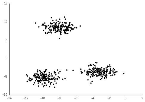
Generally, I don't like putting too much weight in to these linkage clusterings. But we do see two fairly distinct groups. One contains the population variable, so likely the other members of this group are counts rather than frequencies.

(This also shows some entertaining things, like the snowmobiles strongly correlating with latitude.)

Now, we want to use some of these to predict the number of cases of school fire in a given town. Say that \( C \) is the cases of school fire, and that \( P \) is the population. Following this, we let the remaining predictors be \( x_1, x_2, \) etc. The clear relation between \( C \) and \( P \) we noted above, and it would seem we could invsetigate \( \frac{C}{P} \), assuming a linear relation. But we could also behave a bit more agnoistically about this relation.

$$
\log C = f(\log P) + g(\log x_1, \log x_2, \ldots) + \varepsilon
$$

I don't have a particularly good argument for doing all this on a log scale. It is just that I've found it to be generally useful when there are several orders of magnitude of dynamic range.

Ideally here, the effect of population size should be captured by the function \( f \).

An issue though, is the predictors which correlate with population. Since we want all the effects of Population size to be captured in \( f \), we would need to remove this effect from the other predictors. Since we know that Population will predict the Cases quite well, finding one of these to be predictive will most likely just illustrate confounding with the Popultion effect. I can't really think of a clever way of dealing with this (except "normalising" them, but I want to avoid that strategy here, as the point is to try to be non-parametric). For now, we deal with this by not picking predictors from the cluster that correlates with population.

What we actually want to learn is, which of the predictors in \( g \) is more important?

By performing Gaussian Process Regression, we can investigate the functions \( f \) and \( g \). This is a Bayesian technique, where we first provide a prior distribution for each of the functions. If the prior distribution is such that the covariance of function values are parametrised by a covariance function between the predictor values, these distributions will be Gaussian Processes. By selecting your covariance function, you state what kind of functions you would expect if you hadn't observed any data. Once you have observations of data, you can find the posterior distribution of function values for \( f \) and \( g \).

For my research, I use Gaussian Process Regression and other related models to investigate the dynamics of gene expression.

In our case, we will use the Squared Exponential covariance function for \( f \), and an Automatic Relevence Determination version of the SE covariance function for \( g \). The ARD will allow us to find which predictor variables affect predictions from the model, which should relate to their importance.

To model the data as described above, we will use the new Gaussian Process package GPflow. This package implements several Gaussian Process models, and components for these, using the TensorFlow library.

import GPflow

For simplicity, let's combine everything in to one DataFrame.

data = sum_fires.join(indicators.set_index('name'))
data.columns
Index(['Cases', 'Population', 'code', 'medianIncome', 'youthUnemployment2010',
       'youthUnemployment2013', 'unemployment2010', 'unemployment2013',
       'unemploymentChange', 'reportedCrime', 'populationChange',
       'hasEducation', 'asylumCosts', 'urbanDegree', 'satisfactionInfluence',
       'satisfactionGeneral', 'satisfactionElderlyCare', 'foreignBorn',
       'reportedCrimeVandalism', 'youngUnskilled', 'latitude', 'longitude',
       'population', 'populationShare65plus', 'municipalityType',
       'municipalityTypeBroad', 'refugees', 'rentalApartments', 'governing',
       'fokusRanking', 'foretagsklimatRanking', 'cars', 'motorcycles',
       'tractors', 'snowmobiles'],
      dtype='object')

Now we prepare the data for Gaussian Process Regression. We log-scale both the dependent variable, and the predictors (taking care to deal with infinities.)

We also pick some predictors to work with. There are a large number of variables, and with the limited data we have, using all of them will probably just model very small effects which we wouldn't notice very well. Also recall that we don't want to use any of the ones correlating with population!

Y = data[['Cases']] \
        .replace(0, 1) \
        .pipe(np.log10) \
        .as_matrix()

model_kpis = ['Population', 'refugees', 'unemployment2013',
              'longitude', 'asylumCosts', 'satisfactionGeneral',
              'cars', 'fokusRanking', 'youngUnskilled', 'tractors']

X = data[model_kpis] \
        .replace(0, 1) \
        .apply(pd.to_numeric, errors='coerce') \
        .pipe(np.log10) \
        .replace(np.nan, 0) \
        .as_matrix()

A thing which makes these models so flexible, is that the way you express the type of expected functions and the relation between predictors in terms of the covariance function. Here we will formulate the relation by saying that

$$
F(X) = f(\log P) + g(\log x_1, \log x_2, \ldots),
$$
$$
k_F(\cdot, \cdot) = k_f(\cdot, \cdot) + k_g(\cdot, \cdot).
$$

(Here \( k_f(\cdot, \cdot) \) is a covariance function for \( f \) which only acts on the first column of \( X \). And \( k_g(\cdot, \cdot) \) acts on the remaining columns.)

Above, we put the Population in the first column of X, and the remaining columns contain the predicors which we want to use with the ARD SE covariance function.

N_m = len(model_kpis) - 1
kernel = GPflow.kernels.RBF(1, active_dims=[0]) + \
         GPflow.kernels.RBF(N_m , active_dims=list(range(1, N_m + 1)), ARD=True)

Now we are ready to define the model and provide the observed data.

m = GPflow.gpr.GPR(X, Y, kern=kernel)

The way investigate this model, is by selecting hyperparameters for the priors. Hyperparameters are parameters of the covariance functions which dictate features of the functions we are expected to see if we have not observations, which in turn affect the kind of posterior functions we would expect to see.

A nice feature with Gaussian Process models is that in many cases these can be optimized by finding the optimal likelihood of the model. This is also where the power of TensorFlow comes in. Internally in GPflow, you only need to define your objective function, and gradients will be calculated for you.

m.optimize()
compiling tensorflow function...
done
optimization terminated, setting model state


      fun: 47.661120041075691
 hess_inv: <13x13 LbfgsInvHessProduct with dtype=float64>
      jac: array([  2.77119459e-05,   3.10312238e-11,  -5.20177179e-11,
        -1.53390706e-11,  -2.40598480e-10,   7.86837771e-10,
         3.27595726e-04,  -3.28255760e-04,  -3.12000506e-10,
        -1.50492355e-04,   2.20556318e-04,   5.18355739e-05,
        -2.45822687e-03])
  message: b'CONVERGENCE: REL_REDUCTION_OF_F_<=_FACTR*EPSMCH'
     nfev: 154
      nit: 121
   status: 0
  success: True
        x: array([  7.83550523e+00,   4.15028062e+03,   3.49511056e+03,
         8.85917870e+03,   1.25124606e+04,   1.52042456e+03,
         1.27664713e+00,   8.35964994e-02,   5.61225444e+03,
        -1.24241599e+00,   1.31391936e+00,   2.30057289e+00,
        -2.57666517e+00])

After this optimization, we can investigate the model.

m
Namevaluespriorconstraint
model.kern.rbf_2.lengthscales[ 7.8359016 inf inf inf inf inf
1.52270404 0.73581972 inf]
None+ve
model.kern.rbf_2.variance[ 0.25362403]None+ve
model.kern.rbf_1.lengthscales[ 1.55196403]None+ve
model.kern.rbf_1.variance[ 2.39606716]None+ve
model.likelihood.variance[ 0.07327667]None+ve

The lengthscale parameters indicate how "dynamic" the function is with respect to the predictor variable. A long lengthscale means that longer distances in the predictor are needed before the function values changes. While a short one means the function values chanes a lot, and thus are sensitive with resposect to the predictor.

The trick of the ARD, is to allow a separate lengthscale for each predictor, but with shares noise. A predictor with a short lengthscale (in the optimal likelihood) will cause many changes as you change the predictor.

This means we can use the inverse of the ARD lengthscales as a measure of variable importance.

pdict = m.kern.get_parameter_dict()
pdict
{'model.kern.rbf_1.lengthscales': array([ 1.55196403]),
 'model.kern.rbf_1.variance': array([ 2.39606716]),
 'model.kern.rbf_2.lengthscales': array([ 7.8359016 ,         inf,         inf,         inf,         inf,
                inf,  1.52270404,  0.73581972,         inf]),
 'model.kern.rbf_2.variance': array([ 0.25362403])}
sensitivity = pdict['model.kern.rbf_2.variance'] / pdict['model.kern.rbf_2.lengthscales'] ** 2
figsize(6, 4)
plt.barh(np.arange(1, N_m + 1) - 0.4, sensitivity, color='k');
plt.yticks(np.arange(1, N_m + 1), model_kpis[1:], rotation=0);
plt.xlabel('Sensitivity');

It is possible illustrate the population effect by itself, by making a Gaussian Process Regression model using only this part of the covariance function, which was optimized for the full model.

i = 8

plt.loglog()

m_pop = GPflow.gpr.GPR(X, Y, kern=m.kern.rbf_1)
XX = np.linspace(3.5, 6.)[:, None]
YY_m, YY_v = m_pop.predict_f(XX)

plt.scatter(10 ** X[:, 0], 10 ** Y, c=10 ** X[:, i], s=40);
sns.despine()
plt.colorbar(label=model_kpis[i])

plt.plot(10 ** XX, 10 ** YY_m, c='r', lw=3, label='Population effect')
plt.plot(10 ** XX, 10 ** (YY_m + 2 * np.sqrt(YY_v)), c='r', linestyle='--', lw=3)
plt.plot(10 ** XX, 10 ** (YY_m - 2 * np.sqrt(YY_v)), c='r', linestyle='--', lw=3);

plt.legend(loc='upper left')

plt.xlabel('Population'); plt.ylabel('Cases');

It is still not perfectly visible how a predictor explains school fire cases when correcting for population. As a visualization, we can remove the mean population effect from the cases, and thus look at how the residuals relate to the predictor of choice.

Y_p_m, Y_p_v = m_pop.predict_f(X)
plt.loglog()
plt.scatter(10 ** X[:, 0], 10 ** (Y - Y_p_m), c=10 ** X[:, i], s=40);
sns.despine()
plt.colorbar(label=model_kpis[i])

plt.plot(10 ** XX, 10 ** (0 * YY_m), c='r', lw=3)
plt.plot(10 ** XX, 10 ** (2 * np.sqrt(YY_v)), c='r', linestyle='--', lw=3)
plt.plot(10 ** XX, 10 ** (- 2 * np.sqrt(YY_v)), c='r', linestyle='--', lw=3);

plt.xlabel('Population'); plt.ylabel('Residual of Cases');
plt.loglog()
plt.scatter(10 ** X[:, i], 10 ** (Y - Y_p_m), c='k', s=40);
sns.despine()

plt.xlabel(model_kpis[i]); plt.ylabel('Residual of Cases');
data.sort_values(model_kpis[i], ascending=False).head()[['Cases', model_kpis[i]]]
Cases youngUnskilled
Municipality
Perstorp 4 19.1
Haparanda 2 17.1
Södertälje 44 16.9
Skinnskatteberg 1 16.6
Gnesta 5 16.0

The variability of a spoonful of coffee

I like freshly ground coffee, especially made with a French press. The common advice regarding coffee is to dose by weight, due to measurement variability regarding beans in spoons. I was curious how large this variability is.


The different sizes and shapes of the coffee beans makes the volume of the packed beans not correspond to the mass of the coffee, which will be ground to powder.

Different coffee beans are also differently dense, here I’m looking at Brazil Santos coffee.

I made 10 measurements, where I took a level spoon, weighed the contents, then replaced them in my jar of beans before I repeated the measurement.


To quantify the variability, I made a model in Stan. Here a spoonful is modeled normally distributed with a standard deviation parameter which correspond to the between-spoonful variability.

import pystan

code = '''
data {
    int<lower> N;
    real<lower> y[N];
}
parameters {
    real<lower> mu;
    real<lower> sigma;
}
model {
    // Priors
    mu ~ uniform(0, 25);
    sigma ~ uniform(0, 25);

    // Likelihood
    y ~ normal(mu, sigma);
}
'''

data = {
    'N': 10,
    'y': [13.54, 14.22, 13.63, 13.20, 13.32,
          13.23, 13.98, 13.66, 13.51, 14.18]
}

fit = pystan.stan(model_code=code, data=data)

fit

Inference for Stan model: anon_model_393a8d8deb17adb090b969fb1275a378.
4 chains, each with iter=2000; warmup=1000; thin=1; 
post-warmup draws per chain=1000, total post-warmup draws=4000.

        mean se_mean     sd   2.5%    25%    50%    75%  97.5%  n_eff   Rhat
mu     13.64  2.3e-3   0.14  13.34  13.55  13.64  13.73  13.91   4000    1.0
sigma   0.43  2.1e-3   0.13   0.26   0.35   0.41   0.49   0.76   4000    1.0
lp__    5.14    0.02   1.13   2.27   4.74   5.47   5.91   6.22   4000    1.0

Samples were drawn using NUTS(diag_e) at Mon Jul 11 20:54:38 2016.
For each parameter, n_eff is a crude measure of effective sample size,
and Rhat is the potential scale reduction factor on split chains (at 
convergence, Rhat=1).


The y values in the data dictionaries are the weight measurements.


In the end this means that the confidence interval of the spoonful of coffee is between 12.8g and 14.5g.

Writing and Citing with Google Docs and Paperpile

Earlier this day Mick Watson posted a brief post about his scientific writing workflow using Mendeley and Word. I’ve been happily using Paperpile and Google Docs for similar goals, so though I’d post that as a comparison.

First, you just start a new doc for your paper. You write until you need to cite something. Then you hit ctrl+alt+shift+p and search for papers. Initially in your curated collection, but also in many databases on the web such as PubMed.

As you add references, they both get added to your own Paperpile collection, and stored in the Google Doc itself (so all collaborators can see them and manage citations).

Once you have a lot of citations, you pick a citation style, click Format citations in the Paperpile menu.

And you end up with a reference list styled to your liking.

You can then click each citation and edit it in terms of changing and adding/removing references.

In Mick’s post he makes a group in Mendeley to keep track of papers related to a given manuscript. You can also do this in Paperpile, but in practice i think it’s easier just to look at the documents individual manager (on the right in picture above).

Streaming RNA-seq data from ENA

For many of the projects I’m working on for my PhD I use published data. Up until now my strategy has been to download all read files of an experiment from ENA, then process them all with e.g. Salmon to get expression values. This feels a bit silly because sequencing read files are on the order of gigabytes in size, while a csv file of expression values is a few megabytes. In fact, currently my data directory has almost 50 terabytes of public data in it.

The other day I saw this gist from Mike Love. Supposedly it gives you the URL of a ftp hosted fastq from the ENA/SRA accession number of it. This is great, because you can just use curl on the URL, which by defualt streams a file in chunks, to fetch the contents of a sequencing read data set. We only need to know the name of it.

I made a small Bash script for streaming a given accession id.

#/bin/bash

fastq="$1"

prefix=ftp://ftp.sra.ebi.ac.uk/vol1/fastq

accession=$(echo $fastq | tr '.' '_' | cut -d'_' -f 1)

dir1=${accession:0:6}

a_len=${#accession}
if (( $a_len == 9 )); then
    dir2="";
elif (( $a_len == 10 )); then
    dir2=00${accession:9:1};
elif (( $a_len == 11)); then
    dir2=0${accession:9:2};
else
    dir2=${accession:9:3};
fi

url=$prefix/$dir1/$dir2/$accession/$fastq.gz

curl --keepalive-time 4 -s $url | zcat


We call this file stream_ena. You need to know the id of accession, and whether the file you want to look at is part of a pair. But then you have instant access to the contents of any published sequencing data-set!

If we want to look at some single-end data, we can just do

$ ./stream_ena SRR3185782.fastq | head
@SRR3185782.1 HWI-D00361:180:HJG3GADXX:2:1101:1460:2181/1
AGTGTGTTCATCAGTGTGGATTTGCCAATGCCGGTCTCCCCCACACAGAG
+
BBBFFBFFFB<FFFFFBFF<FFFFFFFFFFFFFIIIIFFFFFFFFIFFFF
@SRR3185782.2 HWI-D00361:180:HJG3GADXX:2:1101:1613:2218/1
GCCAATTTTCTTAATGTAAGTGCTGACTTCCTTAACAATTTCCTCATATC
+
BBBFFFFFFFFFFIIIIIIIIIIIIIIIIIIIIIIIIIIIIIIIIIIIII
@SRR3185782.3 HWI-D00361:180:HJG3GADXX:2:1101:2089:2243/1
CGGGTTCTTGGACTTCAGCCAGTTGAGCAGGGCATCCTTGTTGAAGGCGG


If we want to quantify this data set with salmon, we can now simply run

$ salmon quant -l IU \
-i Homo_sapiens.GRCh38.78.cdna_ERCC_repbase.fa \
-r <(./stream_ena SRR3185782.fastq) -o SRR3185782


This will stream the entire contents of accession in to salmon directly from ENA without storing anything on disk, and quantified expression will be saved in the directory SRR3185782.

For a dataset with paired reads we would do for example

$ salmon quant -l IU \
-i Homo_sapiens.GRCh38.78.cdna_ERCC_repbase.fa \
-1 <(./stream_ena SRR1274127_1.fastq) \
-2 <(./stream_ena SRR1274127_2.fastq) -o SRR1274127


Many sequencing tools supports streaming out box don care whether you are your disk or server online.

Say for example we want to look at 5 random reads:

$ seqtk sample -s $(date +%s) <(./stream_ena SRR1274127_1.fastq) 0.001 | head -n 20
@SRR1274127.753 753/1
TTAGAAGGATTATGGATGCGGTTGCTTGCGTGAGGAAATACTTGATGGCAGCTTCTGTGGAACGAGGGTTTATTTTTTTGGGTAGAACTGGAATAAAAGCT
+
BCCFFFFFHHHHHJJJJJJJJHIJIJJJIICGHIJGIJJIJJJJJJJJJJJJJJJJJIJJJGHHFFFD;ADDDDEEDDDD>&2>?ACDDDCDDDDDDDDDC
@SRR1274127.1464 1464/1
AATCAATACTCATCATTAATAATCATAATGGCTATAGCAATAAAACTAGGAATAGCCCCCTTTCACTTCTGAGTCCCAGAGGTTACCCAAGGCACCCCTCT
+
CCCFFFFFHHHHHJJIIHIIJJIJJIGJGJJJJJJJJJJJJJJJJJJJJJJJJJJFIIJJJJJJIJJIIJJIIIJJHHHHFFDFFFFEEDDDDDDB@BBB9
@SRR1274127.1672 1672/1
CCCTACTACTATCTCGCACCTGAAACACCCTAACATGACTAACACCCTTAATTCCATCCACCCTCCTCTCCCTAGGAGGCCTGCCCCCGCTAACCGGCTTT
+
@@@DDDD>FABBD@BDFB:FE;+2+2<)):CFB?<3?4?B*99???FFFE98)>F;778)7(5@E1CF?DDB#############################
@SRR1274127.2188 2188/1
GATTATTAGGGGAACTAGTCAGTTGCCAAAGCCTCCGATTATGATGGGTATTACTATGAAGAAGATTATTACAAATGCATGGGCTGTGACGATAACGTTGT
+
@?@DFDEDFBHFHGGG@DCHEEHG@FEHG@HGGGGIID=FDHGGHGCG?8?CFHHGHGAHEACHA@E<D@EFE>??C@@CD@B@AABCCC@BB@BCB9992
@SRR1274127.4127 4127/1
CTTATACTAGTATCCTTAATCATTTTTATTGCCACAACTAACCTCCTCGGACTCCTGCCTCACTCATTTACACCAACCACCCAACTATCTATAAACCTAGC
+
??@DDFFFDHFFDGHGGGGGHEGGJEHIIAFDGIIGGIJGIGHHIJJIAFBGIGHJGEGIGGJGGGI=EGEEECHAB<?ACB?ABCCDDDDDDCCDDCDCD


Or if we want to check the quality of a dataset without wasting space downloading it:

$ ./stream_ena SRR1274127_1.fastq | fastqc -o SRR1274127_1_fastqc -f fastq stdin


Of course there are caveats. You can’t just blindly put any reads in to salmon and get correct expression. You need to read the methods section of the related study to see what parameters use. The data might need some might preprocessing before it is useful. It is also very common that files uploaded to ENA should be merged before being input to processing tools. But this streaming approach greatly ease storage burden burden from working with public data.

K-means in TensorFlow

I have been getting a bit interested in the new fancy TensorFlow package. As a little exercise to figure out roughly how to use it, I figured I could implement a simple model. I chose to implement k-means clustering, since it’s very simple, but a bit different from the regression/classification models in TensorFlows examples.

We’ll make some ideal clustered data using scikit-learn.

from sklearn import datasets

Xi, yi = datasets.make_blobs(500, random_state=1111)
plt.scatter(*Xi.T, c='k', lw=0);
`


Now we want to divide these in to clusters. We will use the objective used by Bottou & Bengio 1995,

$$ E(w) = \sum_i \min_k (x_i - w_k)^2. $$

Or in words: the sum of the (squared) distances to the closest prototype $ w_k $.

For our implementation, first we need to put in data. Secondly, we need to define the variables we want to optimize. In this case we want the prototypes $ w $.

import tensorflow as tf

# Number of clusters
k = 3

# Input
Xi = Xi.astype(np.float32)
X = tf.placeholder_with_default(Xi, Xi.shape, name='data')

# Model variables, initiate randomly from data
idx = np.random.choice(range(Xi.shape[0]), k, replace=False)
Wi = Xi[idx].copy()
W = tf.Variable(Wi, name='prototypes')


Now we only need to write out how the objective function value is calculated from the data and the variables.

# Reshape data and prototypes tensors
Xc = tf.concat(2, k * [tf.expand_dims(X, 2)])
Wc = tf.transpose(tf.expand_dims(W, 2), [2, 1, 0])

# Define objective of model

distances = tf.reduce_sum((Xc - Wc) ** 2, 1)

cost = tf.reduce_sum(tf.reduce_min(distances, 1))


After the tensors have been formatted correctly this is very simple. We just calculate the distances from each point to each prototype. Then we sum the smallest of these per data-point.

The final value in cost is represented in such a way that TensorFlow automatically can figure out the gradients for minimizing it with respect to the variables in W.

# Make an object which will minimize cost w.r.t. W
optimizer = tf.train.GradientDescentOptimizer(0.001).minimize(cost)


This is the nice thing with TensorFlow, you don’t need to care about finding gradients for objective functions.

sess = tf.Session()

sess.run(tf.initialize_all_variables())

for i in range(100 + 1):
    sess.run(optimizer)
    if i % 10 == 0:
        print('Iteration {}, cost {}'.format(i, sess.run(cost)))

Iteration 0, cost 21533.69140625
Iteration 10, cost 950.78369140625
Iteration 20, cost 940.453369140625
Iteration 30, cost 940.4503784179688
Iteration 40, cost 940.450439453125
Iteration 50, cost 940.450439453125
Iteration 60, cost 940.450439453125
Iteration 70, cost 940.450439453125
Iteration 80, cost 940.450439453125
Iteration 90, cost 940.450439453125
Iteration 100, cost 940.450439453125


Once we’ve optimized the W we get the number for them. Then we can make cluster labels for the data points by looking at which prototype $ w_k $ is closest to a data point.

W_learned = sess.run(W)
y = sess.run(tf.arg_min(distances, 1))

sess.close()

plt.scatter(*Xi.T, c=y, lw=0, cmap=cm.Greys_r, vmax=k + 0.5, label='data');
plt.scatter(*W_learned.T, c='none', s=100, edgecolor='r', lw=2, label='prototypes');
plt.legend(scatterpoints=3);


This is also available in notebook form here: https://gist.github.com/vals/a01a37b14c4918df7937b30d43327837

Some intuition about the GPLVM

Over the last year I’ve been learning about the statistical framework of Gaussian Processes. I’ve been thinking about writing about this for a while, but I feel like I would just decrease the signal-to-noise ratio given the fantastic resources available.

One of my favourite models in the Gaussian Process framework is the Gaussian Process Latent Variable Model (GPLVM). The point of the GPLVM, is that if we have multivariate data, we can simultaneously model every variable with a Gaussian Process. It turns out then that the same way that one can pick hyper parameters for a regression model, we can find optimal, latent, predictor variables for the data.

The leap from regression to the latent variable model is a bit drastic though, so I was trying to think of how we could get some more intuition about this. Let us look at a minimal example. We will use the excellent GPy package for this.

We generate a small number of points (5) on a sine curve, and perform Gaussian Process Regression on this.

import GPy

X = np.linspace(0, np.pi, 5)[:, None]
Y = np.sin(X)

kernel = GPy.kern.RBF(1)
m = GPy.models.GPRegression(X, Y, kernel=kernel)
m.optimize()
m.plot(plot_limits=(-0.1, 3.2));


Now we have a curve which optimally describes the 5 points. Imagine we have a stray 6th point. Say we did 6 measurements, but for one of the points we lost the measurement values. Where could this measurement have happened?

Well, we have the model of the curve describing the data. If we guess the measurement values for the 6th point, we can add that as an observation, and evaluate the likelihood of the regression when including the point.

Let us perform this by guessing some potential points in a 20 by 20 grid around or known observations.

N = 20
xx = np.linspace(0, np.pi, N)
yy = np.linspace(0, 1, N)

ll = []
xxi = []
yyi = []
for i in range(N):
    for j in range(N):
        x = xx[i]
        xxi.append(x)
        Xs = np.vstack((X, np.array([[x]])))
        y = yy[j]
        yyi.append(y)
        Ys = np.vstack((Y, np.array([[y]])))
        ms = GPy.models.GPRegression(Xs, Ys, kernel=kernel,
             noise_var=m.Gaussian_noise.variance)
        ll.append(ms.log_likelihood())

plt.scatter(xxi, yyi, c=ll, s=50, vmin=-1e4,
            edgecolor='none', marker='s',
            cmap=cm.Greys_r);
plt.colorbar(label='log likelihood')
m.plot(ax=plt.gca(), c='r', legend=False,
       plot_limits=(-0.1, 3.2));


Here every square is a position where we guess the 6th point could have been, colored by the log likelihood of the GP regression. We see that it is much more likely the 6th point came from close to the curve defiend by the 5 known points.

Now, imagine that we know that the y value of the 6th point was 0.4, then we can find an x value such that the likelihood is maximized.

x = 1.2
y = 0.4
Xs = np.vstack((X, np.array([[x]])))
Ys = np.vstack((Y, np.array([[y]])))
gplvm = GPy.models.GPLVM(Ys, 1, X=Xs, kernel=kernel)
gplvm.Gaussian_noise.variance = m.Gaussian_noise.variance
gplvm.fix()
gplvm.X[-1].unfix();

gplvm.optimize()

gplvm.plot(legend=False, plot_limits=(-0.1, 3.2));
plt.scatter([x], [y], c='r', s=40);
ax = plt.gca()
ax.arrow(x, y, gplvm.X[-1, 0] - x + 0.1, gplvm.Y[-1, 0] - y,
        head_width=0.03, head_length=0.1,
        fc='r', ec='r', lw=2, zorder=3);


This is done with gradient descent, and the optimum it finds will in this particular case depend on where we initialize the x value of the 6th point. But if we had more variables than the y value above, and we want to find the x-value which is optimal for all variables at the same time, it will end up being less ambiguous. And we can do this for every point in the model at the same time, not just one.

This is illustrated in this animation.


Here there are two variables and we are looking for x-values which best describes the two variables as independant Gaussian processes.

Observations needed to estimate standard deviation

I was curious as to practically how well standard deviation can be estimated at different numbers of observed samples. I thought the plot was interesting, so figured I’d share.

Here is the Julia code I used:

using Distributions
using Gadfly

function std_of_sample(n)
    std(rand(Normal(2, 5), n))
end;

nmax = 200
n_observations = collect(0:nmax * 100) % nmax + 2;

p = plot(
    x=n, y=map(std_of_sample, n_observations),

    Guide.XLabel("Number of observations"),
    Guide.YLabel("Estimated σ"),
    Theme(default_color=color("black")),
    Coord.Cartesian(ymin=-3, ymax=13, xmin=-20, xmax=220),
    Guide.xticks(ticks=[0, 10, 25, 50, 100, 200])
);

draw(PNG(640px, 480px), p)


We just sample a different number of samples from a normal distribution with mean 2 and known standard deviation 5.

Timecourse analysis with Sleuth

An extremely interesting application of RNA-sequencing analysis is to study samples over a time series. This allows you to identify patterns of expression over some response to a stimuli or developmental progression.

While Sleuth together with the Kallisto from the Pachter lab makes it easy to perform differential expression analysis in the two-condition case of an RNA-seq experiment, there is still some confusion about how to perform DE over a time series. I thought it would be useful to write an example text of how to detect DE transcripts over a time course with Sleuth.

The first problem is to define what we mean by differentially expressed in the context of a time series. For a treatment-vs-control type experiment it is simple: What genes are higher or lower expressed in the treatment condition compared to the control? The first generalization which comes to mind would be to find genes whose level increase or decrease with the time points. This means finding correlation with time points and boils down to linear regression of expression with time points. However, this will mask potentially interesting genes which could for example peak in the middle of the time series. What we want is to find if the expression of a gene follows a general pattern to a higher degree than just noise.

In a linear modelling framework, such as Sleuth, a common solution for this is to use natural splines. Given a number of degrees of freedom for a natural spline model, knots will be placed along the quantiles of the observations of the time axis, which will define basis polynomials with local support.

$$ Expression \sim \beta_0 + \sum_{i=1}^3 \beta_i B_{i}(Timepoint) + \varepsilon $$

The idea is now to compare the model of a genes expression which includes the polynomial terms, with a model that only includes the noise term.

$$ Expression \sim \beta_0 + \varepsilon $$

In the latest versions of Sleuth, there is a likelihood ratio test implemented for this sort of comparison of models. This is how time course analysis is implemented both in Ballgown and Monocle. The benefit of Sleuth is the ability of using the quantification bootstraps to attempt to separate technical variance from biological variance.

Let’s get to the actual practical example. We will be using data from the publication “High-resolution mapping of transcriptional dynamics across tissue development reveals a stable mRNA-tRNA interface”. In the paper they perform RNA-sequencing on a developmental time series of mice, from both brain and liver, at six time points. For the sake of this example, let us just focus on the brain samples.

We load Sleuth and define the locations for the Kallisto outputs.

library(sleuth)
sample_id <- list('do2174', 'do2175', 'do2176', 'do2177',
'do2183', 'do2184', 'do2185', 'do2186', 'do2187', 'do2188',
'do2189', 'do2190')
paths <- list('kallisto/do2174_RNAseq_brain_mmuBL6e15.5_CRI01p_kallisto_out',
'kallisto/do2175_RNAseq_brain_mmuBL6e18.5_CRI01p_kallisto_out',
'kallisto/do2176_RNAseq_brain_mmuBL6P0.5_CRI01p_kallisto_out',
'kallisto/do2177_RNAseq_brain_mmuBL6P4_CRI01p_kallisto_out',
'kallisto/do2183_RNAseq_brain_mmuBL6e15.5_CRI01p_kallisto_out',
'kallisto/do2184_RNAseq_brain_mmuBL6e18.5_CRI01p_kallisto_out',
'kallisto/do2185_RNAseq_brain_mmuBL6P0.5_CRI01p_kallisto_out',
'kallisto/do2186_RNAseq_brain_mmuBL6P4_CRI01p_kallisto_out',
'kallisto/do2187_RNAseq_brain_mmuBL6P22_CRI01p_kallisto_out',
'kallisto/do2188_RNAseq_brain_mmuBL6P29_CRI01p_kallisto_out',
'kallisto/do2189_RNAseq_brain_mmuBL6P22_CRI01p_kallisto_out',
'kallisto/do2190_RNAseq_brain_mmuBL6P29_CRI01p_kallisto_out')
names(paths) <- sample_id

s2c <- read.table("brain_times.tsv", header = TRUE, stringsAsFactors = FALSE)
s2c <- dplyr::mutate(s2c, path = paths)
s2c[] <- lapply(s2c, as.character)
s2c


In order to pass the spline based model to Sleuth, we need to make a design matrix. This can be done by using the splines library and pass a formula using the splines by the ns() functions to model.matrix.

library(splines)
day <- s2c$day
full_design <- model.matrix(formula(~ ns(day, df = 4)))
full_design


The df parameter essentially governs how smoothed the expression patterns will be over the time points. I picked 4 because it’s the default in Ballgown. In Monocle the default is 3, but it seems this smooths the expression too much. Lower values for the df parameters will capture less “dynamics”, but will have more statistical power. 

As described in the Sleuth vignette, it is quite handy to have the external gene name which is associated to every transcript, to quickly see roughly what gene we are looking at when we see a differentially expressed transcript.

library("biomaRt")
mart <- biomaRt::useMart(biomart = "ENSEMBL_MART_ENSEMBL",
dataset = "mmusculus_gene_ensembl",
host = "www.ensembl.org")
t2g <- biomaRt::getBM(attributes = c("ensembl_transcript_id",
"ensembl_gene_id",
"external_gene_name"),
  mart = mart)
t2g <- dplyr::rename(t2g,
target_id = ensembl_transcript_id,
ens_gene = ensembl_gene_id,
ext_gene = external_gene_name)


Now we are read to start performing the Sleuth analysis

so <- sleuth_prep(s2c, full_model = full_design, target_mapping = t2g)
so <- sleuth_fit(so)
so <- sleuth_fit(so, formula = ~ 1, fit_name = "reduced")
so <- sleuth_lrt(so, "reduced", "full")


Sleuth has an interactive Shiny application associated with it to browse the results of the analysis. It’s not mandatory to use it though, and many of the handy features in it mostly makes sense for the treatment-vs-control style of experiments.

plot_qq(so, test = 'reduced:full', test_type = 'lrt', sig_level = 0.05)


We can extract the results of the likelihood ratio test as a dataframe to look at closer

lrt_results <- sleuth_results(so, 'reduced:full', test_type = 'lrt')
table(lrt_results[,"qval"] < 0.05)

FALSE  TRUE 
49523  3083


This tells us that we find 3083 transcripts which have an expression pattern ove the time course which is significantly better explained by a natural spline over the time than by just random noise. Let’s have a look at the very top transcripts.

lrt_results %>% head(n = 20) %>% dplyr::select(target_id, qval, ens_gene, ext_gene)


I don’t know enough about brain development to say if these genes make any sense in the context. We can also plot a clustered heatmap of these top genes.

plot_transcript_heatmap(so, head(lrt_results, n = 20)$target_id, 'est_counts')


Unfortunately there doesn’t seem to be a way to rename the axis labels to some other information, or to enforce ordering the samples by time point. Let’s also plot the expression of a differntailly expressed transcript to see what it looks like.

tmp <- so$obs_raw %>% dplyr::filter(target_id == 'ENSMUST00000145067')
tmp <- dplyr::full_join(so$sample_to_covariates, tmp, by = 'sample')
tmp
tmp <- transform(tmp, day = as.numeric(day))
ggplot(tmp, aes(x=day, y=est_counts)) 
  + geom_point(shape=1) 
  + geom_smooth(method = loess)