Immune response enrichment analysis in Python

In a recent paper, Cui and colleagues define a ‘dictionary’ of immune responses to cytokine stimulation (Cui et al. 2023). The experiments performed to produce this dictionary is at an impressive scale, involving injecting 272 mice with 86 different cytokines and harvesting cells from the mice’s draining lymph nodes.

Cytokines are secreted proteins that interact with surface receptors of cells, signaling to the receiving cell to change its current state or perform a function. The immune system heavily relies on this form of signaling.

When a problem occurs, non-immune cells signal to immune cells to activate, to recruit them to the site of the problem, differentiate cells to properly respond to the problem. After the issue is resolved, other cytokines are secreted to decrease the activities of the responding cells. The immune system consists of many components, many different cell types which can handle immune issues in different ways. These components communicate with different sets of cytokines to customize the responses to the problem at hand (Altan-Bonnet and Mukherjee 2019; Saxton, Glassman, and Garcia 2022; Moschen, Tilg, and Raine 2019).

In any diseases or afflictions where the immune system is involved, it is extremely valuable to know which cytokines are involved. The immune dictionary by Cui and colleagues provides, for a large collection of cell type-cytokine pairs, the genes which are transcribed in response to the stimulation from that cytokine. If you know what cell type you are looking at, which genes that cell type has started transcribing, you can look up in the dictionary which cytokine stimulated the cell.

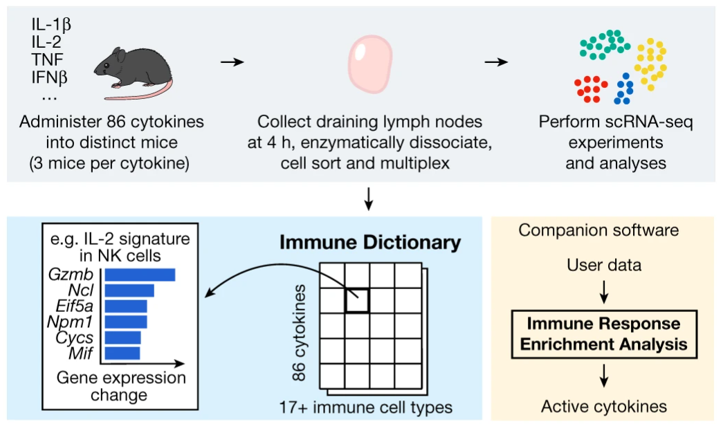
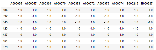
Adapted from https://www.nature.com/articles/s41586-023-06816-9/figures/1

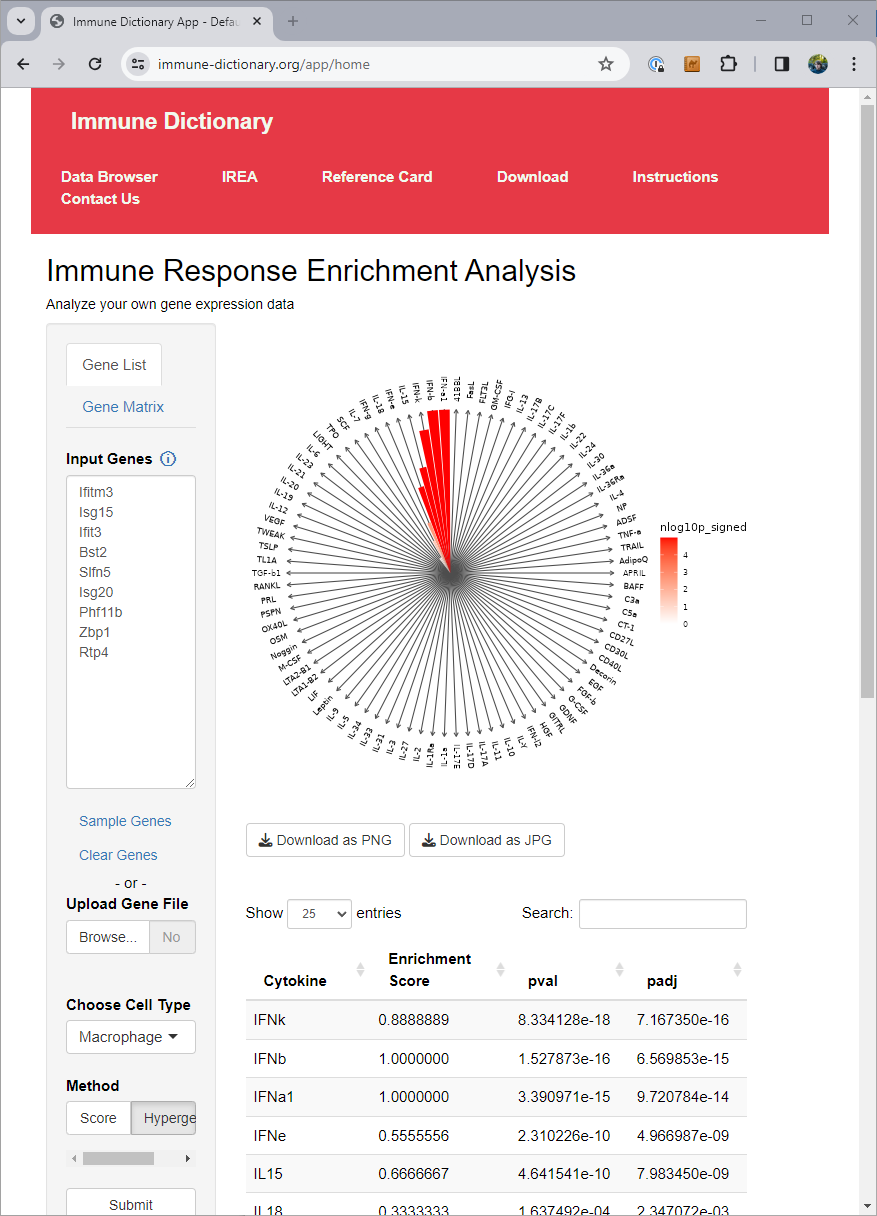
The authors of the immune dictionary created a website at https://www.immune-dictionary.org/ where anyone can upload a list of genes, and infer which cytokines are responsible for the expression of those genes, through what they call ‘immune response enrichment analysis’.


When working in cases with many different conditions or cell types, going to a website and pasting in gene lists for each of them can end up being tedious. At that point you want a solution you can just run as code in your local environment.

The final dictionary from Cui and colleagues, summarizing the results of their large experiment, is available as Supplementary Table 3 in the online version of the paper, having the filename 41586_2023_6816_MOESM5_ESM.xlsx. With these data the tests available on the immune-dictionary.org website can be implemented in Python.

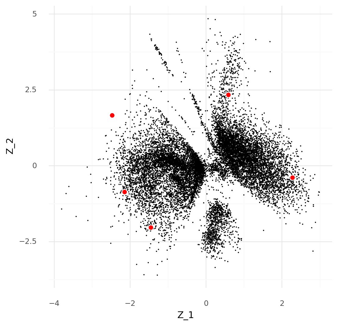
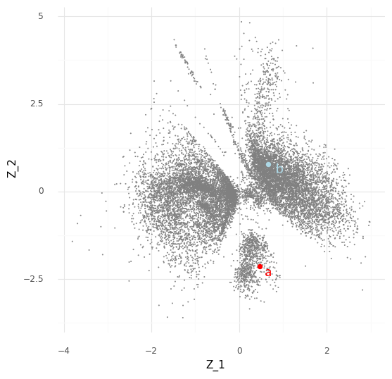
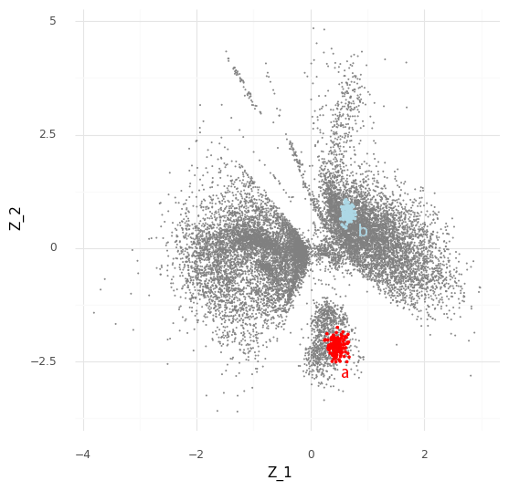
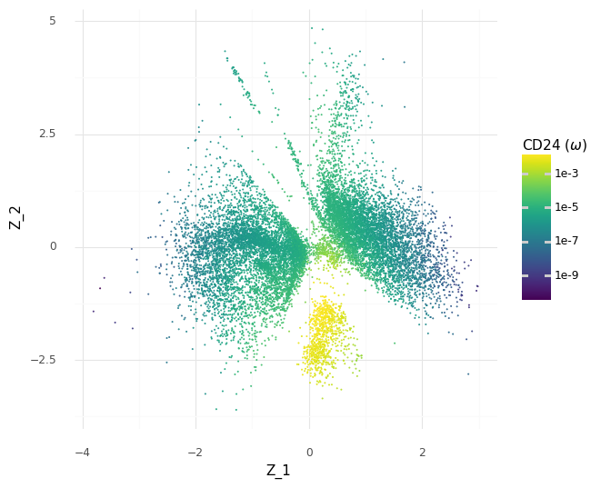
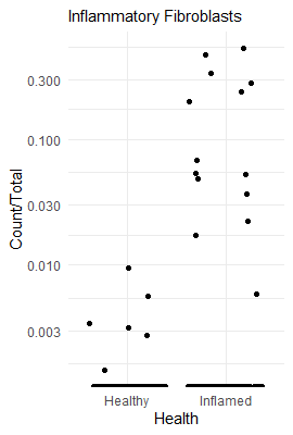
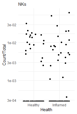
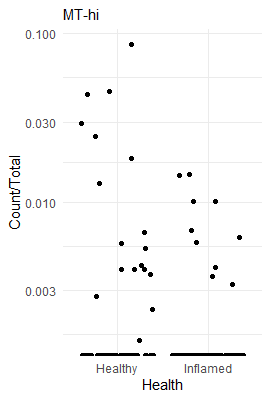
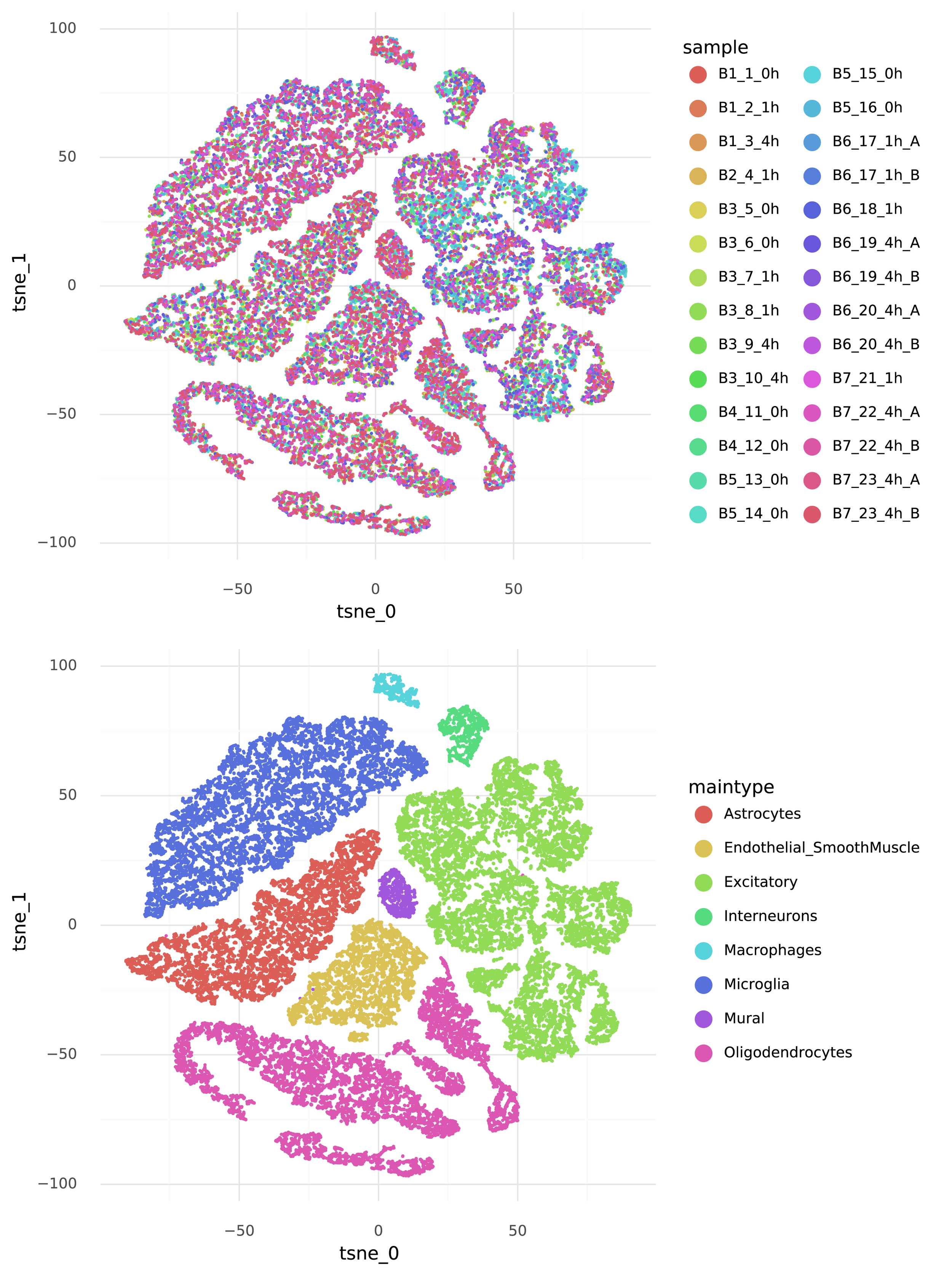
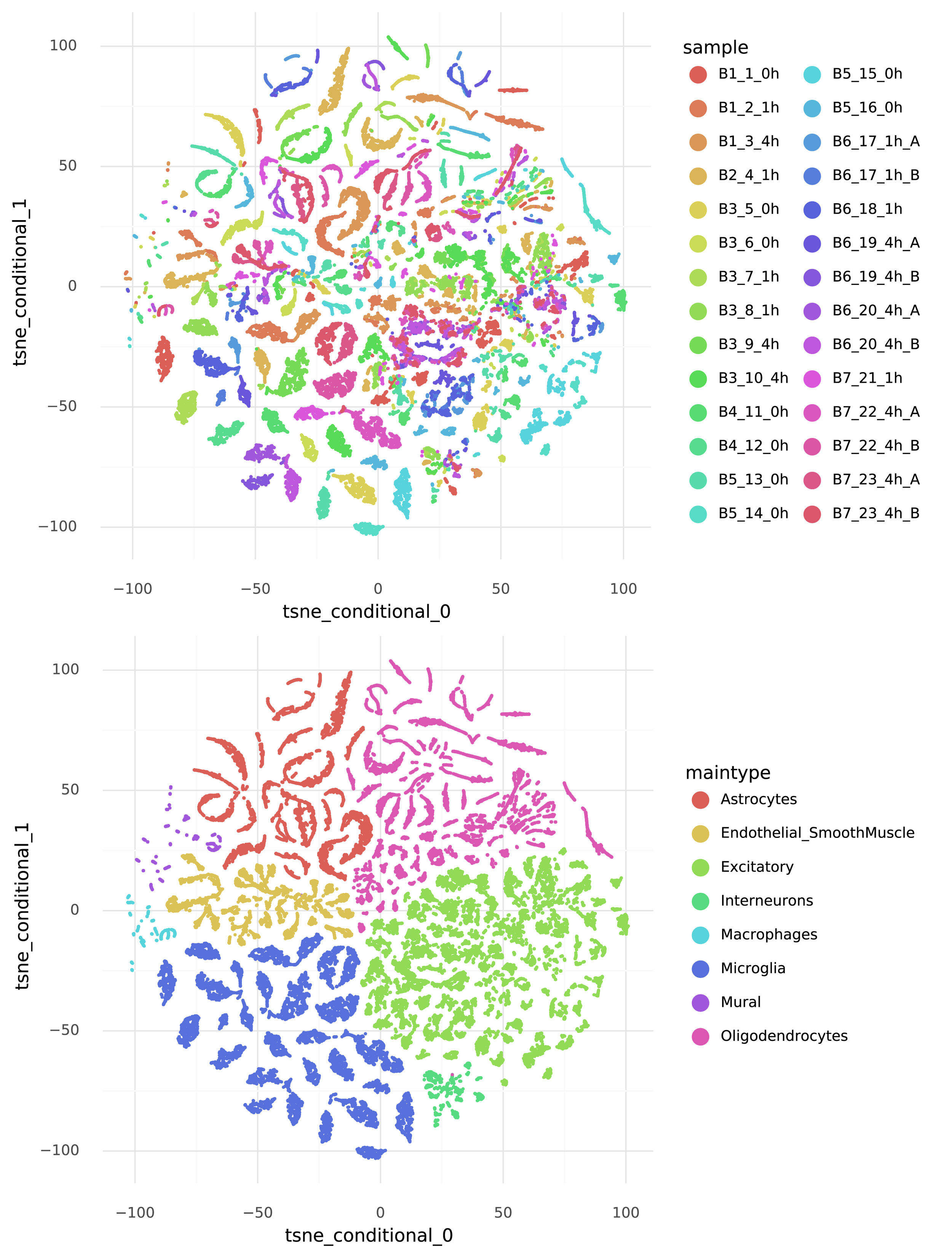
For an example, I found a dataset of mouse colon tissue, with the three conditions of healthy, acute colitis, and chronic colitis, on Figshare. Unfortunately, I haven’t been able to identify what paper these data are from, but it has annotated cell type labels which is very useful for this analysis. By comparing macrophages from healthy mice with macrophages from mice with acute colitis, we can see which genes are activated in the acute colitis case, and compare that list of genes to the genes activated by the different cytokines in the immune dictionary.

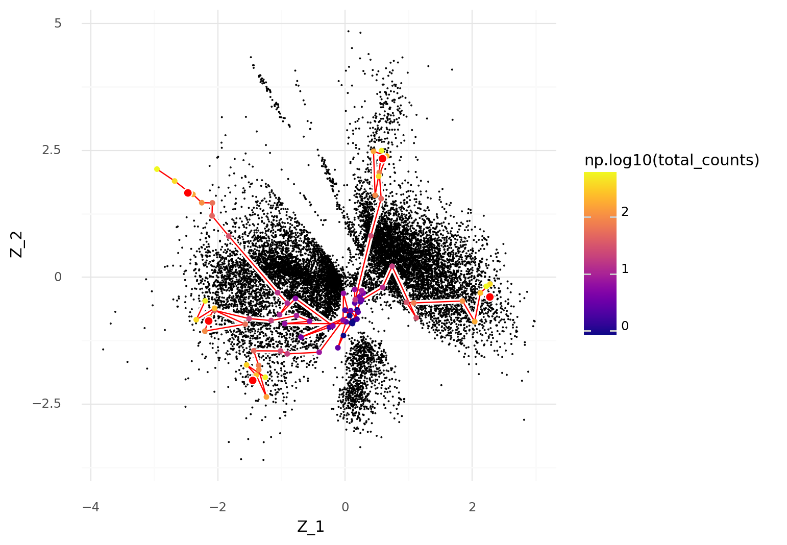
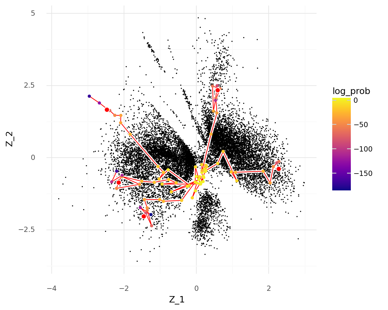
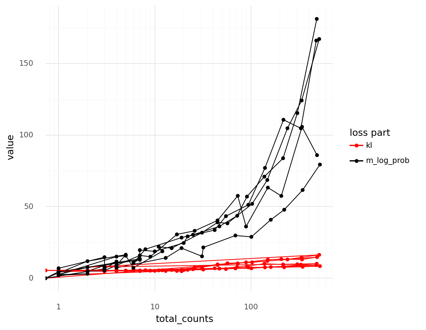
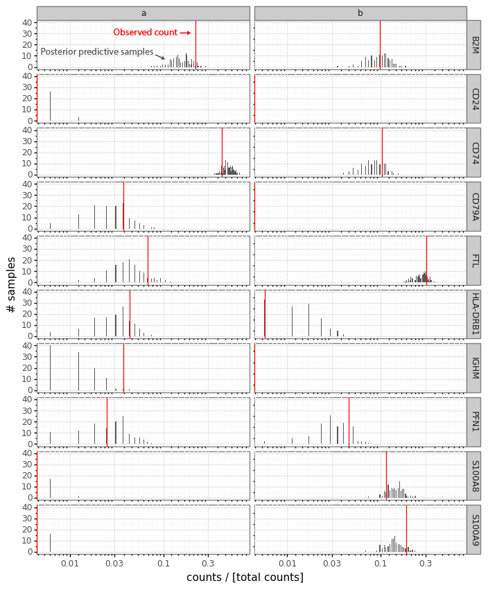
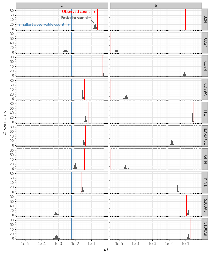
After cleaning up the mouse colon data (changing gene identifiers) I ingested it into my Lamin database and fitted an SCVI model to use for differential expression tests.

After reading in the immune response dictionary gene lists from the Excel file, enrichment analysis is done by looking at the overlap between cytokine response genes and genes that are differentially expressed, using, for example, a hypergeometric test.

The Pertpy package’s Enrichment.hypergeometric function would probably be the easiest way to perform the analysis. The gene lists per cytokine stimulation are provided as a dictionary. This function requires your DE results to be stored in a specific format used by scanpy’s rank_genes_groups function.

Since I’m using an SCVI model for differential expression, it will be easier to just obtain a list of DE genes and make use of the code behind the Enrichment.hypergeometric function.

# Differential expression

idx_ = (
    vae.adata.obs
    .query('celltype_minor == "Macrophage"')
    .query('condition in ["Healthy", "AcuteColitis"]')
    .index
)
tmp_ = vae.adata[idx_].copy()

de_results = vae.differential_expression(
    tmp_,
    groupby = 'condition',
    group1 = 'AcuteColitis',
    group2 = 'Healthy'
)

fde_r = (
    de_results
    .query('proba_de > 0.95')
)


# Get immune dictionary gene lists

celltype_response = cytokine_responses.query('Celltype_Str == "Macrophage"').copy()
celltype_response['Gene'] = celltype_response['Gene'].map(lambda s: [s])
response_sets = celltype_response.groupby(['Cytokine'])['Gene'].sum().to_dict()


# Calculate hypergeometric gene set enrichment statistics

de_genes = set(fde_r.index)
universe = set(vae.adata.var.index)

results = pd.DataFrame(
    1,
    index = list(response_sets.keys()),
    columns=['intersection', 'response_gene_set', 'de_genes', 'universe', 'pvals']
)
results['de_genes'] = len(de_genes)
results['universe'] = len(universe)

for ind in results.index:
    response_gene_set = set(response_sets[ind])
    common = response_gene_set.intersection(de_genes)
    results.loc[ind, "intersection"] = len(common)
    results.loc[ind, "response_gene_set"] = len(response_gene_set)
    pval = stats.hypergeom.sf(len(common) - 1, len(universe), len(de_genes), len(response_gene_set))
    results.loc[ind, 'pvals'] = pval

results['Cytokine'] = results.index

After this we can investigate the results table, or, here, to save some space, visualize the ranking of likely upstream cytokines in a plot.

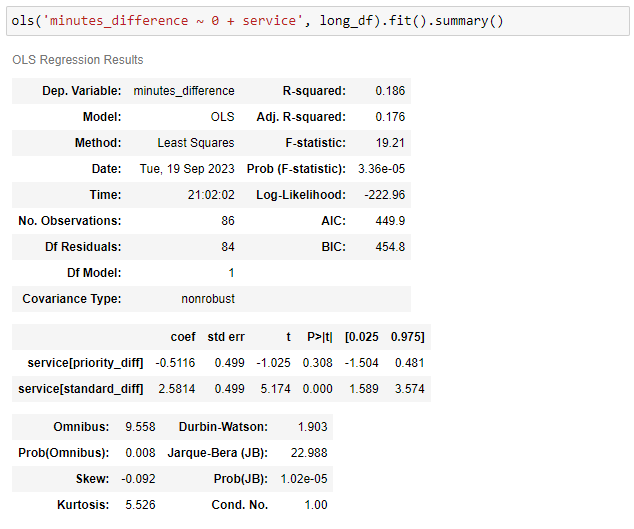
|        |   intersection |   response_gene_set |   de_genes |   universe |      pvals | Cytokine   |
|:-------|---------------:|--------------------:|-----------:|-----------:|-----------:|:-----------|
| IL-21  |              1 |                   1 |         96 |      18416 | 0.00521286 | IL-21      |
| RANKL  |              1 |                   1 |         96 |      18416 | 0.00521286 | RANKL      |
| IL-13  |              2 |                  34 |         96 |      18416 | 0.0135363  | IL-13      |
| IL-17F |              1 |                   3 |         96 |      18416 | 0.015558   | IL-17F     |
| OSM    |              1 |                   7 |         96 |      18416 | 0.0359301  | OSM        |
...

We see that, based on the immune dictionary, the macrophages in the colon of mice with acute colitis are likely to have been stimulated by the cytokines IL-21, RANKL, IL-17F, IL-13, and OSM.

The notebooks used for this post are available on GitHub, the data used for this post are available on LaminDB, and the trained SCVI model is available from Hugging Face using scvi-hub. Thanks to Eduardo Beltrame for helpful feedback on this post.

References

Altan-Bonnet, Grégoire, and Ratnadeep Mukherjee. 2019. “Cytokine-Mediated Communication: A Quantitative Appraisal of Immune Complexity.” Nature Reviews. Immunology 19 (4): 205–17. https://doi.org/10.1038/s41577-019-0131-x.

Cui, Ang, Teddy Huang, Shuqiang Li, Aileen Ma, Jorge L. Pérez, Chris Sander, Derin B. Keskin, Catherine J. Wu, Ernest Fraenkel, and Nir Hacohen. 2023. “Dictionary of Immune Responses to Cytokines at Single-Cell Resolution.” Nature, December. https://doi.org/10.1038/s41586-023-06816-9.

Moschen, Alexander R., Herbert Tilg, and Tim Raine. 2019. “IL-12, IL-23 and IL-17 in IBD: Immunobiology and Therapeutic Targeting.” Nature Reviews. Gastroenterology & Hepatology 16 (3): 185–96. https://doi.org/10.1038/s41575-018-0084-8.

Saxton, Robert A., Caleb R. Glassman, and K. Christopher Garcia. 2022. “Emerging Principles of Cytokine Pharmacology and Therapeutics.” Nature Reviews. Drug Discovery, September. https://doi.org/10.1038/s41573-022-00557-6.

Single-cell metadata as language

Single-cell RNA-seq data is molecule counts of transcripts from different genes within different cells. With this data alone, you can learn which genes tend to covary between cells, or you might learn of groups of cells where different sets of genes are used.

Metadata is data about this data. In the single-cell field this includes information such as which tissue were the cells were harvested from, what technology was used to perform the measurements, or was there some experimental stimulation of the cells.

When you are relating the data and the metadata, you get a connection between the gene expression patterns and external phenomena. You can relate the observations to the rest of the world, either in terms of what observations are related to technical factors, or how observations might change depending on stimuli.Only when you have both gene expression data and the sources of variation in the data can you begin to understand how gene expression is modified in the cells, or the expression in the cells lead to related downstream differences.

When working with single-cell data from multiple sources, you quickly encounter the issue of different people having different ideas on how to format the metadata for the cells. For example, below are the metadata fields and values for two cells from two different data sets.

{
    "Index": "CTGAAACAGAATAGGG-11",
    "Patient_assignment": "U3",
    "Tissue_assignment": "R",
    "Disease_assignment": "diseased",
    "Celltype": "B"
}

{
    "Index": "N52.LPA1b.CCCAGTTTCTGGTTCC-2",
    "Cluster": "Plasma",
    "Subject": "N52",
    "Health": "Non-inflamed",
    "Location": "LP",
    "Sample": "N52.LPA1b",
    "Batch": "2"
}

In any analysis of data from the two datasets, the metadata needs to be harmonized. You will need to assign a relation between what parts of data represent the same thing, or different things. Which fields relate to the same concept (e.g., ‘Celltype’ and ‘Cluster’)? Which values within a field represent the same category (e.g., plasma cells are a subset of B cells)?

Once metadata in different datasets are harmonized, and there are subsets of data that are aligned, the different datasets can be put in a model, treated as replicates, or used for comparisons. This metadata harmonization work is equally required no matter the analysis workflow, no matter if it is based on linear models, graph based methods, nonparametric statistics, or deep generative models. The concepts in the metadata need to be aligned to a common vocabulary.

When you are looking at the metadata examples from two cells above, you are probably already aligning the concepts in your head. Clusters and cell types, health status, there appears to be multiple patients and batches which can probably be treated as replicates, etc.

Why can you do this matching? It is because even though the metadata is not standardized, it is text communicating language, in a somewhat structured way. The people who wrote this metadata did actually write it in a way meant to communicate information. They just had slightly different ideas about phrasing. The metadata is language.

At this moment, there are endless language models that can take pieces of text and produce embedding vectors which preserve semantic relations between the texts, in contexts all the way between song lyrics and code in obscure programming languages. These embedding models are designed to preserve that intuition about relations between text which we are using when we can match up the concepts in the metadata examples above.

If we can convert the metadata for the cells to vector representations that preserve the information that the original author meant to communicate, then we can redefine an enormous amount of analysis tasks to circumvent the harmonization step.

A simple version of metadata embedding could be to take the metadata dictionary, convert it to a JSON string, and embed this with a language embedding model, e.g., text-embedding-3-small from OpenAI.

client = OpenAI()

row_ = pd.Series({
    "Index": "CTGAAACAGAATAGGG-11",
    "Patient_assignment": "U3",
    "Tissue_assignment": "R",
    "Disease_assignment": "diseased",
    "Celltype": "B"
})

js_ = row_.to_json()

response = client.embeddings.create(
        input = js_,
        model = 'text-embedding-3-small'
    )

embeddings = np.array([d.embedding for d in response.data])

To investigate this strategy, I went through my collection of scRNA-seq data and sampled 100 random cells from each dataset. I filtered out all cells that didn’t have textual metadata, and was left with 5,760 cells from 58 datasets. I took the textual metadata (that is, I filtered out numeric metadata) for these cells and created 1,536-dimensional embeddings of the JSON representations using the text-embedding-3-small model.

To get some intuition about the embeddings, they can be visualized with PyMDE.

Cell metadata from the same dataset largely group together and do not intermix. There are some cases where we can see the same dataset occupy different regions in the embeddings (for example, purple data in lower right corner).

Do the embeddings represent any interesting information within datasets? As an example, we can zoom in on the first dataset as an example (this is the data with the first dictionary of the first example up top).

These cells have metadata that cover three distinct regions in the embedding space.

Coloring the cells by some of the metadata information (PBMC vs R [rectum], diseased vs healthy), we can see that the metadata embedding is reflecting that these cells came from different tissues and different disease states.

So, what do these figures indicate? They are pointing to some interesting analysis strategies.

When integrating out variation between datasets, the common choice is a one-hot encoded vector of the length of the number of datasets. Since individual datasets appear to group together in distinct space, the embedding coordinates could be used as continuous covariates in integration models.

Within a dataset, cells with different recorded properties are separated. So also on the local scale, within-dataset, between-condition variation can be modeled with the embedding coordinates as covariates.

This concept can be used with many analysis strategies, but it would tie well with the conditional variational autoencoders in scvi-tools. Zooming in on the relevant part of the SCVI model, a model can be defined with $$ \rho_n = f(z_n, s^{\text{dataset}}_n, s^{\text{health}}_n), $$

where \( s^{\text{dataset}} \) and \( s^{\text{health}} \) end up being one-hot encodings of the dataset and health categories.

Instead, we can imagine creating the cVAE so that it is conditional on the metadata embedding vector (from some function \( g \)):

$$ \rho_n = f(z_n, g(\text{metadata})). $$

This way, we can tie the gene expression to the author-reported language in the cell metadata. We can analyze the data without spending as much time on metadata harmonization.

There are more potential benefits. We have been thinking about using the language embeddings as a way to represent the observed metadata. Another concept is that the observed language in the metadata can be related directly to language as queries about the data.

The example dataset above mentions two tissue sources for the cells: PBMC, and R. As an example, we can take just the English word “Blood”, and ask how similar the different cells metadata are to this word. Coloring the cells by their metadata distance to “Blood” we see that PBMC-cells are closer than R-cells. We are not informing the model that PBMC is a subset of blood, instead this information is encoded in the OpenAI language model and represented in the embeddings.

This suggests that if a model is trained with enough single cell data with matched embedded metadata we could get to a point where we can ask differential expression queries using natural language. You can imagine using different natural language queries to filter areas in \( Z \) cell transcriptome representation space and define contrasts between areas of metadata embedding space, leading us to highly complex conditional questions.

Here I have just tested a raw embedding of the JSON of the metadata. I couldn’t find any models that had been specifically trained to represent key-value dictionaries. It would be interesting if the language model had distinctions between keys and values encoded in it somehow, though I’m not sure in what way.

Another potential direction could be to fine-tune the language embedding model as the gene expression cVAE model is trained. By iterating between training the cell gene expression representation model and training the metadata embedding model, some gene expression information will inform which terms in the metadata are similar.

A notebook with the analysis presented here is available on GitHub. Thanks to Eduardo Beltrame for helpful feedback on this post.

Organizing scRNA-seq data with LaminDB

Occasionally, when I’m curious about something scRNA-seq related, I analyze some data. Often this leads to posts on this website.

I have made it a habit to try to find some recent, somewhat interesting, scRNA-seq data for these kinds of analysis. This is because I don’t want to end up mentally overfitting to a particular dataset, and I also consider it a way to keep up with how the scale and complexity of datasets are changing over time.

Over the years, I have ended up collecting a large number of scRNA-seq datasets. I did a global search for ‘*.h5ad’ on my Google Drive, and found over 300 files in various directories scattered throughout my drive.

Due to the increasing popularity and scale of scRNA-seq experiments, products for organizing large collections of data, such as LaminDB.

LaminDB is designed for tracking biological data in general. It offers plugins to manage ontologies related to scRNA-seq data as well as for AnnData format data.

The LaminDB database tracks metadata about the data, as well as the location of the data. It can track data locally on a computer, but it is probably most useful when storing your data on cloud storage.

After filtering duplicates and non-public H5ADs from my list, I ingested all my H5ADs into LaminDB, while also spending some time to hunt down the original publications for all the datasets and tag them with the DOI of the source publication for each dataset.

LaminDB is organized around ‘artifacts’ and ‘collections’. Each H5AD file is considered an ‘artifact’, which can be annotated with ‘features’ and ‘labels’.

Since each artifact (H5AD file) has an article DOI associated, I was able to use the single cell studies database to add some further annotation to the files: organism, tissue, and technique associated with the DOI.

Features and labels can be arbitrarily registered, and you can build your own ontologies to organize your data. For single-cell genomics data, Lamin provides a plugin, ‘bionty’, with pre-defined labels and features using relevant public ontologies, including organisms and tissues. The data from the single cell studies database was used to create these labels for the artifacts.

The LaminDB database can be explored on lamin.ai, and can be loaded by running lamin load vals/scrna in the terminal. In my case, the database is hosted on AWS. After running the load command, the database is directly accessible in Python through the ‘lamindb’ package, which is typically imported as ln.

For example, we can count how many files are tracked by the database.

> ln.Artifact.filter().all().count()
236

These are the 236 H5AD files I ingested to the database after deduplication. This deduplication happened automatically as I ingested files based on the hash of the file contents.

Files of interest can be identified by filtering based on metadata (which in this case is on the publication level).

> organisms = lb.Organism.lookup()
> tissues = lb.Tissue.lookup()
> techniques = lb.ExperimentalFactor.lookup()
> query = (
    ln.Artifact
    .filter(organism = organisms.mouse)
    .filter(tissues = tissues.brain)
    .filter(experimental_factors = techniques.chromium)
)

> print(query.df().head())
                     uid  storage_id   
id                                     
15  88k1xpSWBdJzEbYUf6MZ           1  \
16  UDH0CAo3JHo0uQUiAtUV           1   
21  kFvwhKtIBY0mhQTOqaOX           1   
22  PBAwUla9eERbI1KJQADZ           1   
23  HW9uS90M2PVyeX50o6ct           1   

                                                  key suffix accessor   
id                                                                      
15      cortex-align-2018/Zeisel 2018/l1_cortex2.h5ad  .h5ad  AnnData  \
16      cortex-align-2018/Zeisel 2018/l1_cortex3.h5ad  .h5ad  AnnData   
21  hca-benchmark-2019/Ding/2019-05-Ding-et-al-bio...  .h5ad  AnnData   
22  hca-benchmark-2019/Ding/PBMC/PBMC_read_counts....  .h5ad  AnnData   
23  hca-benchmark-2019/Ding/PBMC/PBMC_umi_counts.h5ad  .h5ad  AnnData   

   description version       size                    hash hash_type n_objects   
id                                                                              
15        None    None   77363974  SlY49Cv9vnMGofdSCMOj90   sha1-fl      None  \
16        None    None   64354637  ZVFW2H_B1ZlD9KK_WKS11T   sha1-fl      None   
21        None    None  224711660  e7bzC5ZhAV-e_swr_6jQie   sha1-fl      None   
22        None    None  307531280  DaQIiOBzYf5VjXmOmWE1tQ   sha1-fl      None   
23        None    None  296120754  aKSloGAGbodFRA8PlBR1Vz   sha1-fl      None   

   n_observations transform_id run_id  visibility  key_is_virtual   
id                                                                  
15           None         None   None           1            True  \
16           None         None   None           1            True   
21           None         None   None           1            True   
22           None         None   None           1            True   
23           None         None   None           1            True   

                         created_at                       updated_at   
id                                                                     
15 2023-11-06 07:03:39.184199+00:00 2024-01-21 07:04:35.258135+00:00  \
16 2023-11-06 07:04:08.454681+00:00 2024-01-21 07:04:38.216085+00:00   
21 2023-11-06 07:16:59.839767+00:00 2024-01-21 07:06:08.275496+00:00   
22 2023-11-06 16:19:26.830698+00:00 2024-01-21 07:06:18.767072+00:00   
23 2023-11-06 16:20:20.747104+00:00 2024-01-21 07:06:29.318662+00:00   

    created_by_id  
id                 
15              1  
16              1  
21              1  
22              1  
23              1

Artifacts, here representing H5AD files, contain a lot of different metadata that relates to provenance, meaning the source and transformations that have occurred for the file, as well as annotations added to the files.

> artifact = query.first()
> artifact.describe()

Artifact(uid='88k1xpSWBdJzEbYUf6MZ', key='cortex-align-2018/Zeisel 2018/l1_cortex2.h5ad', suffix='.h5ad', accessor='AnnData', size=77363974, hash='SlY49Cv9vnMGofdSCMOj90', hash_type='sha1-fl', visibility=1, key_is_virtual=True, updated_at=2024-01-21 07:04:35 UTC)

Provenance:
  🗃️ storage: Storage(uid='3wVRAheC', root='s3://vals-scrna', type='s3', region='us-west-1', updated_at=2023-11-05 20:36:19 UTC, created_by_id=1)
  👤 created_by: User(uid='8joZB4lw', handle='vals', updated_at=2023-11-05 20:36:19 UTC)
  ⬇️ input_of (core.Run): ['2024-01-25 15:18:34 UTC']
Features:
  external: FeatureSet(uid='b20JpuwZ5gfBUAvcS8jP', n=3, registry='core.Feature', hash='iKuEmOyrwt4opSDzC-dF', updated_at=2024-01-21 07:29:48 UTC, created_by_id=1)
    🔗 organism (1, bionty.Organism): 'mouse'
    🔗 tissue (1, bionty.Tissue): 'brain'
    🔗 technique (1, bionty.ExperimentalFactor): 'Chromium'
Labels:
  🏷️ organism (1, bionty.Organism): 'mouse'
  🏷️ tissues (1, bionty.Tissue): 'brain'
  🏷️ experimental_factors (1, bionty.ExperimentalFactor): 'Chromium'

Since LaminDB has native support for H5AD files and AnnData objects, the contents of the artifact, as represented by a link to an H5AD file, can be loaded to the local Python session from the cloud storage it is stored in.

> adata = artifact.load()
> adata
AnnData object with n_obs × n_vars = 20811 × 27998
    obs: 'Age', 'AnalysisPool', 'AnalysisProject', 'CellConc', 'Cell_Conc', 'ChipID', 'Class', 'ClassProbability_Astrocyte', 'ClassProbability_Astrocyte,Immune', 'ClassProbability_Astrocyte,Neurons', 'ClassProbability_Astrocyte,Oligos', 'ClassProbability_Astrocyte,Vascular', 'ClassProbability_Bergmann-glia', 'ClassProbability_Blood', 'ClassProbability_Blood,Vascular', 'ClassProbability_Enteric-glia', 'ClassProbability_Enteric-glia,Cycling', 'ClassProbability_Ependymal', 'ClassProbability_Ex-Neurons', 'ClassProbability_Ex-Vascular', 'ClassProbability_Immune', 'ClassProbability_Immune,Neurons', 'ClassProbability_Immune,Oligos', 'ClassProbability_Neurons', 'ClassProbability_Neurons,Cycling', 'ClassProbability_Neurons,Oligos', 'ClassProbability_Neurons,Satellite-glia', 'ClassProbability_Neurons,Vascular', 'ClassProbability_OEC', 'ClassProbability_Oligos', 'ClassProbability_Oligos,Cycling', 'ClassProbability_Oligos,Vascular', 'ClassProbability_Satellite-glia', 'ClassProbability_Satellite-glia,Cycling', 'ClassProbability_Satellite-glia,Schwann', 'ClassProbability_Schwann', 'ClassProbability_Ttr', 'ClassProbability_Vascular', 'Clusters', 'Comments', 'DateCaptured', 'Date_Captured', 'DonorID', 'Flowcell', 'Fraction Reads in Cells', 'Label', 'Mean Reads per Cell', 'Median Genes per Cell', 'MitoRiboRatio', 'NGI_PlateWell', 'NumPooledAnimals', 'Num_Pooled_Animals', 'Number of Reads', 'Outliers', 'PCRCycles', 'PCR_Cycles', 'PassedQC', 'PlugDate', 'Plug_Date', 'Project', 'Q30 Bases in Barcode', 'Q30 Bases in UMI', 'Reads Mapped Confidently to Exonic Regions', 'Reads Mapped Confidently to Intergenic Regions', 'Reads Mapped Confidently to Intronic Regions', 'Reads Mapped Confidently to Transcriptome', 'SampleID', 'SampleIndex', 'SampleOK', 'Sample_Index', 'SeqComment', 'SeqLibDate', 'SeqLibOk', 'Seq_Comment', 'Seq_Lib_Date', 'Seq_Lib_Ok', 'Serial_Number', 'Sex', 'Species', 'Strain', 'Subclass', 'TargetNumCells', 'Target_Num_Cells', 'TimepointPool', 'Tissue', 'Transcriptome', 'Valid Barcodes', '_KMeans_10', '_LogCV', '_LogMean', '_NGenes', '_Total', '_Valid', '_X', '_Y', '_tSNE1', '_tSNE2', 'cDNAConcNanogramPerMicroliter', 'cDNALibOk', 'cDNA_Lib_Ok', 'ngperul_cDNA', 'ClusterName', 'Description', 'Probable_location'
    var: 'Accession', '_LogCV', '_LogMean', '_Selected', '_Total', '_Valid'

Say we want to look at some human 10x Chromium data, but we’re not sure which tissue, or even what tissues are represented in the database. We can query the database and investigate other pieces of metadata for the results.

> query = (
    ln.Artifact
    .filter(organism = organisms.human)
    .filter(experimental_factors = techniques.chromium)
)

> (
    query
    .df(include = 'tissues__name')
    .explode('tissues__name')
    .groupby(['tissues__name'])
    .size()
    .sort_values(ascending = False)
    .head(5)
)
tissues__name
blood           39
colon           35
cell culture    30
brain            3
lung             3
dtype: int64

Based on results, we decide that blood would be an interesting tissue for our current question.

> query = (
    ln.Artifact
    .filter(organism = organisms.human)
    .filter(tissues = tissues.blood)
    .filter(experimental_factors = techniques.chromium)
)

> print(query.df().head())
                     uid  storage_id   
id                                     
90  UWETAZbzAURlLQCyTV1d           1  \
10  ZbAhp5ASiaOaKBqpOFQ2           1   
11  bEIwnqnBRf3ewAjRzNOY           1   
24  S2hi2e0q1t0rr2KL667H           1   
25  GZN0nW18UUQ1JOfUPyQR           1   

                                                  key suffix accessor   
id                                                                      
90                        Boland et al/GSE125527.h5ad  .h5ad  AnnData  \
10  220222 Exploratory analysis with scVI/GSE13826...  .h5ad  AnnData   
11  220222 Exploratory analysis with scVI/GSE13826...  .h5ad  AnnData   
24  hca-benchmark-2019/h5ads/10X2x5Kcell250Kreads_...  .h5ad  AnnData   
25  hca-benchmark-2019/h5ads/10X2x5Kcell250Kreads_...  .h5ad  AnnData   

   description version        size                    hash hash_type   
id                                                                     
90        None    None   526865612  5c33pdXfI7munQb_UJV8bO   sha1-fl  \
10        None    None  1246663095  hFW_l02ns5NOOE9pCOX64h   sha1-fl   
11        None    None   619244593  Fj40Pif5bUgrAt4vllmHY2   sha1-fl   
24        None    None   232265080  yZysuTc6RctVHhd2E2H3lc   sha1-fl   
25        None    None   245881240  w9nksKG3qtOHaKmYxNYmge   sha1-fl   

   n_objects n_observations transform_id run_id  visibility  key_is_virtual   
id                                                                            
90      None           None         None   None           1            True  \
10      None           None         None   None           1            True   
11      None           None         None   None           1            True   
24      None           None         None   None           1            True   
25      None           None         None   None           1            True   

                         created_at                       updated_at   
id                                                                     
90 2023-11-07 04:42:48.631068+00:00 2024-01-21 07:04:08.645070+00:00  \
10 2023-11-06 06:58:09.539943+00:00 2024-01-21 07:04:00.774051+00:00   
11 2023-11-06 06:59:46.752959+00:00 2024-01-21 07:04:04.738173+00:00   
24 2023-11-06 16:25:39.070645+00:00 2024-01-21 07:06:44.435484+00:00   
25 2023-11-06 16:26:15.070279+00:00 2024-01-21 07:06:59.559525+00:00   

    created_by_id  
id                 
90              1  
10              1  
11              1  
24              1  
25              1

Then we can have a closer look at the first result, and load the data.

> artifact = query.first()
> artifact.describe()
Artifact(uid='UWETAZbzAURlLQCyTV1d', key='Boland et al/GSE125527.h5ad', suffix='.h5ad', accessor='AnnData', size=526865612, hash='5c33pdXfI7munQb_UJV8bO', hash_type='sha1-fl', visibility=1, key_is_virtual=True, updated_at=2024-01-21 07:04:08 UTC)

Provenance:
  🗃️ storage: Storage(uid='3wVRAheC', root='s3://vals-scrna', type='s3', region='us-west-1', updated_at=2023-11-05 20:36:19 UTC, created_by_id=1)
  👤 created_by: User(uid='8joZB4lw', handle='vals', updated_at=2023-11-05 20:36:19 UTC)
  ⬇️ input_of (core.Run): ['2024-01-25 15:18:34 UTC']
Features:
  external: FeatureSet(uid='b20JpuwZ5gfBUAvcS8jP', n=3, registry='core.Feature', hash='iKuEmOyrwt4opSDzC-dF', updated_at=2024-01-21 07:29:48 UTC, created_by_id=1)
    🔗 organism (1, bionty.Organism): 'human'
    🔗 tissue (2, bionty.Tissue): 'rectum', 'blood'
    🔗 technique (1, bionty.ExperimentalFactor): 'Chromium'
Labels:
  🏷️ organism (1, bionty.Organism): 'human'
  🏷️ tissues (2, bionty.Tissue): 'rectum', 'blood'
  🏷️ experimental_factors (1, bionty.ExperimentalFactor): 'Chromium'

> adata = artifact.load()
> adata
AnnData object with n_obs × n_vars = 68627 × 10160
    obs: 'cell_id', 'patient_assignment', 'tissue_assignment', 'disease_assignment', 'celltype'

> print(adata.obs)
                     cell_id patient_assignment tissue_assignment   
AAACCTGCATGGTAGG-1         1                 C1                 R  \
AAACGGGAGATAGGAG-1         2                 C1                 R   
AACACGTGTGTGCCTG-1         3                 C1                 R   
AACCGCGGTTCAGACT-1         4                 C1                 R   
AACCGCGTCTCGCATC-1         5                 C1                 R   
...                      ...                ...               ...   
AAAGATGAGAATGTGT-30    68623                 C9              PBMC   
CGACTTCGTGACTACT-30    68624                 C9              PBMC   
GTATTCTCAAGCCATT-30    68625                 C9              PBMC   
TGCCCATAGTTGCAGG-30    68626                 C9              PBMC   
TGGTTCCAGACGCACA-30    68627                 C9              PBMC   

                    disease_assignment celltype  
AAACCTGCATGGTAGG-1             healthy        T  
AAACGGGAGATAGGAG-1             healthy        T  
AACACGTGTGTGCCTG-1             healthy        T  
AACCGCGGTTCAGACT-1             healthy        T  
AACCGCGTCTCGCATC-1             healthy        T  
...                                ...      ...  
AAAGATGAGAATGTGT-30            healthy        T  
CGACTTCGTGACTACT-30            healthy        T  
GTATTCTCAAGCCATT-30            healthy        T  
TGCCCATAGTTGCAGG-30            healthy        T  
TGGTTCCAGACGCACA-30            healthy        T  

[68627 rows x 5 columns]

Previously, my workflow would have been to remember that at some point I downloaded some human data with blood, remembered if I used it in a blog post, and hopefully a copy of the data would be stored in my Google Drive folder for that post. With the LaminDB database, all data I have used previously is instantly accessible.

At this point, I have only ingested H5AD files and annotated them. LaminDB also supports tracking metadata for all the single cells and genes in the H5AD files using standardized ontologies. This seems extremely useful for searching for data of interest, and keeping it harmonized, but would require quite a lot of work for my current collection.

Even just using the tracking of H5AD files, tracking the files with the database will be a far better solution than my many Google Drive folders.

Alex Wolf and Sunny Sun of Lamin helped me with adding annotations to my artifacts, as well as provided feedback on this post, and Lamin offered to host my collection so it can be made available publicly through lamin.ai. Notebooks with code related to this work are available on GitHub.

Detecting scRNA-seq study duplicates using sentence embeddings

I have been maintaining a spreadsheet of publications that generated single-cell transcriptomics data for about five years. It is linked at the top of this website, and we wrote up a paper about it a few years ago (Svensson, da Veiga Beltrame, and Pachter 2020). Earlier today it had 1,933 entries.

Naturally, over time, mistakes such as inserting the same publication twice are bound to happen. I took some time today to identify accidental duplicates.

My initial approach was to search for entries with exactly the same DOI (digital object identifier; the unique string that identifies a publication). I found four papers with this strategy and deduplicated them.

In the spreadsheet, a DOI is the only required field, from which an author list, a title, a publication, and a date are collected automatically with a macro that calls the CrossRef API. Even though DOIs are unique identifiers of papers, sometimes the same study is duplicated with different DOIs. The main reason for this is that a paper gets a DOI when it is posted on a preprint server such as bioRxiv, and then a second DOI once it is published in a peer reviewed journal.

To identify preprint-journal duplicates, my first strategy was to find papers with exactly the same title. This identified five studies, all of which turned out to be the same but one being on bioRxiv and one being in a journal.

A paper that has been revised before being submitted to a journal, then further revised through the review process, and finally has to adhere to the style guide of the journal, is unlikely to retain exactly the same title. To find papers that were likely duplicates, I needed a way to identify titles that probably describe the same paper even if there are slight variations.

The quickest and simplest approach I came up with was to use the OpenAI API to create sentence embeddings of the titles. Then calculate all the pairwise distances between the embeddings, and look at the pairs of titles that were the closest to each other. This ended up being very simple and effective!

client = OpenAI()
responses = []
for chunk in tqdm(np.array_split(data, 10)):
    query = chunk['Title'].to_list()
    response = client.embeddings.create(input = query, model = 'text-embedding-ada-002')
    responses += [response]

embeddings_list = []
for response in responses:
    embeddings = np.array([d.embedding for d in response.data])
    embeddings_list += [embeddings]

embeddings = np.vstack(embeddings_list)
pdists = sklearn.metrics.pairwise_distances(embeddings)

mask = np.triu(np.ones(pdists.shape), k = 1).astype(bool)
pdistsl = pd.DataFrame(pdists).where(mask).stack().reset_index()

top_similar = pdistsl.sort_values(0).head(20)

for _, r in top_similar.iterrows():
    print('Distance:', r[0])
    d_r_0 = data.iloc[r['level_0'].astype(int)]
    d_r_1 = data.iloc[r['level_1'].astype(int)]
    print(d_r_0['DOI'], '\n|', d_r_0['Title'])
    print(d_r_1['DOI'], '\n|', d_r_1['Title'])
    print()


Distance: 0.04542879727657215
10.1101/2020.10.07.329839 
| Single-nucleus transcriptome analysis reveals cell type-specific molecular signatures across reward circuitry in the human brain
10.1016/j.neuron.2021.09.001 
| Single-nucleus transcriptome analysis reveals cell-type-specific molecular signatures across reward circuitry in the human brain

Distance: 0.051210665464434646
10.1101/2020.07.11.193458 
| Single-nucleus RNA-seq2 reveals a functional crosstalk between liver zonation and ploidy
10.1038/s41467-021-24543-5 
| Single-nucleus RNA-seq2 reveals functional crosstalk between liver zonation and ploidy

Distance: 0.07003401486501365
10.1101/2020.03.02.955757 
| Diversification of molecularly defined myenteric neuron classes revealed by single cell RNA-sequencing
10.1038/s41593-020-00736-x 
| Diversification of molecularly defined myenteric neuron classes revealed by single-cell RNA sequencing

Distance: 0.08156853865981699
10.1101/2021.07.19.452956 
| The Tabula Sapiens: a multiple organ single cell transcriptomic atlas of humans
10.1126/science.abl4896 
| The Tabula Sapiens: A multiple-organ, single-cell transcriptomic atlas of humans

Distance: 0.1182708273417854
10.1101/2020.04.22.056341 
| Deconvolution of Cell Type-Specific Drug Responses in Human Tumor Tissue with Single-Cell RNA-seq
10.1186/s13073-021-00894-y 
| Deconvolution of cell type-specific drug responses in human tumor tissue with single-cell RNA-seq

Distance: 0.14183682263019862
10.1101/2020.01.19.911701 
| Surveying Brain Tumor Heterogeneity by Single-Cell RNA Sequencing of Multi-sector Biopsies
10.1093/nsr/nwaa099 
| Surveying brain tumor heterogeneity by single-cell RNA-sequencing of multi-sector biopsies

Distance: 0.15672052837461234
10.21203/rs.3.rs-745435/v1 
| Single cell analysis of endometriosis reveals a coordinated transcriptional program driving immunotolerance and angiogenesis across eutopic and ectopic tissues.
10.1038/s41556-022-00961-5 
| Single-cell analysis of endometriosis reveals a coordinated transcriptional programme driving immunotolerance and angiogenesis across eutopic and ectopic tissues

Distance: 0.16437164718666886
10.1101/2020.06.17.156943 
| Chromatin potential identified by shared single cell profiling of RNA and chromatin
10.1016/j.cell.2020.09.056 
| Chromatin Potential Identified by Shared Single-Cell Profiling of RNA and Chromatin

Distance: 0.16911884570096825
10.1101/2021.04.24.441206 
| Single-cell landscapes of primary glioblastomas and matched organoids and cell lines reveal variable retention of inter- and intra-tumor heterogeneity
10.1016/j.ccell.2022.02.016 
| Single-cell landscapes of primary glioblastomas and matched explants and cell lines show variable retention of inter- and intratumor heterogeneity

Distance: 0.183893761793663
10.1101/2020.02.12.946509 
| No detectable alloreactive transcriptional responses during donor-multiplexed single-cell RNA sequencing of peripheral blood mononuclear cells
10.1186/s12915-020-00941-x 
| No detectable alloreactive transcriptional responses under standard sample preparation conditions during donor-multiplexed single-cell RNA sequencing of peripheral blood mononuclear cells

Distance: 0.18895108556159476
10.1101/2020.01.13.891630 
| Single-cell transcriptome analysis reveals cell-cell communication and thyrocyte diversity in the zebrafish thyroid gland
10.15252/embr.202050612 
| Single‐cell transcriptome analysis reveals thyrocyte diversity in the zebrafish thyroid gland

Distance: 0.2003776161396695
10.21203/rs.3.rs-599203/v1 
| A Single-cell Interactome of Human Tooth Germ Elucidates Signaling Networks Regulating Dental Development
10.1186/s13578-021-00691-5 
| A single-cell interactome of human tooth germ from growing third molar elucidates signaling networks regulating dental development

Distance: 0.23986737520644938
10.1101/2022.01.12.476082 
| Scalable in situ single-cell profiling by electrophoretic capture of mRNA
10.1038/s41587-022-01455-3 
| Scalable in situ single-cell profiling by electrophoretic capture of mRNA using EEL FISH

Distance: 0.25840869095237246
10.2337/db16-0405 
| Single-Cell Transcriptomics of the Human Endocrine Pancreas
10.1016/j.cels.2016.09.002 
| A Single-Cell Transcriptome Atlas of the Human Pancreas

Distance: 0.26278269347286093
10.15252/embj.2018100811 
| A single‐cell transcriptome atlas of the adult human retina
10.1093/nsr/nwaa179 
| A single-cell transcriptome atlas of the aging human and macaque retina

Distance: 0.26422422020526076
10.1038/s41467-018-08079-9 
| Single-cell transcriptomic analysis of mouse neocortical development
10.1101/2020.04.23.056390 
| Single-cell transcriptomic analysis identifies neocortical developmental differences between human and mouse

Distance: 0.2916387113759244
10.1038/s41586-022-04518-2  
| A single-cell atlas of human and mouse white adipose tissue
10.1038/s41467-023-36983-2 
| An integrated single cell and spatial transcriptomic map of human white adipose tissue

Distance: 0.29364709869497707
10.1016/j.devcel.2020.05.010 
| Single-Cell RNA Sequencing of Human, Macaque, and Mouse Testes Uncovers Conserved and Divergent Features of Mammalian Spermatogenesis
10.1016/j.devcel.2020.07.018 
| Single-Cell RNA Sequencing of the Cynomolgus Macaque Testis Reveals Conserved Transcriptional Profiles during Mammalian Spermatogenesis

Distance: 0.2940628150528307
10.1126/science.aar4362 
| Single-cell mapping of gene expression landscapes and lineage in the zebrafish embryo
10.1101/2021.10.21.465298 
| Spatiotemporal mapping of gene expression landscapes and developmental trajectories during zebrafish embryogenesis

Distance: 0.2991743187594748
10.1101/2022.02.01.478648 
| Single-cell RNA profiling of Plasmodium vivax liver stages reveals parasite- and host-specific transcriptomic signatures and drug targets
10.1371/journal.pntd.0010633 
| Single-cell RNA sequencing of Plasmodium vivax sporozoites reveals stage- and species-specific transcriptomic signatures

The majority of highly similar article titles were bioRxiv preprints with their matched journal publications, and a couple of medRxiv and ResearchSquare preprints. Some were genuinely different papers that just happened to have very similar titles. Through this process, I could remove 14 more duplicates. In total, I discovered 23 paper duplicates!

I was particularly impressed with how easy it is to get high quality sentence embeddings at this time. There are probably technically simpler strategies to get similar titles, such as removing punctuation and converting all characters to lowercase, both of which mostly depend on journal style guides. But in actuality, at this point, just getting text embeddings will be easier than any ad hoc strategy.

A notebook with code related to this post is available at Github

References

Svensson, Valentine, Eduardo da Veiga Beltrame, and Lior Pachter. 2020. “A Curated Database Reveals Trends in Single-Cell Transcriptomics.” Database: The Journal of Biological Databases and Curation 2020 (November). https://doi.org/10.1093/database/baaa073.

Interpreting scVI - adjusted expression levels

With single cell RNA-seq measurements, you observe molecule counts spread over genes of origin from a sample of the transcripts in individual cells. The small number of sampled molecules in relation to the number of genes used by cells to produce transcripts leads to sparse and discontinuous data that requires statistical analysis to properly interpret.

One statistical tool to explore and interpret this count data is the scVI model. As a reminder, the model can be written as $$ \begin{align*} z_n &\sim \text{N}(\mathbf{0}, I), \\ \rho_n &= f(z_n, s_n), \\ y_n &\sim \text{NB}(\rho_n \cdot \ell_n, \phi). \end{align*}$$

In this model, \( \rho_{n, g} \) represents a relative expression level of gene \( g \) in cell \( n \). After fitting a model, we get access to an estimate of \( \mathbb{E}[\rho_{n, g} \ | \ Y] \), which we can refer to as \( \hat{\rho}_{n, g} \). These estimates of expression levels are inferred using all observed counts of all genes in all cells, where the function \( f \) encodes various co-expression relationships between genes across cells based on the available evidence (if the model has fitted successfully). In scvi-tools models, these estimates are accessible through the .get_normalized_expression() method.

As an example, we can apply the scVI model to a dataset generated by (Garrido-Trigo et al. 2023). In this study, the authors made scRNA-seq measurements of 33,538 genes in 60,952 cells from colon biopsies of 18 donors. Six of the donors were healthy (HC-1 through HC-6), six of the donors had Crohn’s disease (CD-1 through CD-6), and six of the donors had ulcerative colitis (UC-1 through UC-6).

We fit the model, supplying the 18 donor identities as ‘batches’ (\( s_n \) in the model).

With the fitted model, we can generate the estimates for any genes we are interested in. In this case, we will look at the genes MS4A1 and TGFB1.

The gene MS4A1 (membrane-spanning 4A 1) encodes the protein CD20. Like all CD (cluster of differentiation) proteins, CD20 is a surface protein. Proteins are designated CD numbers at the ‘Human Leukocyte Differentiation Antigen Workshops’ if antibodies against the proteins can be used to isolate functionally distinct white blood cell populations. The protein encoded by MS4A1 was given the number CD20 in the 1984 workshop because it can be used to isolate B cells (Bernard and Boumsell 1984).

TGFB1 encodes the protein TGF-β1 (transforming growth factor β 1) which is a cytokine; a protein that is released from cells in order to communicate with other nearby cells, dictating them to change their current functions. TGF-β1 is released by most immune cells, including B cells.

In the above plot, the x-axis displays \( \hat{\rho}_{n, \text{MS4A1}} \) and the y-axis displays \( \hat{\rho}_{n, \text{TGFB1}} \) for all the 60,952 cells, colored by health status of the biopsy donor. As is apparent from the plot, there is a group of cells with particularly high expression of MS4A1 compared to all the other cells. These are likely B cells. The expression levels of TGFB1 appear to vary between disease states of the donors. To dig into this, we can instead plot a small multiple plot of the expression levels, where cells from all 18 of the donors are split out into individual facets.

In this plot, the distribution of all cells (regardless of donor) are displayed in the background as light gray points. This is a technique to make it easier to notice which subsets of a dataset correspond to certain regions of the range of the full dataset without having to look too closely at the axis labels.

From the plot we can learn that the variation in TGFB1 expression levels is not clearly related to health status of the donors, but rather related to independent donor-to-donor variation.

Suppose we want to classify cells into two levels: whether a cell is an immune cell, and then whether an immune cell is a B cell. Since we know that most immune cells secrete TGF-β1, we can argue that immune cells will express higher levels of TGFB1 than other cells. The expression levels of TGFB1 vary between donors, but a consistent pattern emerges: a dense group of cells with pronounced TGFB1 expression exists within each donor. But to decide whether a cell is an immune cell, we don’t want to set a different threshold for TGFB1 expression for each donor individually.

To solve this problem we can use the statistical technique of ‘adjusting’ the expression levels for donor identity. Another popular term for this technique is ‘regressing out’ donor identity, or the more descriptive term ‘keeping donor identity constant’. Another popular term for the same idea is ‘accounting for’ donor identity.

This technique is extremely common when using linear regression models for analysis. As a simple example, say we want to analyze how the weight of people depends on a choice between two different dietary choices. If you have some data on this, you would write a linear regression model as $$ \text{weight} = a \cdot [\text{diet}] + \epsilon. $$

However, you might worry that your dataset is biased in some way, where, for some reason, taller people choose one diet over the other. In that case you want to adjust for height in the model (or in other terms, ‘accounting for height’, ‘regressing out height’, or ‘keeping height constant’). To do this, you change the linear regression model to $$ \text{weight} = a \cdot [\text{diet}] + b \cdot [\text{height}] + \epsilon. $$

This way you can interpret the model and data in the unit of ‘height adjusted weight’ by fixing ‘height’ to a specific value while varying the value of ‘diet’. A common choice is to set \( \text{height} = 0 \), though, in the particular case of height it is a better choice to set it to the average height in the dataset, ensuring that predicted weight values remain within a realistic range.

The same ‘adjustment’ concept can be used with an scVI model. The estimated expression level \( \hat{\rho}_{n, g} \) produced through \( \rho_{n} = f(z_n, s_n) \), where \( s_n \) is the identity of the donor of the cell. To adjust the expression levels, so they are comparable between batches, we can fix \( s_n \) to a reference batch, e.g., donor HC-1. The choice of reference batch is arbitrary, and here we are choosing HC-1 just because it is the first healthy donor in the dataset. So we can produce adjusted estimated expression through $$ \hat{\rho}_{n, g \, | \, \text{HC-1}} = \mathbb{E}[ f(z_n, \text{HC-1} ) \ | \ Y ]. $$

In scvi-tools models, these adjusted expression levels can be obtained using the transform_batch argument in the .get_normalized_expression() method. In this particular case you would write .get_normalized_expression(transform_batch = ‘HC-1’).

Unlike in a linear regression model, the scVI model will adjust expression levels for different individual cells at different amounts, since the function \( f \) is a neural network which includes interactions between the cell representations \( z_n \) and the donor identities \( s_n \).

After producing the estimated adjusted expression levels, we can again plot the small multiples plot.

In this plot, the gray cells in background use the original estimated expression levels (from all donors regardless of facet), while the colored cells in the foreground display the adjusted estimated expression levels \( \hat{\rho}_{n, \text{MS4A1} \, | \, \text{HC-1}} \) and \( \hat{\rho}_{n, \text{TGFB1} \, | \, \text{HC-1}} \). On top of the cells, a small sample of cells have arrows between the estimated expression levels and the adjusted estimated expression levels, to illustrate how the scVI model adjusts expression for different individual cells.

On the scale of these adjusted estimated expression levels, the ranges of TGFB1 expression levels are comparable between the donors. This would allow us to isolate the dense region of cells with high TGFB1 expression which likely indicate immune cells.

A notebook for producing the figures in this plot is available on GitHub.

References

Bernard, A., and L. Boumsell. 1984. “[Human leukocyte differentiation antigens].” Presse medicale 13 (38): 2311–16. https://www.ncbi.nlm.nih.gov/pubmed/6239187.

Garrido-Trigo, Alba, Ana M. Corraliza, Marisol Veny, Isabella Dotti, Elisa Melón-Ardanaz, Aina Rill, Helena L. Crowell, et al. 2023. “Macrophage and Neutrophil Heterogeneity at Single-Cell Spatial Resolution in Human Inflammatory Bowel Disease.” Nature Communications 14 (1): 4506. https://doi.org/10.1038/s41467-023-40156-6.

Lyft priority pickup waiting times

When I moved to California at the beginning of the year I didn’t have a drivers’ license. To get to the office in the morning and back home in the afternoon I used Lyft rides.

Lyft rides have an add-on option called ‘Priority Pickup’, where you can spend a couple of dollars to decrease the amount of time you wait before your ride is available.


The ride ordering screen shows estimated waiting times for the different services ‘Priority Pickup’ and ‘Standard’. Once you choose a service you are matched with a driver, and you get a different estimate of when that particular driver will arrive to pick you up.

After having used Lyft every day for a couple of weeks, it seemed that the estimate for the ‘Priority Pickup’ waiting time was never accurate compared to how long I had to actually wait. It seemed that I could have just picked the ‘Standard’ pickup option.

To test this, I started gathering data. Every time I ordered a Lyft ride I saved a screenshot of the screen showing the estimated waiting times for the two different services, picked ‘Priority Pickup’, and then saved a second screenshot showing the time to arrival for the driver I had matched with.

Over the course of about a month, I collected screenshot pairs from 43 lyft rides, and then copied the different estimated times into a spreadsheet.

For every post-match estimated waiting time, there are two pre-booking estimated waiting times: one for ‘Priority Pickup’ and one for ‘Standard’. Naturally, pre-booking ‘Priority Pickup’ waiting times are always shorter than ‘Standard’.

Once you are matched with a driver after selecting ‘Priority Pickup’, is that estimated waiting time typically closer to the promised ‘Priority Pickup’ estimate or the ‘Standard’ estimate?

We can look at the distribution of the differences between the ‘Priority Pickup’ pre-booking estimate and the post-match estimate, and at the distribution of the differences between the ‘Standard’ pre-booking estimate and the post-match estimate. Then we can compare these distributions.

Visually we can see that the ‘Standard’ difference from the post-match estimate is shifted to the right of 0. So the post-match estimated waiting times are typically better than the pre-booking ‘Standard’ estimated waiting times.

Through linear regression we can learn that, on average, the post-match estimated waiting times after selecting ‘Priority Pickup’ are two and a half minutes shorter than the pre-booking estimated waiting time for ‘Standard’.

The post-match waiting times are, on average, half a minute longer than the pre-booking estimates, but there is uncertainty in the estimation of this average, where the possibility of pre-booking estimates being spot-on is contained in the 95% confidence interval.

It turns out my impression of the ‘Priority Pickup’ option not improving waiting times was wrong. There are a few cases where the post-match estimates are much longer than the pre-booking waiting times estimated for ‘Priority Pickup’, visible as the red dots in the upper left corner of the scatter plot above. My original impression is a very common cognitive bias, where the cases when I had to wait for the ride for longer than I had paid for are more memorable due to the associated disappointment. Without collecting this data I would have continued to believe that selecting the ‘Priority Pickup’ option wouldn’t make a difference.

A notebook with the code for the analysis is available at GitHub

Training scVI — Summarizing posterior predictive distributions

How good is a trained scVI model? The objective when training a model is to minimize the evidence lower bound (ELBO). The ELBO consists of two parts: the KL divergence between the approximate posterior of \( Z \) and the prior of \( Z \), \( \text{KL}(Q(Z) || P(Z)) \), and the reconstruction error. The reconstruction error is the negative log likelihood, meaning the probability of the observed data given the fitted model, \( -\log P(Y | Z) \).

The single reconstruction error number for a model consists of the sum of the likelihoods for all genes in each cell, then further summarized to the mean of those compound likelihoods across all the cells:

$$ \texttt{reconstruction_error} = - \frac{1}{N} \sum_{n = 1}^N \sum_{g = 1}^G \log P(y_{n, g} \ | \ z_n). $$

This final reconstruction error value might be, e.g., 3,783, for a fitted model. It is hard to understand the implications of this number, and how this relates to practical implications for interpreting and using the model.

In a previous post we looked at how monitoring the posterior predictive distribution of a tiny slice of data for different values of ELBO (or reconstruction error) could help build intuition about general performance of the model.

Can we build upon this idea to get an alternative performance quantification for the model that is more intuitive?

The likelihood reflects how often the observed value is sampled from the model when generating posterior samples. If the model is performing well, samples of UMI counts from the posterior will often coincide with the observed UMI count from a cell-gene pair. The posterior probability distribution of the molecule counts can be viewed as a mass, and we can consider ranges where the majority of this mass is located. If e.g., 90% of the mass falls within the interval of 200 to 100,000 molecules, this is referred to as the 90% confidence interval of the distribution. In the example below, the observed molecule count falls within this confidence interval.

On the other hand, in cases where the model is performing poorly, the observed value is rarely generated through sampling. In the example below, the observed count is outside the 90% confidence interval.

These two cases give us a way of summarizing model performance in an intuitive way. Out of all the cell-gene pairs in the data, what fraction are cases of the observed counts falling outside the 90% confidence interval?

This can be estimated by sampling counts from the posterior 200 times for each cell-gene pair, then checking if the observed molecule count is between the 5% quantile and the 95% quantile of the samples of UMI counts from the posterior.

Here we are using a dataset from (Garrido-Trigo et al. 2023), where the authors used single-cell RNA-sequencing data from colon tissue from multiple donors to investigate differences between healthy donors and donors with ulcerative colitis or Crohn’s disease. Here we are using a random subset of 10,000 cells out of the total 60,952 cells from these donors with measurements of 33,538 genes.

As an experiment to learn about the relation between the reconstruction error and the fraction of observed counts observed within the 90% confidence intervals, the process can be performed after each epoch of training of a model.

We can see with this quantification, that the fraction of observed counts within 90% confidence intervals, increases very slowly after around 20 epochs. The decrease in reconstruction error after 20 epochs appears more dramatic than the increase in fractions within 90% CI.

In this case, after training for 40 epochs, 99.5% of observations from cell-gene pairs are contained within the 90% confidence interval. What kinds of practical implications would this have? As one example, if a cluster of 1,000 cells all have high expression of a certain gene according to scVI, the model might be wrong about this expression level for 5 of those 1,000 cells.

One aspect of the posterior predictive distributions that are not captured by this quantification is the breadth of the confidence intervals. The likelihood value itself on the other hand will reflect this. If the confidence interval is small and the model is accurate in the sense that the observed count is within the interval, this means the observed count will be sampled even more often than if the interval was wide. I can’t think of an easy way to summarize the widths of the confidence intervals that isn’t as abstract as the likelihood itself.

Notebooks to reproduce this analysis are available at github.

References

Garrido-Trigo, Alba, Ana M. Corraliza, Marisol Veny, Isabella Dotti, Elisa Melón-Ardanaz, Aina Rill, Helena L. Crowell, et al. 2023. “Macrophage and Neutrophil Heterogeneity at Single-Cell Spatial Resolution in Human Inflammatory Bowel Disease.” Nature Communications 14 (1): 4506. https://doi.org/10.1038/s41467-023-40156-6.

Training scVI - Posterior predictive distributions over epochs

When fitting an scVI model for scRNA-seq data it is important to inspect the loss curves over epochs after finishing training. An example is shown below.

There are a couple of key features to look for when inspecting the loss curve. The validation loss should not dramatically deviate from the training set loss, as this indicates overfitting. A judgment call must also be made to determine whether to consider the training ‘finished,’ or if you should train for additional epochs. Once the loss plateaus, further training epochs yield no improvement. However, when is the curve ‘flat enough’ to be satisfactory?

The scVI model is formulated as:

$$ \begin{align*} z_n &\sim \text{N}(\mathbf{0}, I), \\ \rho_n &= f(z_n, s_n), \\ y_n &\sim \text{NB}(\rho_n \cdot \ell_n, \phi). \end{align*} $$

In the loss curves, model performance, representing estimation of gene expression for all cells and all genes in the data, is summarized by a single number. The loss reported during scVI training is the evidence lower bound (\( \text{ELBO} \)), defined as \( \text{ELBO} = \log p(y | z) - \text{KL}(q_\phi (z) || p(z)) \).

For smaller models, like univariate linear regression models represented as \( y \sim \text{N}(a \cdot x + b, \sigma) \), beyond looking at a single performance metric, it is beneficial to explore the posterior predictive distribution in relation to the observed data. In this linear regression example, the parameters \( a \), \( b \), and \( \sigma \) have the joint posterior distribution \( p( a, b, \sigma \ | \ x, y) \). The posterior predictive distribution describes the distribution of potential observations \( \tilde{y} \) given the seen observations \( y \) and the model, represented as $$ p(\tilde{y} \ | x, y) = \int_{a, b, \sigma} p(\tilde{y} \ | \ a, b, \sigma) p(a, b, \sigma \ | \ x, y) d (a, b, \sigma). $$

Analyzing a posterior predictive distribution allows a user to understand potential variation in the data that the model might overlook, or determine the breadth of the posterior predictive distribution.

With Bayesian models, examining the posterior predictive distribution requires sampling from the posterior distribution of the parameters, integrating these parameters into the likelihood distribution, and then drawing samples from the combined distribution. For the scVI model, the procedure is:

$$ \begin{align} \tilde{Z} &\sim p(Z | Y), \\ \tilde{\rho} &= f(\tilde{Z}, s), \\ \tilde{Y} &\sim \text{NB}(\tilde{\rho} \cdot \ell, \phi). \end{align} $$

As an illustrative example of looking at posterior predictive distributions from an scVI model, an scRNA-seq dataset from (Zhu et al. 2023) is chosen. The full dataset comprises 139,761 blood cells with measurements for 33,528 genes from 17 human donors. For illustrative purposes a random sample of 20,000 cells from this dataset is selected, ensuring each epoch provides 20,000 examples to the model (using the entire dataset leads to rapid convergence, making it challenging to observe the training effect).

Reviewing the posterior predictive distribution for an scVI model involves examining distribution densities for tens of thousands of genes across tens of thousands of cells. To obtain a general understanding of the posterior predictive distribution, a smaller subset of cells and genes is chosen, and the posterior posterior predictive distributions for this subset are analyzed.

By employing this limited set of cells and genes, it is possible to sample from the posterior predictive distribution after each training epoch. This process allows for an understanding of how decreases in the model’s loss function correlate with its ability to emulate training data.

The animation below shows UMI count histograms of 128 samples from the posterior predictive distributions of an scVI model as black bars for five cells and 10 genes across 60 epochs of training. The red bar marks the observed UMI count for each cell-gene combination.

After the first epoch, most samples from the posterior predictive samples are zeros or show very low counts compared to the observed counts indicated by the red lines. Following the second epoch, the posterior predictive distribution undergoes a significant shift, producing very broad count ranges for each cell-gene combination. In subsequent epochs, the posterior predictive distributions become more focused and align closer with the observed counts. Histograms of posterior predictive distribution counts for observations of zero shrink to mostly generate zeros.

Beyond the 40th epoch, the posterior predictive distributions remain largely unchanged. By the 60th epoch, all observed counts for this cell-gene subset overlap with samples from the posterior predictive distributions.

Jupyter notebooks for generating posterior predictive distributions are available on GitHub.

Tutorial - Label transfer with scVI and scHPL

One of the most time-consuming and challenging steps in single-cell RNA-seq analysis is the assignment of cell types based on clustering marker genes. There are numerous variations on settings, all equally valid but slightly different, and never align perfectly with expected biology. This challenge is compounded by the ambiguous literature regarding which marker genes should appear where.

To leverage the hard work that has already been done, strategies for label transfer have been developed. In this scenario, unlabeled data is labeled based on its similarity to already labeled cells.

The scHPL package (Michielsen, Reinders, and Mahfouz 2021; Michielsen et al. 2022) is an excellent tool for this task. It uses k-nearest neighbor classifiers and incorporates a powerful feature that takes into account a tree structure of cell type labels. This approach not only enables the use of known labels at a lower resolution than some other labels but also prevents overly confident label transfers for highly resolved sub-labels that may not be realistic.

Although this tool is generally straightforward to use, it requires some initial setup in the form of upstream tasks. Some helper code can also make it more approachable.

ImYoo, a biotech startup (www.imyoo.health), has provided a pre-labeled scRNA-seq dataset. This dataset, composed of capillary blood samples self-collected by three participants. Included are their custom labels, specifically incorporated for creating a comprehensive tutorial on label transfer using tools such as scVI and scHPL. Those interested in exploring rich single-cell gene expression datasets, particularly those related to the human immune system, or seeking more information on decentralized blood sampling, are encouraged to contact ImYoo through their website.

To start, you’ll need to import a number of packages that will be used throughout the tutorial.

import anndata
import numpy as np
import pandas as pd
import plotnine as p
import matplotlib.pyplot as plt
import scvi
from scvi.model.utils import mde
import scHPL
import torch

import matplotlib.pyplot as plt
%matplotlib inline
%config InlineBackend.figure_format='retina'

import warnings
warnings.filterwarnings('ignore')
from IPython.display import display

With these packages, you can proceed to read data stored in the h5ad format.

adata = anndata.read_h5ad('imyoo_capillary_blood_samples_76535_pbmcs.h5ad')
adata

AnnData object with n_obs × n_vars = 87213 × 36601
    obs: 'barcode', 'Sample IDs', 'Participant IDs', 'Cell Barcoding Runs', 'cell_type_level_1', 'cell_type_level_2', 'cell_type_level_3', 'cell_type_level_4'
    var: 'name', 'id'

This dataset has 87,000 cells sourced from three independent donors, which have been processed over multiple experimental samples.

adata.obs['Participant IDs'].value_counts()

Participant IDs
3     49170
2     30917
51     7126
Name: count, dtype: int64

In this tutorial, we assume that the cell type labels for participants 2 and 3 are known, and the goal is to transfer these labels to participant 51.

Participant IDs are confounded with Sample IDs. To make cell type labels consistent across participants and experimental samples, you will need to learn an scVI cell representation where variation due to Sample IDs is removed.

scvi.model.SCVI.setup_anndata(
    adata,
    batch_key = 'Sample IDs',
)

Once the AnnData dataset has been set up for scVI, you can proceed to construct an scVI model.

model = scvi.model.SCVI(
    adata, 
    n_layers = 2,
    gene_likelihood = 'nb'
)

model.view_anndata_setup()

Anndata setup with scvi-tools version 0.20.3.


Setup via `SCVI.setup_anndata` with arguments:


{
│   'layer': None,
│   'batch_key': 'Sample IDs',
│   'labels_key': None,
│   'size_factor_key': None,
│   'categorical_covariate_keys': None,
│   'continuous_covariate_keys': None
}


        Summary Statistics         
┏━━━━━━━━━━━━━━━━━━━━━━━━━━┳━━━━━━━┓
┃     Summary Stat Key     ┃ Value ┃
┡━━━━━━━━━━━━━━━━━━━━━━━━━━╇━━━━━━━┩
│         n_batch          │  32   │
│         n_cells          │ 87213 │
│ n_extra_categorical_covs │   0   │
│ n_extra_continuous_covs  │   0   │
│         n_labels         │   1   │
│          n_vars          │ 36601 │
└──────────────────────────┴───────┘


              Data Registry                
┏━━━━━━━━━━━━━━┳━━━━━━━━━━━━━━━━━━━━━━━━━━━┓
┃ Registry Key ┃    scvi-tools Location    ┃
┡━━━━━━━━━━━━━━╇━━━━━━━━━━━━━━━━━━━━━━━━━━━┩
│      X       │          adata.X          │
│    batch     │ adata.obs['_scvi_batch']  │
│    labels    │ adata.obs['_scvi_labels'] │
└──────────────┴───────────────────────────┘


                    batch State Registry                     
┏━━━━━━━━━━━━━━━━━━━━━━━━━┳━━━━━━━━━━━━┳━━━━━━━━━━━━━━━━━━━━━┓
┃     Source Location     ┃ Categories ┃ scvi-tools Encoding ┃
┡━━━━━━━━━━━━━━━━━━━━━━━━━╇━━━━━━━━━━━━╇━━━━━━━━━━━━━━━━━━━━━┩
│ adata.obs['Sample IDs'] │     20     │          0          │
│                         │     95     │          1          │
│                         │    329     │          2          │
│                         │    424     │          3          │
│                         │    892     │          4          │
│                         │    894     │          5          │
│                         │    909     │          6          │
│                         │    911     │          7          │
│                         │    952     │          8          │
│                         │    953     │          9          │
│                         │    958     │         10          │
│                         │    959     │         11          │
│                         │    970     │         12          │
│                         │    971     │         13          │
│                         │    977     │         14          │
│                         │    978     │         15          │
│                         │    1004    │         16          │
│                         │    1005    │         17          │
│                         │    1071    │         18          │
│                         │    1072    │         19          │
│                         │    1170    │         20          │
│                         │    1171    │         21          │
│                         │    1176    │         22          │
│                         │    1177    │         23          │
│                         │    1382    │         24          │
│                         │    1385    │         25          │
│                         │    1394    │         26          │
│                         │    1395    │         27          │
│                         │    1553    │         28          │
│                         │    1585    │         29          │
│                         │    1593    │         30          │
│                         │    1643    │         31          │
└─────────────────────────┴────────────┴─────────────────────┘


                    labels State Registry                      
┏━━━━━━━━━━━━━━━━━━━━━━━━━━━┳━━━━━━━━━━━━┳━━━━━━━━━━━━━━━━━━━━━┓
┃      Source Location      ┃ Categories ┃ scvi-tools Encoding ┃
┡━━━━━━━━━━━━━━━━━━━━━━━━━━━╇━━━━━━━━━━━━╇━━━━━━━━━━━━━━━━━━━━━┩
│ adata.obs['_scvi_labels'] │     0      │          0          │
└───────────────────────────┴────────────┴─────────────────────┘

This model is designed to learn a representation for the 87,000 cells, where variation due to the 32 Sample IDs has effectively been eliminated by treating each Sample ID as a separate batch.

With 87,000 cells, running the model for 50 epochs will allow it to process just over four million examples during the fitting process. This should be more than sufficient to reach convergence, a good rule of thumb being to allow a model to process at least one million examples.

model.train(50, check_val_every_n_epoch = 1)

GPU available: True (cuda), used: True
TPU available: False, using: 0 TPU cores
IPU available: False, using: 0 IPUs
HPU available: False, using: 0 HPUs
LOCAL_RANK: 0 - CUDA_VISIBLE_DEVICES: [0]
Epoch 50/50: 100%|█████████████████████████████████████████████████████████████████████████████████████████████████████████████████████████████████| 50/50 [12:45<00:00, 15.51s/it, loss=7.36e+03, v_num=1]
`Trainer.fit` stopped: `max_epochs=50` reached.
Epoch 50/50: 100%|█████████████████████████████████████████████████████████████████████████████████████████████████████████████████████████████████| 50/50 [12:45<00:00, 15.31s/it, loss=7.36e+03, v_num=1]

To ensure the effectiveness of the model fitting, examining the loss curves over the training period is advisable. These curves indicate whether the model is converging as well as highlight if there are issues with overfitting.

history_df = (
    model.history['elbo_train'].astype(float)
    .join(model.history['elbo_validation'].astype(float))
    .reset_index()
    .melt(id_vars = ['epoch'])
)

p.options.figure_size = 6, 3

p_ = (
    p.ggplot(p.aes(x = 'epoch', y = 'value', color = 'variable'), history_df.query('epoch > 0'))
    + p.geom_line()
    + p.geom_point()
    + p.scale_color_manual({'elbo_train': 'black', 'elbo_validation': 'red'})
    + p.theme_minimal()
)

p_.save('fig1.png', dpi = 300)

print(p_)


The decrease in loss between epochs 40 and 50 is extremely small, with the validation loss showing stability. With this level of performance, the model is now ready to estimate representation vectors for all the 87,000 cells.

adata.obsm['X_scvi'] = model.get_latent_representation(adata)

To aid in visualizing the representations, the PyMDE package can be utilized to generate a 2D representation of the neighborhood graph of the scVI representation vectors. This package is conveniently available as a utility within scvi-tools.

adata.obsm['X_mde'] = scvi.model.utils.mde(adata.obsm['X_scvi'])

for i, y in enumerate(adata.obsm['X_mde'].T):
    adata.obs[f'mde_{i + 1}'] = y

The labels in the dataset are organized in four columns, each representing different levels. Some cells may only be labeled in the second column, without labels in the third or fourth columns. Conversely, some cells might have labels in all four columns. Absence of labels is indicated by NaNs.

(
    adata
    .obs
    .groupby(
        ['cell_type_level_1', 'cell_type_level_2', 'cell_type_level_3', 'cell_type_level_4'],
        observed = True,
        dropna = False
    )
    .size()
    .rename('#')
    .reset_index()
)

In order to make this label structure compatible with scHPL, there needs to be a single column of labels for each cell, along with a separate tree structure that indicates how these labels relate to each other. Moreover, cells without specific labels must be labeled as ‘root’ in order for scHPL to function properly. This label indicates that the cell can originate from any branch of the tree.

for i in range(1, 4 + 1):
    adata.obs[f'cell_type_level_{i}'] = adata.obs[f'cell_type_level_{i}'].pipe(np.array)

# Propagate upper level labels

adata.obs.loc[adata.obs.query('cell_type_level_1.isna()').index, 'cell_type_level_1'] = 'root'

If a cell has a label in a column representing a higher level, but lacks a label at the current level, the label from the higher level must be propagated to the next level.

for i in range(2, 4 + 1):
    idx_ = adata.obs.query(f'cell_type_level_{i}.isna()').index
    adata.obs.loc[idx_, f'cell_type_level_{i}'] = adata.obs.loc[idx_][f'cell_type_level_{i - 1}'].values

(
    adata
    .obs
    .groupby(
        ['cell_type_level_1', 'cell_type_level_2', 'cell_type_level_3', 'cell_type_level_4'],
        observed = True,
        dropna = False
    )
    .size()
    .rename('#')
    .reset_index()
)

The reformatted label structure encapsulates all necessary information about the cell type labels encoded in the fourth column, eliminating any NaNs.

The tree structure, which can be visually understood from the grouped summary table, must be represented by a precise tree data structure. This can be achieved by encoding the structure as a nested set of dictionaries.

# Empty dicts indicates leaves.
tree = {
    'root': {
        'Lymphoid': {
            'T Cells': {
                'Mucosal-Associated Invariant T Cells': {},
                'Gamma-Delta T Cells': {
                            'Gamma-Delta T Cells 1': {},
                            'Gamma-Delta T Cells 2': {},
                            'Gamma-Delta T Cells 3': {},
                },
                'CD8 T Cells': {
                            'CD8 Memory T Cells': {},
                            'CD8 Cytotoxic T Cells': {},
                            'CD8 Naive T Cells': {},
                },
                'CD4 T Cells': {
                            'CD4 Naive T Cells': {},
                            'CD4 Memory T Cells': {},
                            'CD4 Regulatory T Cells': {},
                            'CD4 Naive T Cells': {},                    
                            'CD4 Regulatory T Cells': {},
                            'CD4 Cytotoxic T Cells': {}
                }          
            },

            'NK Cells': {
                'CD56 Dim NK Cells': {},
                'Adaptive NK Cells': {},
                'CD56 Bright NK Cells': {}
            },
            'B Cells': {
                'Naive B Cells': {},
                'IgM Memory B Cells': {},
                'Plamsa B Cells': {},
                'Age-associated B Cells': {},
                'Classical Memory B Cells': {},
                'CLL-associated B Cells': {},
            },    
            'Lymphoid Progenitors': {}
        },
        'Myeloid': {
            'Monocytes': {
                'Classical Monocytes': {},
                'Intermediate Monocytes': {},
                'Classical Monocytes HSP artifact': {},
                'Nonclassical Monocytes': {}
            },
            'Dendritic Cells': {
                'asDC': {},
                'pDC': {},
                'cDC3': {},
                'tumorDC': {}
            },

            'Granulocytes': {
                'Mast Cells': {}
            },
            'Myeloid Progenitors': {}
        }
    }
}

scHPL utilizes trees defined in the Newick format to construct a tree structure of classifiers. The nested dictionary structure can be conveniently converted into a Newick string using a small helper function.

# This lets you define trees as a dict of dicts. It converts it to a Newick string that you can give to scHPL

def dict2newick(tree, name):

    if len(tree[name]) == 0:
        return f'{name}'

    else:
        child_strings = [dict2newick(tree[name], child) for child in tree[name]]
        return f'({", ".join(child_strings)}){name}'

tree1 = scHPL.utils.create_tree(dict2newick(tree, 'root'))

Once the scHPL tree has been created, a graphical representation can be plotted to verify the accuracy of the structure.

scHPL.utils.print_tree(tree1)
 

The tree structure, now delineating the relationship between the different cell type labels, facilitates the training of a tree of k-nearest neighbor classifiers using these labels in scHPL. In the continuous scVI embedding space, cells with similar vectors will produce statistically compatible UMI counts. Cell types within this space will manifest as dense regions of embedded cells, but without any expectation that these regions are linearly separable, which makes k-nearest neighbor classifiers a compelling choice for label transfer. k-nearest neighbor classifiers are also highly resistant to class imbalance, particularly for small k values with large volumes of training data. Cell types are often significantly imbalanced due to biology; for example, in this dataset 70% of the cells are T cells.

Before starting the training process, labels from participant 51, which are assumed to be unknown in this tutorial, need to be renamed to ‘Unknown’ (or some other arbitrary name).

adata.obs['tree_label'] = adata.obs['cell_type_level_4']

# We are ignoring known labels for participant 51, so here we rename these

adata.obs.loc[adata.obs.query('`Participant IDs` == 51').index, 'tree_label'] = 'Unknown'

adata.obs['participant_ids'] = adata.obs['Participant IDs']

Equipped with these labels, we can visualize the cells’ representations along with their given labels using scatter plots.

p.options.figure_size = 12, 15

tmp_ = adata.obs.sample(20_000)

p_ = (
    p.ggplot(p.aes(x = 'mde_1', y = 'mde_2', color = 'tree_label'), tmp_)
    + p.geom_point(shape = '.', size = 0.1, color = 'lightgrey', data = tmp_.drop(['participant_ids'], axis = 1))
    + p.geom_point(shape = '.', size = 0.2)
    + p.theme_minimal()
    + p.guides(color = p.guide_legend(override_aes = {'size': 10}))
    + p.facet_grid('participant_ids ~ .', labeller = 'label_both')
)

p_.save('fig3.png', dpi = 300)

print(p_)

When initiating the training process for the tree, the data from participant 51 is deliberately excluded.

adata_train = adata[adata.obs.query('participant_ids != 51').index].copy()

Finally, the cell representations from scVI, the known labels, and the tree structure of the labels, are all fed into the training function in scHPL. This process generates a trained classifier tree.

trained_tree = scHPL.train_tree(
    adata_train.obsm['X_scvi'],
    adata_train.obs['tree_label'],
    tree1,
    dimred = False,  # These two options for compatibility with scVI
    useRE = False
)

Once trained, the classifier tree can be applied to all cells to generate their predicted labels.

adata.obs['predicted_label'] = scHPL.predict_labels(adata.obsm['X_scvi'], trained_tree)

Comparing the results of the label transfer with the given labels allows for an assessment of their consistency with their continuous scVI representation vectors. A confusion matrix is an ideal tool for this, as it displays the distribution of predicted labels for each given label.

Since scHPL utilizes the hierarchical structure of the labels, and can ‘stop’ at higher levels of labels if lower levels are ambiguous, it is beneficial to order the confusion matrix in a manner that preserves this hierarchical structure. Such ordering can be achieved through a recursive depth-first traversal of the label tree.

def get_depth_first_order(tree):

    label_order = []
    depth = 0 - 1

    def depth_first_order(node, label_order, depth):
        depth += 1
        label_order += [{'name': node.name[0], 'depth': depth}]

        for child in node.descendants:
            depth_first_order(child, label_order, depth)

        depth -= 1

    depth_first_order(tree[0], label_order, depth)

    return pd.DataFrame(label_order).reset_index().rename(columns = {'index': 'order'})

label_order = get_depth_first_order(tree1)

scHPL.evaluate.heatmap(
    adata.obs['tree_label'],
    adata.obs['predicted_label'],
    order_rows = label_order['name'].to_list() + ['Unknown'],
    order_cols = label_order['name'].to_list() + ['Rejection (dist)'],
    shape = (12, 11)
)

for i in label_order.query('depth == 1')['order'].values:
    plt.axhline(i, color = 'black', lw = 1)
    plt.axvline(i, color = 'black', lw = 1)

for i in label_order.query('depth == 2')['order'].values:
    plt.axhline(i, color = 'grey', lw = 0.5)
    plt.axvline(i, color = 'grey', lw = 0.5)

for i in label_order.query('depth == 3')['order'].values:
    plt.axhline(i, color = 'grey', lw = 0.2, ls = (0, (5, 10)))
    plt.axvline(i, color = 'grey', lw = 0.2, ls = (0, (5, 10)))

plt.tight_layout()

plt.savefig('fig5.png', dpi = 300)

The majority of the cells are predicted as the lower level label given to the classifier. Cells where the prediction ‘stopped’ at a higher level would be visible below the diagonal, adjacent to the separating lines in the confusion matrix plot. Cells with the given label ‘root’ are distributed among the possible labels in the ‘predicted labels’ axis; it is impossible to determine the accuracy of these predictions as there is no ground truth. Some cells receive the predicted label ‘Rejection (dist)’, indicating that these cells are distant from others to infer their potential label.

Cells bearing the ‘Unknown’ label are also distributed among the possible predicted labels, in line with the objective of this tutorial.

The two-dimensional visualization process can be reiterated with the transferred labels. This time, the cells from participant 51 will also have cell type labels.

p.options.figure_size = 12, 15

tmp_ = adata.obs.sample(20_000)

p_ = (
    p.ggplot(p.aes(x = 'mde_1', y = 'mde_2', color = 'predicted_label'), tmp_)
    + p.geom_point(shape = '.', size = 0.1, color = 'lightgrey', data = tmp_.drop(['participant_ids'], axis = 1))
    + p.geom_point(shape = '.', size = 0.2)
    + p.theme_minimal()
    + p.guides(color = p.guide_legend(override_aes = {'size': 10}))
    + p.facet_grid('participant_ids ~ .', labeller = 'label_both')
)

p_.save('fig4.png', dpi = 300)

print(p_)

With this, the task is completed! The transferred labels can be utilized for downstream analysis. For instance, you could compare the proportions of the cell types in participant 51 with the other participants. Alternatively, a differential expression analysis between participant 51 and the other participants could be performed to identify any genes that are uniquely expressed in the samples from the donor, for each cell type.

As a bonus, in this specific case, there were already existing labels for the cells from participant 51. As such, the confusion matrix plot from earlier can be replicated, this time comparing the originally given labels with the transferred labels for this subset of data that wasn’t utilized during the tree training phase.

scHPL.evaluate.heatmap(
    adata.obs.query('participant_ids == 51')['cell_type_level_4'],
    adata.obs.query('participant_ids == 51')['predicted_label'],
    order_rows = label_order['name'].to_list(),
    order_cols = label_order['name'].to_list() + ['Rejection (dist)'],
    title = 'Participant IDs == 51 (held out)',
    shape = (12, 11)
);


for i in label_order.query('depth == 1')['order'].values:
    plt.axhline(i, color = 'black', lw = 1)
    plt.axvline(i, color = 'black', lw = 1)

for i in label_order.query('depth == 2')['order'].values:
    plt.axhline(i, color = 'grey', lw = 0.5)
    plt.axvline(i, color = 'grey', lw = 0.5)

for i in label_order.query('depth == 3')['order'].values:
    plt.axhline(i, color = 'grey', lw = 0.2, ls = (0, (5, 10)))
    plt.axvline(i, color = 'grey', lw = 0.2, ls = (0, (5, 10)))

plt.tight_layout()

plt.savefig('fig6.png', dpi = 300)

The transferred labels largely align with the original labels; cells typically reside within their own hierarchical ‘box’, although the resolution is not as consistent as with the data used for training. One notable deviation is the group of NK cells, many of which received labels from T cells. Some gamma-delta T cells are assigned as other T cells. None of the cells annotated as cytotoxic T cells are recognized, and some age-associated B cells cannot be predicted with higher precision than the overarching B cells label.

Although this workflow is somewhat extensive, it offers significant reliability. While the prediction step from scHPL can be time-consuming (it took about 10 minutes for these 87,000 cells), the accuracy and clarity of the outcome makes it a worthwhile effort. The usage of k-nearest neighbor classifiers adds robustness against class imbalance, a common challenge when dealing with cell types in biological samples. Parametric classifiers may be more efficient, but they struggle with class imbalance. By examining the predictions within the hierarchies, users can identify potentially unrealistic subclass definitions. If there is significant mixing between predicted cell types, it suggests that the original labels do not align well with the low-dimensional representation of the cells.

A Jupyter notebook for running the entire workflow is available on Github: https://github.com/vals/Blog/tree/master/230608-scHPL-tutorial

The dataset used for this tutorial is available on Zenodo: https://dx.doi.org/10.5281/zenodo.8020792

Thanks to Eduardo Beltrame for useful feedback on this tutorial, and to ImYoo for providing the dataset.

Michielsen, Lieke, Mohammad Lotfollahi, Daniel Strobl, Lisa Sikkema, Marcel Reinders, Fabian J. Theis, and Ahmed Mahfouz. 2022. “Single-Cell Reference Mapping to Construct and Extend Cell Type Hierarchies.” bioRxiv. https://doi.org/10.1101/2022.07.07.499109.

Michielsen, Lieke, Marcel J. T. Reinders, and Ahmed Mahfouz. 2021. “Hierarchical Progressive Learning of Cell Identities in Single-Cell Data.” Nature Communications 12 (1): 2799. https://doi.org/10.1038/s41467-021-23196-8.

Cells in the center of scVI latent space

When modeling scRNA-seq data with scVI, it is common to notice that some cells of mixed cell types appear in the center of the representation space. Often these are lower quality cells, or in cases where snRNA-seq data is mixed with scRNA-seq data, the snRNA-seq data tend to appear closer towards the middle. This leads to difficulties when assigning cell type labels to these cells, or using label transfer workflows. Why does this happen?

With scVI, gene expression levels in cells are modeled by latent variables, representing their state in a way that is compatible with the observed molecule counts of the transcriptomes. A substantially simplified version of the model can be defined by

$$ \begin{align*} Z &\sim \text{N}(\mathbf{0}, \mathbf{1}), \\ \omega &= f(Z), \\ Y &\sim \text{Poisson}(\omega \cdot \ell). \end{align*} $$

Here \( Z \) is the latent representation of the cells, \( \omega \) are observation probabilities for the genes in the cells, and \( \ell \) are the total observed UMI count depths for the cells. This turns the \( \omega \cdot \ell \) term into rate parameters for the Poisson distribution which is used to generate the UMI counts \( Y \). The goal of scVI is to infer the posterior distribution of \( Z \) given the observed counts \( Y \): \( P(Z \ | \ Y) \).

For an illustration, a simple dataset consisting of one sample from (Ren et al. 2021) can be used as in a previous post. This example has 14,545 cells limited to 141 genes known to be markers of various blood cells. Here the scVI model is fitted with a 2-dimensional representation for the sake of a simple visualization.

After fitting the model we get the following plot of the latent representations for the cells:

To investigate the effect of counting fewer mRNA molecules than were actually counted, binomial thinning can be used. The observed counts are used to estimate probabilities of all observations:

$$ P_{c, g} = \frac{Y_{c, g}}{\sum_{g} Y_{c, g}}. $$

These are passed to a binomial distribution where the number of trials are set to the a number \( n \), lower than the observed number, from which new counts are sampled:

$$ \hat{Y}^n \sim \text{B}(n, P). $$

Picking a few cells, these can be binomially thinned to different depths while keeping track of which cells they originated from. These new thinned cells \( \hat{Y}^n \) can be used to infer \( P( \hat{Z}^n \ | \ \hat{Y}^n ) \).

In the plot below five cells were selected for thinning and then used to obtain latent representations \( Z \). The thinned versions of the cells are connected by red lines depending on which their original cell was. These thinned cells are colored by their UMI count depth after thinning.

The plot illustrates that as the UMI count depth decreases, the more likely a cell is to be represented by central coordinates, close to the origin, in the scVI latent space.

This effect can be explained by investigating the loss function used for the scVI model. The posterior \( P(Z \ | \ Y) \) is approximated by a parameterized distribution \( Q(Z) \) specifically where \( Q(z_{c, d}) = \text{N}(\mu_{c, d}, \sigma_{c, d}) \) and

$$ \texttt{loss} = \sum_{c, g, d} \left( -\log P(Y | Z) + \text{KL}(Q(Z) || P(Z)) \right). $$

In inference, the loss is minimized. In this particular version with a Poisson likelihood,

$$ \begin{align*} \texttt{log_prob}_c &=\sum_g \log \text{Poisson}(\mathbf{y}_g \ | \ \omega_{c, g} \cdot \ell_c) \\ &= \sum_g \left( \mathbf{y}_g \cdot \log( \omega_{c, g} \cdot \ell_c) - \omega_{c, g} \cdot \ell_c - \log \Gamma (\mathbf{y}_g + 1) \right). \end{align*} $$

It is worth pointing out that \( \ell_c = \sum_g y_{c, g} \) in most situations, so \( \max{\mathbf{y}_g} \leq \ell_c \) The consequence of this is that the \( \texttt{log_prob}_c \) term is limited by the total UMI count depth \( \ell_c \).

The KL term quantifies how far the approximation of the posterior \( Q(Z) \) is from the prior \( P(Z) \). Since the prior consists of unit Gaussian distributions, the KL term is

$$ \begin{align*} \texttt{kl}_c &= \sum_d \text{KL}(Q(\mathbf{z}_d) \ || \ P(\mathbf{z}_d)) \\ &= \sum_d \text{KL}(\text{N}(\mathbf{\mu}_{c, d}, \mathbf{\sigma}_{c, d}) \ || \ \text{N}(0, 1)) = \sum_d \left( -\log \sigma_{c, d} + \frac{{\sigma_{c, d}}^2 + {\mu_{c, d}}^2}{2} - \frac{1}{2} \right). \end{align*} $$

When inferring the approximate posterior \( Q(\mathbf{z}_c) \), the magnitude of \( \texttt{log_prob}_c \) term need to beat the magnitude of the \( \texttt{kl}_c \) term to escape the isotropic unit Gaussian prior \( \text{N}(\mathbf{0}, \mathbf{1}) \).

This can be illustrated by repeating the plot above, but coloring the thinned cells by the \( \texttt{log_prob}_c \) term instead of the UMI count depth.

As the \( \texttt{log_prob}_c \) term decreases, cells are more likely to be represented inside the prior \( \text{N}(\mathbf{0}, \mathbf{1}) \).

The thinned cells can be used to visualize how the relation between the \( \texttt{log_prob}_c \) term and the \( \mathtt{kl}_c \) term depend on the total UMI count depth \( \ell_c \).

Below a threshold, the magnitude of the \( -\texttt{log_prob}_c \) term is of the same magnitude as the \( \texttt{kl}_c \) term.

This explains the phenomenon of lower quality cells with fewer UMI counts landing in the center of the latent scVI representation. The intuition to keep in mind is that for count distributions, when you count fewer items you have less information than when you count more items. In these cases, information from the prior is used instead, which constrains the representations to the center.

This also highlights the value of obtaining cells with high UMI counts. If all cells in an analysis have extremely low UMI counts, it will be hard to escape the prior to learn cell states (which manifest as dense regions of the latent representation space). When working with cells that have low UMI counts, be comfortable with their identities being ambiguous; you simply can’t learn as much from them as cells with higher counts.

Notebooks for the analysis in this post are available on Github at https://github.com/vals/Blog/tree/master/230524-center-of-scvi-space.

Ren, Xianwen, Wen Wen, Xiaoying Fan, Wenhong Hou, Bin Su, Pengfei Cai, Jiesheng Li, et al. 2021. “COVID-19 Immune Features Revealed by a Large-Scale Single-Cell Transcriptome Atlas.” Cell 184 (23): 5838. https://doi.org/10.1016/j.cell.2021.10.023.

Keyboard switches on a Squarp Pyramid MIDI sequencer

Over the last couple of years I have gotten interested in synthesizers and electronic music. I can't really play any instrument, but I enjoy noodling and making sounds and little melodies that I find pleasant. One of my favorite tools for this is the Squarp Pyramid MIDI sequencer. The workflow suits me very well and it lets me control several voices at once (usually a lead, a bass, drums, samples, and triggering effects). I tend to start with some small ideas that I build out across the different tracks, then expand with variations that I store as 'patterns' that can be switched between with some key combinations. It's a compact yet powerful device.

One aspect I did not enjoy was the membrane buttons used to control the sequencer. They are serviceable for programming the device, but when testing out melodies and beats it was often difficult to activate the buttons reliably. This in particular made fast switching between 'patterns' and in particular playing live sections near impossible.

I had the sequencer placed next to my keyboard on my desk, and I noticed that the membrane buttons were very close in size to standard computer keyboard keys. I took some measurements and found that indeed, Cherry MX switches with keycaps would fit through the holes on the top of the case.


The holes were still a few millimeters too large to just plug in a switch, so I designed an adaptor with a bottom that would fit Cherry MX switches and a top that would allow keycaps to fit.


After trying a 3D print of the adaptor, to my great amazement, it worked out perfectly, on the first try! I had expected I would need to make a few iterations before arriving at a design that would actually work.

I installed switches with clear enclosures and white keycaps designed for keyboards with LEDs, hoping the lights from the LEDs on the PCB of the sequencer would shine through. It does shine through, but not nearly as strong as with the membrane buttons. It is still functional though, even if they are quite hard to see in daylight you can detect some faint light.

It took some experimentation to figure out how the membrane switches on the PCB could be activated with the Cherry MX switches. I soldered connections to an FFC (flat flexible cable) connector, so I could run the circuit to the cover of the sequencer where the keys are attached so I would be able to assemble and/or disassemble the sequencer more easily. Then I soldered the corresponding connections at the other end to the appropriate keys.

It took some work to fit the wiring and the FFC adaptors under the cover. In the process some connections came loose and I had to re-solder them.

Finally I got the sequencer together in a working state. In the video below I made a quick demonstration of the functionality by controlling some software instruments in Ableton Live using the modified Squarp Pyramid sequencer.

It is unfortunate the lights on the keys are as faint as they are (I was thinking of installing LEDs in the switches, but that would require twice as much wiring as is there already).

In the end though I really do think the change to these keys has transformed my sequencer to an absolutely amazing tool. I am also very happy with how the final design turned out, everything ended up fitting together very neatly! It was also a fun project, I hadn't used a 3D printer before and it has been over twenty years since the last time I soldered anything.

Tracking grocery expenses

An interesting trend is the increase in online services providing APIs with a cost per query. This seems particularly useful for data extraction on parsing tasks. Obtaining usable data from various sources is not necessarily difficult, but automated solutions such as data munging scripts can be tedious. Once you have finished a parser you tend to be sapped of the creativity you went in with for uses of the data.

I came across the parsing service Parseur, which charges a few cents to extract data from a document, in particular emails.

To test the service, I thought of something I have been curious about for a while: whether my monthly grocery spending has changed over the last couple of years. I order groceries from Whole Foods, and some time in the last year I changed the frequency of how often I get groceries. Since I don’t order groceries at regular intervals, and the intervals have changed over time, it is hard to compare order-to-order regarding how much I’m spending on them.

In my email inbox I had 106 Whole Foods order receipts starting from November 2019. I signed up for Parseur, and forwarded all of them to my Parseur email for the task. Over the years, the format of the receipt emails has changed slightly, and getting general parsing templates took some trial and error.

After parsing the emails, I could download a CSV file with the extracted information. One column in the CSV has the timestamp of the order, and another column has the order amount.

To account for variation in order frequency over time, created a running window of 91 days, and calculated the sum of the orders in each running window. By dividing the results by three, I get an average monthly grocery spend value.

This way I learned that at the moment I am spending about $300 per month on groceries, with about +/- $50 month-to-month variation.

The first rise in the trend in 2019 is from starting to use the service and the running sum building up. The first drop is from the service breaking down at the beginning of the COVID pandemic, at which point limited deliveries were available. I don’t remember what happened at the end of 2020, but that was probably also related to the pandemic. Since then my spending was largely stable after the first quarter of 2021. The dip in the first quarter of 2022 is probably a reflection of a long vacation I had in April where I went to restaurants much more often than I usually do.

It took me a couple of hours getting the email parsing templates working. I also messed up in how I forwarded a number of the emails, making me waste ‘documents’ that I paid for parsing. In the end, I think I saved a lot of times compared to figuring out how to download the emails and parsing them by myself. I was pretty impressed by how well the GUI from Parseur worked for creating parsing templates.

The notebook for creating the plot is available on Github: https://github.com/vals/Blog/tree/master/221121-tracking-grocery

Making coffee

The benefit of manual pour over compared to drip coffee from a machine is the ability to ensure more of the coffee grounds gets exposed to water for extraction. As water falls onto the grounds and travels through them, channels form.

Classical pour over methods call for the water to be added and drained a bit at a time. This way new channels form with each pour of water and more of the grounds get exposed to water.

There are alternative and equivalent strategies that require less thinking and monitoring. You can add all the water to the grounds, then use a spoon to stir the grounds as the extraction and draining through the filter is happening. Because this means dirtying a spoon, I prefer the orbital shaking method. After adding all the water to the grounds, move the holder of the filter, coffee grounds, and water in an orbital motion so that they keep mixing as the water is draining.

For a long time, this is how I have made my coffee in the morning. I’ve gotten my grind sizes, water temperature, and grounds-to-water ratio to a place where I really enjoy the coffee I get from this process.

The problem with this process is the physical activity it requires. Especially after just having woken up in the morning, spinning the entire coffee making contraption can be a challenge, at times ending with coffee grounds and boiling water all over the kitchen counter.

This general idea of gently spinning liquids in an orbit is generally used in biology labs. This is to blend materials in cell cultures, assuring uniform concentrations of the material that the cells need to take up.

I looked into getting an orbital shaker to use for making coffee, and some of them are relatively affordable. You can also get spare ones from labs, they often have old ones they don’t want anymore. They are however quite large, and I didn’t want to dedicate so much counter space in my kitchen. The affordable ones I found also have pretty garish colors that don’t fit with my kitchen.

Instead, I figured the mechanism is pretty simple, and I could probably build one myself.


I got all the components from Amazon. The biggest challenge was imaging some mechanical parts I feel must exist, but having no idea what they would be called. I spent about two evenings searching for things like ‘plate with hole for rod’, ‘stable feet for hobby projects’, ‘box to put electronics in’, or ‘sideways ball bearing’. Eventually I found terms that produced the results I needed (but I have since forgotten them).

To turn the orbital shaker I used a DC motor with a speed controller, and by aligning two lids from two hobby boxes I got a surface that could orbit using an offset axis.

Simply drilling and screwing things together took a lot longer than I had expected. Yet it was extremely satisfying! I didn’t draw out any plans, and that might have made things simpler, but it was a joy to just take the components and figure out how I would put them together.

Once the orbital shaker was finished I felt a great deal of pride, and I even liked the result aesthetically. I did have to add a friction pad to my coffee scale though to keep the pot from gliding off.

For about a month I was using my orbital shaker for the spinning method of pour over coffee brewing. As I was doing this, I was growing tired of the primary step: pouring the water into the filter with coffee grounds. With the passing days, fueled by the success of the orbital shaker, I couldn’t help thinking if I could solve this problem as well with the same strategy.

Initially I was overthinking it. I started looking up components to build a temperature controlled boiler from scratch. Eventually I learned from a friend that there are tiny portable and cheap kettles. So instead I figured that I could drill a shole in one and connect tubing to a pump to provide boiling water to the coffee.

After another Amazon/Google session, I learned about the different kinds of pumps there are, food safe tubing, and standards for tube sizes and the various adapters to make it all fit. I figured I could use a speed controller also for the water pump to make sure the coffee isn’t blasted by the pump. I found a hobby box large enough to contain the base of the stand and the electronics in the same style as the orbital shaker.

The challenge that appeared was the outlet for the water from the pump. Just using a normal nozzle at the end of the water tub made a harsh beam of water that didn’t wet the grounds properly, and it was easy to create too much pressure, pushing the grounds up along the sides of the filter. To my surprise, I couldn’t find a small shower head to attach at the end of the tube. In the end I made one by drilling holes in a plastic stopper that I connected to a couple of adapters.

So I ended up with a coffee machine.

Unlike a traditional coffee machine though, I have control of water temperature, how much water is added, and I can ensure even extraction using the orbital shaker.

The coffee system takes up more space than I’d like. And it doesn’t taste quite as good as when I make it manually. My theory is the water gets cooled as it travels through the pump and the tubes.

Many people who make pour over coffee enjoy the feeling that you are really making it yourself. As do I. Now every morning I have the additional joyous feeling that I’m making it with a device I made.

In all, I really enjoyed this as a hobby project. And it’s empowering to know that if you have a problem, you can make your own solution to it, using nothing but off the shelf components from Amazon. I didn’t even need to learn how to use a 3D printer or CAD!

Policy under spatial constraints

A few years ago we published a paper on SpatialDE, a method to identify genes which follow spatial patterning in tissues measured with spatial transcriptomics methods. Methods for measuring entire transcriptomes in spatial context have exploded in the last couple of years, including the release of commercial platforms such as Visium or Xenium instruments from 10x genomics and the MERSCOPE instrument from VizGen. Hopefully SpatialDE will be useful for users of these methods.

SpatialDE also comes with the automatic expression histology (AEH) method which identifies global spatial structures in tissues which explain the expression of a number of spatially covarying genes.

When encountering a type of data you are not familiar with, the first thing you do is first think of the question you want to answer from the data. Secondly you look for analysis methods to make use of the data. It appeared that the form of data in spatial transcriptomics data was unique. Spatial statistics is a classical field with many well developed theories and analysis methods, but what to do when measuring thousands of variables over spatial coordinates had not been explored. So we were led to develop our own method for analysis, and a particular question we wanted to address was how to find spatially constrained patterns of gene expression. But are there other cases than histology where this form of analysis can be interesting?

One case could be spatially constrained policy. There are many cases where geographical regions for cultural reasons have different ideas of what a government should or shouldn’t do. This could directly fold into an effective definition of a country, a topic that often arises in the Caltech Sovereignty Club, a discussion club on international politics and history. In representational democracies, votes on bills by representatives from spatially defined regions can act as a proxy for the opinions of the regions. The bills are analogous to the “genes” and the geography of the country becomes the “tissue”. Can we identify cultural geographical divides from the voting records of representatives?

In 2016, the US house of representatives, which consists of 438 districts, voted on 621 bills. The spatial geographical information of the districts can be downloaded from http://cdmaps.polisci.ucla.edu/ (districts114.zip) as Shapefiles.

We can use the longitude/latitude coordinate centroids of the districts as spatial locations. Roll calls for each bill are made available at pages such as for example http://clerk.house.gov/evs/2016/roll621.xml for the 621st bill. All the XML files for bills can be downloaded and easily parsed to extract which representatives voted ‘yes’, ‘no’, or did not vote on the bill. We can encode these values as 1.0 for ‘yes’, -1.0 for ‘no’, and use 0.0 for the abstained votes.

Of the 621 bills, 521 are significantly correlated with spatial location. We fit the AEH model to these bills, asking for 3 spatial functions to explain variance, and a spatial length scale of 7 minutes (about 800 km).

The AEH model will group the bills into three categories, such that if you know the spatial coordinate you can predict the vote for the category. The full model for the 521 modeled bills and the three categories can be written as

$$ \begin{aligned} P(Y, \mu, Z, \sigma^2, \Sigma) &= P(Y | \mu, Z, \sigma^2) \cdot P(\mu | \Sigma) \cdot P(Z), \\ P(Y | \mu, Z, \sigma^2) &= \prod_{k = 1}^{3} \prod_{b = 1}^{521} \text{N}(\mu_k | 0, \Sigma), \\ P(\mu | \Sigma) &= \prod_{k = 1}^{3} \text{N}(\mu_k | 0, \Sigma), \\ P(Z) &= \prod_{k = 1}^{3} \prod_{b = 1}^{521} \left( \frac{1}{3} \right)^{z_{b, k}}. \end{aligned} $$

After the variational inference for the AEH model reaches convergence, we have three smooth functions over coordinates corresponding to bill-to-function allocation in the matrix . The interpretation is that if a function has a high value at a spatial coordinate, it means that that coordinate is likely to vote ‘yes’ on the bills that were assigned to the function.

Results

Pattern 1

Assigned bills (top 6):

  • Justice Against Sponsors of Terrorism Act
  • Anti-terrorism Information Sharing Is Strength Act
  • Housing Opportunity Through Modernization Act
  • Fair Investment Opportunities for Professional Experts Act
  • Expressing the sense of the House of Representatives to support the territorial intergrity of Georgia
  • To direct the Secretary of State to develop a strategy to obtain observer status for Taiwan in the International Criminal Police Organization, and for other purposes

Pattern 2

Assigned bills (top 6):

  • Accelerating Access to Capital Act of 2016
  • Satisfying Energy Needs and Saving the Environment Act
  • VA Accountability First and Appeals Modernization Act
  • Clarifying Congressional Intent in Providing for DC Home Rule Act of 2016
  • Regulatory Integrity Act of 2016
  • Motor Vehicle Safety Whistleblower Act

Pattern 3

Assigned bills (top 6):

  • Providing for consideration of H.R. 4361, Federal Information Systems Safeguards Act of 2016
  • Providing for consideration of H.R. 2745, the Standard Merger and Acquisition Reviews Through Equal Rules Act of 2015; and providing for proceedings during the period from March 24, 2016, through April 11, 2016
  • Iranian Leadership Asset Transparency Act
  • Energy Policy Modernization Act of 2016
  • Providing for consideration of the bill (H.R. 5325) making appropriations for the Legislative Branch for the fiscal year ending in September 30, 2017, and for other purposes
  • Expressing the sense of Congress that a carbon tax would be detrimental to the United States economy

For example, the two bills “Justice Against Sponsors of Terrorism Act” and “Anti-terrorism Information Sharing Is Strength Act” are both assigned to the first function. First, this means that support for these two bills is spatially correlated; in a spatial location where one bill is supported, the other is also likely to be supported. (In this particular case the names of these bills alone makes this pretty plausible). Secondly, this means that if we evaluate the first function on a map of the US, we can locate which spatial regions support these bills.

The spatial functions can be used to segment the country into spatially smooth regions where the house members largely agree on issues. For each house district, we can evaluate the three spatial functions and obtain the largest value. The identity of the spatial function producing the largest value defines which spatial region the house district belongs to.

This largely coincides with party affiliation of the house members from the districts.

Though we have obtained spatially constrained regions with similar political opinion, this is not optimal. Ideally the model would identify regions which are spatially connected, to avoid forming enclaves or exclaves. How to define a similar model which satisfies such connectivity constraints might be an interesting follow-up research project.

Jupyter notebooks and data for this post are available here.

VAE's are explainable - differential expression in scVI

The scRNA-seq analysis package scVI can both be used to find representations of data and perform differential expression analysis at the same time. This is achieved by using a generative model for the observed data in the form of a variational autoencoder (VAE). How to go from the representation to the differential expression results is not directly intuitive. This post visually goes through the steps to get to such a result to illustrate how the process works.

To give a practical and visual illustration of how the differential expression in scVI works we will make use of a simple dataset consisting of one sample from Ren et al. 2021. This sample consists of peripheral blood mononuclear cells collected from a man in Shanghai. It has 14,565 cells where 27,943 genes were measured. For the sake of simplicity, the genes are filtered to a small targeted panel of 141 genes known to be markers of various blood cells.

We will use a simplified version of scVI with a 2-dimensional embedding space ( Z ) and a simple Poisson generative model for the observed count data.

$$ \begin{aligned} \omega &= f(Z) \\ Y &\sim \text{Poisson}(\omega \cdot \ell) \end{aligned} $$

NOTE: If you want to use scVI in practice I recommend the default 10-dimensional embedding space and a negative binomial observation model by setting the optional parameter gene_likelihood = ‘nb’ in the model constructor.

With the 2-dimensional embedding we can directly look at it with a scatter plot.

Comparing two single cells

Let us start small. Say we want to compare just two cells, “cell a” (red) and “cell b” (blue).

Typically when looking at the \( Z \) embedding from scVI of the single cells we look at the mean \( Z \) values for each cell. However, the variational autoencoder in scVI approximates the entire posterior distribution \( P(Z | Y) \). For our two cells a (red) and b (blue) we have access to (an approximation of) the posterior distribution \( P(z_a | Y ) \) and the posterior distribution \( P(z_b | Y ) \). Instead of plotting the mean \( \mathbb{E}( P(z_a | Y ) ) \) we can plot 512 samples drawn from \( P(z_a | Y ) \), and the same for cell b.

We can see that these samples cover an area in the \( Z \) representation. The interpretation of this is that based on our observed data \( Y \) the cell a can have a representation somewhere in that covered area which is compatible with the observed counts \( y_a \) from the cell. (Aside: there is probably an opportunity here to create an unsupervised clustering algorithm that segments areas by how likely they are to be reached by posterior samples of cells.)

These samples can be pushed through the entire data generating process which the scVI model tries to capture. For an individual sample \( z^\ast \sim P(z_a | Y) \) we can generate a Poisson rate \( \omega^\ast = f(z^\ast) \). We can then take this \( \omega^\ast \) together with the library size \( \ell_a \) for cell a to sample a count observation from the Poisson observation model

$$ y^\ast_a \sim \text{Poisson}(\omega^\ast \cdot \ell_a). $$ These sampled posterior counts (also known as samples from the posterior predictive distribution) can be compared with the observed count data (a process usually referred to as posterior predictive checks). This is generally a good idea to look at occasionally to make sure your model is faithfully capturing your data generation process (Mimno and Blei 2011; Gelman, Meng, and Stern 1996). Here we can plot the sampled counts from the posteriors for the cells a and b for 10 example genes from the 141 gene panel.

In this plot the red bar shows the observed counts \( y_a \) and \( y_b \). The black bars represent a histogram of scaled count values from the 512 samples from each cell passed through the data generation process. Generally we see that the observed counts (red) are at least somewhat compatible with the samples from the posterior predictive distribution.

To get back to the problem of comparing the cells a and b, we want to work on the inferred \( \omega \) values, since these represent expression levels on a continuous scale before the technical effect of the library size is introduced in the data generation process.

We can make the same plot as above, but with the \( \omega^\ast \) samples from the cells a and b for the 10 example genes.

The histograms now reflect the likely expression levels which can generate counts compatible with the observed data. A benefit is that these \( \omega \) values have much higher resolution than the counts. Here the red line, as above, indicates the observed count values. The blue lines in this plot represent the smallest observable expression value from each cell, which is 1 / [library size]. For cell a this is 1 / 162 = 0.0062 and for cell b this is 1 / 175 = 0.0057.

In Boyeau et al. 2019 the authors phrase the problem of identifying differential expression for a gene as a decision problem. To compare the expression of a gene in cell a with the expression in cell b we want to look at the log fold change \( r_{a, b}^g = \log_2 \omega_{a, g} - \log_2 \omega_{b, g} \) and learn the probability that \( | r_{a,b}^g | > \delta \) for a threshold \( \delta \) (by default in scVI \( \delta = 0.25 \)).

Let us zoom in specifically on the gene CD24.

We have access to these samples of \( P(\omega | z) \) from which we can create \( P(r_{a, b}^g | z_a, z_b) \). Through integration, we can express the posterior \( P( r_{a, b}^g | y_a, y_b) \) as

$$ P(r_{a, b}^g | y_a, y_b) = \int \int P(r_{a, b}^g | z_a, z_b) P(z_a | y_a) P(z_b | y_b) d z_a d z_b. $$

In practice, since we have the ability to quickly obtain samples from (the approximations of) \( P(z_a | y_a) \) and \( P(z_b | y_b) \), we can take several samples \( z_a^\ast \) and \( z_b^\ast \) to create samples from the distribution \( P(r_{a, b}^g | y_a, y_b) \).

In this plot above the grey dashed lines indicate the interval \( (2^{-\delta}, 2^{\delta}) \). The histogram displays the samples from the distribution \( P(r_{a, b}^g | y_a, y_b) \). We can be extremely certain that the expression level of CD24 is higher in cell a than in cell b, with an average fold change of ~300x.

Comparing two populations of cells

The process described above can be extended to compare cells in arbitrary regions of the \( Z \) representation. Say we want to know why the model learns the representation for a group of cells which are in a specific area of \( Z \). We can stratify the cells into a group of interest (A) and all other cells (B).

In the plot above we have simply selected a box around cell a of arbitrary size and assigned this as group A of cells. All other cells are assigned to group B. We want to investigate the distribution of fold changes of CD24 between group A and group B given the data. If \( A = (a_1, \ldots, a_I) \) and \( B = (b_1, \ldots, b_J) \) the distribution of population fold changes \( P(r_{A, B}^g | Y) \) can be expressed as

$$ P(r_{A, B}^g | Y) = \int \int P( r_{a, b}^g | y_a, y_b) P(a) P(b) da db,$$ where \( P(a) = U(a_1, \ldots, a_I) \) and \( P(b) = U(b_1, \ldots, b_J) \). We can obtain samples from this distribution by sampling from \( \frac{1}{I} \sum_i^I P(z_{a_i} | y_{a_i}) \) and \( \frac{1}{J} \sum_j^J P(z_{b_j} | y_{b_j}) \).

This plot above shows mean embeddings \( \mathbb{E}( P(Z | Y) ) \) for all cells in grey color in the background. The red dots shows 5,000 samples from \( P( z_a | y_a ) P(a) \) and 5,000 samples from \( P( z_b | y_b ) P(b) \) as blue dots.

The two histograms above show samples from the distributions of population expression levels \( P(\omega_A | Y_A) \) and \( P(\omega_B | Y_B) \). These can be used to sample from the fold change distribution \( P( r_{A, B}^g | Y_A, Y_B ) \).

Above is a histogram of the samples from the \( P(r_{A, B}^g | Y_A, Y_B) \) distribution for CD24. The vast majority of samples lie outside the rejection interval \( (2^{-\delta}, 2^{\delta}) \), from which we can surmise that \( P( | r_{A, B}^g | > \delta ) \) is large (here we have estimated it to be 0.9954).

Conveniently, the way sampling works with scVI, we get samples from these distributions for all the genes used in the model at the same time. The samples from the distributions can be summarized in two ways that are familiar in the world of RNA sequencing: we can calculate the median fold change among the samples, and we can calculate the probability that a gene is not differentially expressed. With these quantities for each gene, we can create something roughly equivalent to a volcano plot in standard differential expression analysis.

This plot above shows the median inferred fold changes between A and B, vs probability of no differential expression between A and B, for all 141 genes in the panel we are modeling here. Since we are comparing a specific subpopulation of cells with all other cells, we see the most dramatic fold changes are positive, consistent with how we typically think about markers for cell types or cell states reflecting an active transcriptional program defining a cell type.

To step back: what we did here was to make a model that represents cell-to-cell variation through a latent representation in the space of \( Z \). We noted that a number of cells ended up in a specific region in the latent representation. By taking advantage of the generative nature of the representation model we were able to use a number of sampling strategies to investigate exactly why the model put these cells close to each other in the representation. These cells are distinguished by high expression of e.g. CD24, IGHD, CXCR5, or CD19, compared to other cells that were modeled.

Even though the link from the latent representation to the gene expression levels goes through a non-linear neural network with no direct interpretation, it is possible to find an explanation for the geometry in the representation.

We can demonstrate how CD24 is a marker for the selected cell population A by coloring the \( Z \) scatter plot by the observed count expression levels and compare our region with the other regions of \( Z \).

We see that we have higher scaled counts in the small cluster at the bottom for CD24.

However, since we have our generative model which predicts continuous expression levels \( \omega \) from \( Z \), we can go a step further and see how the model would generate the expression levels for CD24 depending on the \( Z \) coordinates.

These predicted expression levels of CD24 are latent parameters for each cell before generating count observations corresponding to the measurement process. Of course, it would be better to include uncertainty in these predictions, since as we saw in the histograms of the samples of the \( \omega \) expression levels a few plots above, there are ranges of plausible values for any gene. Unfortunately, this is difficult to communicate through colors in a scatter plot. But we can see how the model makes the decision to put the group A cells in the same clump based on the modeled expression level of CD24.

Thanks to Eduardo Beltrame and Adam Gayoso for helpful feedback on this post.

The code used to generate these figures are available at https://github.com/vals/Blog/tree/master/220308-scvi-de

References

Boyeau, Pierre, Romain Lopez, Jeffrey Regier, Adam Gayoso, Michael I. Jordan, and Nir Yosef. 2019. “Deep Generative Models for Detecting Differential Expression in Single Cells.” Cold Spring Harbor Laboratory. https://doi.org/10.1101/794289.

Gelman, Andrew, Xiao-Li Meng, and Hal Stern. 1996. “POSTERIOR PREDICTIVE ASSESSMENT OF MODEL FITNESS VIA REALIZED DISCREPANCIES.” Statistica Sinica 6 (4): 733–60.

Mimno, David, and David Blei. 2011. “Bayesian Checking for Topic Models.” In Proceedings of the 2011 Conference on Empirical Methods in Natural Language Processing, 227–37.

Ren, Xianwen, Wen Wen, Xiaoying Fan, Wenhong Hou, Bin Su, Pengfei Cai, Jiesheng Li, et al. 2021. “COVID-19 Immune Features Revealed by a Large-Scale Single-Cell Transcriptome Atlas.” Cell 184 (7): 1895–1913.e19.

Disappointing variational inference for GLMM's

Generalized linear mixed models (GLMMs) are fantastic tools for analyzing data with complex groupings in measurements. With a GLMM, one can write a model so that population level effects can be investigated and compared, while accounting for variation between groups within the population. As the number of population effects one wants to compare increases, and the size of the input data increases, the models take more time to fit.

In Boland et al 2020 the authors compared mRNA expression in cells from blood and rectum from healthy people and patients with ulcerative colitis (UC). They found that T cells (specifically regulatory T cells) from rectum of UC patients had enriched expression of ZEB2. Estimating the expression levels of ZEB2 in the different conditions in this data is a good example of how GLMM's can be used.

All the 68,627 cells in the Boland et al 2020 data can be divided into 20 cell groups of interest from the triplets (5 cell types, 2 tissues, 2 disease states). The cells were collected from 7 UC patients and 9 healthy people. Naturally, disease state is confounded with patient identity: with a regular generalized linear model it is not possible to account for patient-to-patient variation while estimating the disease state specific expression. However, with a GLMM, the patient-specific effect on the expression level can be considered a random effect while the disease state-specific expression level is a population effect. The GLMM for ZEB2 counts \( Y \) can be written as:

$$ \begin{align} \mu_\text{patient} &\sim \text{N}(0, \sigma_\text{patients}), \\ \lambda &= \exp(\mu_\text{cell group} + \mu_\text{patient} ) \cdot s, \\ Y &\sim \text{Poisson}(\lambda), \end{align} $$

where ( s ) is the UMI count depth per cell. This model can be fitted with the lme4 R package using the formula ZEB2 ~ 0 + cell_group + offset(log(total_count)) + (1 | patient_assignment). In the context of single cell RNA-seq data, this problem is relatively simple. There are only 20 fixed (population) effects, and 18 random effects, with ~70,000 observations. But it still takes over 15 minutes to fit this model of ZEB2 expression using lme4.

A popular method to scale model fitting is variational inference. Variational inference is a Bayesian method, so priors need to be specified:

$$ \begin{align} \sigma_\text{patients} &\sim \text{HalfNormal}(0, 1), \\ \mu_\text{cell group} &\sim \text{N}(0, 1) \end{align} $$

Tensorflow-probability (TFP) has a tutorial on how to fit GLMMs with variational inference on their website. The example code provided can be modified to implement the model defined above for the Boland et al 2020 data.

Unlike the parameter fitting algorithm in lme4, variational inference in TFP involves stochastic steps. To compare the results from lme4 with the results from the TFP model it is necessary to fit the TFP model several times to see how much the results vary between runs. Here, the TFP GLMM implementation was fitted on the Boland et al 2020 data 10 times.

The main goal is to obtain accurate estimates with uncertainty for the population level effects (the cell group means). Secondarily, it is good if the fits for the means of the random effects are accurately estimated.

Below are the estimated cell group means from lme4, and the 10 runs of TFP.

1_fe_a.png

One immediately clear issue here is that there is a bias in the TFP estimates compared to the lme4 estimates. Looking at the random effects reveals the reason for this.

2_re_a.png

Even though the model specified \( \mu_\text{patient} \sim \text{N}(0, \sigma_\text{patients}) \) the TFP fits find a non-zero mean for the random effects. This might be an effect of the \( \text{N}(0, 1) \) prior on the fixed effects, causing the estimates both for the fixed and random effects to be shifted to satisfy both priors.

The units of the estimated fixed effects from TFP can be made comparable with the units from lme4 by shifting by the mean of the estimated random effects from TFP, since in the lme4 results the random effects have mean 0.

4_re_a.png

The following plot shows TFP fixed effect estimates on the transformed scale where the means of the random effects are 0:

3_fe_a.png

On this common scale (where the unit is “log probability of observing a ZEB2 molecule when sampling a molecule from the given cell group population”), there are two particularly clear issues. First, the whiskers on the plots show the +/- 2 * standard deviation of the estimates. The standard deviation of the lme4 estimates are obtained from the curvature of the likelihood function. The standard deviations from TFP are parameters which are fitted by the variational inference method. TFP standard deviations are much smaller than the standard deviations from lme4, reflecting a known property of variational inference.

Secondly, and more problematically, there is a huge amount of variation between runs of variational inference with TFP. This variation is much larger than the uncertainty in the lme4 estimate, and often changes the relative difference between two cell groups. That is, if one wants to calculate a contrast between two populations to perform a differential expression analysis, different runs of variational inference will result in negative or positive fold changes randomly.

This is disappointing, because these limitations are not discussed in the TFP tutorial on GLMM's. Instead, the TFP tutorial gives the impression that it 'just works', even without tuning the model.

Jupyter notebooks, R code, as well as a CSV file with ZEB2 expression data, are available at GitHub.

50670151018_cf37f823b4_k.jpg

Cell type abundance analysis in scRNA-seq

By clustering, thresholds based on marker genes, or label transfer, cells in single-cell RNA-seq data can be assigned cell type labels. One use of scRNA-seq data is to compare abundance of cell types between experimental conditions or tissues. If a cell type is enriched in a disease condition it is an interesting avenue to explore what causes this increase in abundance.

Generalized linear models give a very simple yet powerful framework to study differences in cell type abundance. Each cell type can be considered to be sampled from a population of cells in an experimental sample.

Using a binomial linear model one can analyse counts of repeated observations of binary choices.

$$ N_{\text{cell type in sample}} \sim \text{B}(p, N_{\text{total cells in sample}}) $$ $$ \text{logit}(p) = \beta X $$

There are a large number of packages that can analyze this kind of model. They all differ slightly in how to provide values. The glm package in R takes these counts as paired observations of the form \( (N_{\text{cell type in sample}}, N_{\text{other cells in sample}}) = (N_{\text{cell type in sample}}, N_{\text{total cells in sample}} - N_{\text{cell type in sample}}) \).

To illustrate how a binomial GLM can be used to analyze cell type count data we use data from Smillie et al. Here the authors have 51 cell types (‘Cluster’) from a total of 365,492 cells from a number of individuals in healthy, non-inflamed, and inflamed states of ulcerative colitis. How can we analyze which cell types are enriched in inflamed samples?

By taking the metadata of the cells published with the paper, we can group the samples and count how many of each cell type are in each sample. For the input to the binomial GLM, we also calculate the total number of cells in each sample, and create an ‘Other’ column which have the number of cells in the sample not from the cell type of interest.

   Health  batch Location Subject Cluster               Count Total Other
   <chr>   <chr> <chr>    <chr>   <chr>                 <dbl> <dbl> <dbl>
 1 Healthy 0     Epi      N8      Best4+ Enterocytes       21   932   911
 2 Healthy 0     Epi      N8      CD4+ Activated Fos-hi     0   932   932
 3 Healthy 0     Epi      N8      CD4+ Activated Fos-lo     0   932   932
 4 Healthy 0     Epi      N8      CD4+ Memory               0   932   932
 5 Healthy 0     Epi      N8      CD4+ PD1+                 0   932   932
 6 Healthy 0     Epi      N8      CD8+ IELs                 0   932   932
 7 Healthy 0     Epi      N8      CD8+ IL17+                0   932   932
 8 Healthy 0     Epi      N8      CD8+ LP                   0   932   932
 9 Healthy 0     Epi      N8      CD69+ Mast                0   932   932
10 Healthy 0     Epi      N8      CD69- Mast                0   932   932

As a warmup, let us use a GLM to estimate the proportions of the cell types across all the samples, treating the samples as replicates. In this case a simple model can be made where Count vs Other only depends on the cell type identity

model0 <- glm(
  formula = cbind(Count, Other) ~ Cluster,
  family = binomial(link = 'logit'),
  data = df_a
)

An extremely useful tool when working with GLMs is the emmeans package. This package can transform a parameterization of a linear model to return any mean or contrast that is of interest. From the data and the simple linear model, we can obtain per-cell-type probability values with emmeans

emm0 <- emmeans(model0, specs = ~ Cluster)
emm0 %>%
  summary(infer = TRUE, type = 'response') %>%
  arrange(prob) -> cell_type_probs

cell_type_probs %>% head

            Cluster         prob           SE  df    asymp.LCL    asymp.UCL    z.ratio p.value
1        CD69- Mast 0.0003912534 3.271185e-05 Inf 0.0003321153 0.0004609172  -93.80333       0
2 Cycling Monocytes 0.0009576133 5.116207e-05 Inf 0.0008624047 0.0010633216 -129.96235       0
3            RSPO3+ 0.0009904458 5.203089e-05 Inf 0.0008935369 0.0010978534 -131.52763       0
4         CD4+ PD1+ 0.0011409278 5.583960e-05 Inf 0.0010365643 0.0012557858 -138.26581       0
5               DC1 0.0011710243 5.657044e-05 Inf 0.0010652300 0.0012873120 -139.53652       0
6           M cells 0.0012065928 5.742212e-05 Inf 0.0010991312 0.0013245468 -141.00855       0

The results can be compared with a much simpler strategy to get the cell type proportions: counting the cells per cell type in the data and dividing by the total number of cells.

df_a %>% pull(Count) %>% sum -> N
df_a %>% 
  group_by(Cluster) %>% 
  summarise(fraction = sum(Count) / N) %>% 
  arrange(fraction) %>% 
  as.data.frame -> cell_type_fractions

cell_type_fractions %>% left_join(cell_type_probs) -> cell_type_probs
prob-vs-fraction.png

So why bother with the GLM? Because with the GLM we can make predictors for cell type proportions that depend on predictors of interest (inflamed vs healthy), as well as accounting for batch effects and making use of replicates.

The ‘Health’ variable in the data contains ‘Healthy’, ‘Non-inflamed’ and ‘Inflamed’. For the sake of simplicity we will just consider ‘Healthy’ and ‘Inflamed’ here, so filter out ‘Non-inflamed’ samples.

We want to compare ‘Healthy’ and ‘Inflamed’ while accounting for variation due to ‘Location’ and ‘batch’. We do this by making a more complicated linear model

df_a %>% filter(Health %in% c('Healthy', 'Inflamed')) -> df
formula = cbind(Count, Other) ~ Cluster * Health + Cluster * Location + Cluster * batch
model1 <- glm(formula = formula, family = 'binomial', data = df)

Here the abundance of a given cell type depends on whether ‘Health’ is ‘Inflamed’ or ‘Healthy’. In addition, the abundance of the same cell type depends on ‘location’ and ‘batch’. After fitting the model we can compare odds ratios of ‘Inflamed’ vs ‘Healthy’ for each ‘Cluster’ using emmeans.

emm1 <- emmeans(model1, specs = revpairwise ~ Health | Cluster)
emm1$contrasts %>%
  summary(infer = TRUE, type = 'response') %>%
  rbind() %>%
  as.data.frame() -> c_results

             contrast                  Cluster odds.ratio          SE  df  asymp.LCL  asymp.UCL      z.ratio       p.value
1  Inflamed / Healthy Inflammatory Fibroblasts 62.4847804 14.10944910 Inf 40.1391051 97.2704243  18.31182457  6.660029e-75
2  Inflamed / Healthy                  M cells 16.5045991  3.48168172 Inf 10.9154622 24.9555893  13.29039892  2.631714e-40
3  Inflamed / Healthy   Inflammatory Monocytes  4.1921875  0.40353981 Inf  3.4713953  5.0626433  14.88908404  3.880492e-50
4  Inflamed / Healthy                Pericytes  4.1163273  0.50315305 Inf  3.2393999  5.2306448  11.57588915  5.460220e-31
5  Inflamed / Healthy   Post-capillary Venules  3.1448881  0.19793669 Inf  2.7799134  3.5577803  18.20453090  4.751058e-74
6  Inflamed / Healthy                Cycling B  2.5302852  0.15369320 Inf  2.2462922  2.8501826  15.28333532  9.875431e-53
7  Inflamed / Healthy                       GC  2.3807061  0.21261039 Inf  1.9984290  2.8361086   9.71268497  2.662299e-22
8  Inflamed / Healthy              Endothelial  2.1209671  0.12396363 Inf  1.8914025  2.3783945  12.86422519  7.155584e-38
9  Inflamed / Healthy                CD4+ PD1+  1.9756741  0.25707939 Inf  1.5309286  2.5496212   5.23284107  1.669243e-07
10 Inflamed / Healthy               Follicular  1.9259575  0.03832100 Inf  1.8522954  2.0025490  32.94061154 5.765493e-238
11 Inflamed / Healthy           Myofibroblasts  1.8911035  0.12724192 Inf  1.6574584  2.1576845   9.46964966  2.807838e-21
12 Inflamed / Healthy          Enteroendocrine  1.7511544  0.23462541 Inf  1.3467211  2.2770429   4.18168012  2.893629e-05
13 Inflamed / Healthy                    Tregs  1.6836653  0.06086953 Inf  1.5684919  1.8072958  14.41023630  4.461813e-47
14 Inflamed / Healthy                     Tuft  1.6445042  0.15265295 Inf  1.3709489  1.9726441   5.35882535  8.376478e-08
15 Inflamed / Healthy              Enterocytes  1.6271677  0.06957659 Inf  1.4963580  1.7694126  11.38560877  4.932258e-30
16 Inflamed / Healthy               CD69+ Mast  1.5857281  0.06127444 Inf  1.4700675  1.7104885  11.93140033  8.119601e-33
17 Inflamed / Healthy              CD4+ Memory  1.4140279  0.02517604 Inf  1.3655348  1.4642431  19.45814530  2.486205e-84
18 Inflamed / Healthy                   Goblet  1.3441453  0.08543563 Inf  1.1867049  1.5224733   4.65311890  3.269516e-06
19 Inflamed / Healthy               CD8+ IL17+  1.2856555  0.15437166 Inf  1.0160588  1.6267858   2.09264426  3.638092e-02
20 Inflamed / Healthy          Immature Goblet  1.2676903  0.04573710 Inf  1.1811433  1.3605789   6.57435120  4.886577e-11
21 Inflamed / Healthy       Best4+ Enterocytes  1.1589660  0.06670085 Inf  1.0353384  1.2973557   2.56338886  1.036559e-02
22 Inflamed / Healthy                     Stem  1.1518704  0.07809549 Inf  1.0085400  1.3155704   2.08538999  3.703391e-02
23 Inflamed / Healthy              Macrophages  1.1339316  0.02410242 Inf  1.0876623  1.1821693   5.91330273  3.353151e-09
24 Inflamed / Healthy                     TA 1  1.0774633  0.02269981 Inf  1.0338785  1.1228854   3.54139389  3.980189e-04
25 Inflamed / Healthy               Cycling TA  1.0770687  0.02800200 Inf  1.0235606  1.1333739   2.85568871  4.294359e-03
26 Inflamed / Healthy                Cycling T  1.0412753  0.10986760 Inf  0.8467459  1.2804953   0.38333047  7.014748e-01
27 Inflamed / Healthy          WNT2B+ Fos-lo 2  1.0233590  0.05237077 Inf  0.9256941  1.1313281   0.45120147  6.518444e-01
28 Inflamed / Healthy                      NKs  0.9952119  0.05914589 Inf  0.8857849  1.1181571  -0.08076013  9.356327e-01
29 Inflamed / Healthy                     TA 2  0.9930944  0.02931542 Inf  0.9372677  1.0522462  -0.23474820  8.144042e-01
30 Inflamed / Healthy             Secretory TA  0.9134756  0.04545739 Inf  0.8285878  1.0070602  -1.81858714  6.897444e-02
31 Inflamed / Healthy                  CD8+ LP  0.8908214  0.01948936 Inf  0.8534303  0.9298506  -5.28437421  1.261352e-07
32 Inflamed / Healthy                   Plasma  0.8881827  0.01002867 Inf  0.8687427  0.9080576 -10.50176601  8.477899e-26
33 Inflamed / Healthy   Immature Enterocytes 2  0.8734444  0.03039523 Inf  0.8158571  0.9350966  -3.88832100  1.009401e-04
34 Inflamed / Healthy                     ILCs  0.6891946  0.07523673 Inf  0.5564414  0.8536194  -3.40977118  6.501740e-04
35 Inflamed / Healthy                      DC1  0.6608477  0.07781771 Inf  0.5246488  0.8324038  -3.51776226  4.352021e-04
36 Inflamed / Healthy   Immature Enterocytes 1  0.6592190  0.02539055 Inf  0.6112864  0.7109101 -10.81883637  2.803136e-27
37 Inflamed / Healthy            WNT2B+ Fos-hi  0.6524180  0.02751867 Inf  0.6006516  0.7086457 -10.12505367  4.277440e-24
38 Inflamed / Healthy                      DC2  0.5976786  0.03078289 Inf  0.5402905  0.6611622  -9.99342232  1.628598e-23
39 Inflamed / Healthy                 WNT5B+ 1  0.5906783  0.03069201 Inf  0.5334849  0.6540034 -10.13235991  3.969516e-24
40 Inflamed / Healthy                 WNT5B+ 2  0.5801389  0.02750838 Inf  0.5286530  0.6366391 -11.48299320  1.606219e-30
41 Inflamed / Healthy          WNT2B+ Fos-lo 1  0.5559970  0.02165505 Inf  0.5151334  0.6001021 -15.07112820  2.507935e-51
42 Inflamed / Healthy   Enterocyte Progenitors  0.4850947  0.01928310 Inf  0.4487353  0.5244001 -18.19846809  5.307127e-74
43 Inflamed / Healthy    CD4+ Activated Fos-hi  0.4497154  0.01155000 Inf  0.4276382  0.4729325 -31.11565882 1.479043e-212
44 Inflamed / Healthy    CD4+ Activated Fos-lo  0.4256359  0.01102951 Inf  0.4045582  0.4478117 -32.96301722 2.753587e-238
45 Inflamed / Healthy            Microvascular  0.3241644  0.03439802 Inf  0.2632946  0.3991065 -10.61609664  2.508316e-26
46 Inflamed / Healthy                   RSPO3+  0.3030192  0.04640930 Inf  0.2244415  0.4091071  -7.79569031  6.405731e-15
47 Inflamed / Healthy                     Glia  0.2698563  0.02237938 Inf  0.2293727  0.3174851 -15.79469705  3.384151e-56
48 Inflamed / Healthy               CD69- Mast  0.2300449  0.05171148 Inf  0.1480717  0.3573988  -6.53716643  6.269527e-11
49 Inflamed / Healthy        Cycling Monocytes  0.2278063  0.03064635 Inf  0.1750069  0.2965352 -10.99591380  3.998428e-28
50 Inflamed / Healthy                    MT-hi  0.2235797  0.02702011 Inf  0.1764261  0.2833362 -12.39519687  2.774635e-35
51 Inflamed / Healthy                CD8+ IELs  0.2130551  0.01009845 Inf  0.1941540  0.2337962 -32.62151756 2.031799e-233

We see that the most enriched cell types are ‘Inflammatory Fibroblasts’, ‘M cells’, and ‘Inflammatory Monocytes’. The results from emmeans are in the unit of odds ratios. ‘Inflammatory Fibroblasts’ have an odds ratio of 62.5, which means the odds of seeing an ‘Inflammatory Fibroblast’ in an ‘Inflamed’ sample is 62.5 times higher than seeing an ‘Inflammatory Fibroblast’ in a healthy sample.These results can be visualized as a volcano plot to compare statistical significance and odds ratio for each cell type.

volcano.png

We can also extract the mean abundance for each ‘Cluster’ from the model using emmeans with a different ‘specs’ parameter. After putting this together with the previous results we can make an MA-plot to relate odds ratio with the average abundance of each cell type.

emm2 <- emmeans(model1, specs = ~ Cluster)
emm2 %>%
  summary(type = 'response') %>%
  select(Cluster, prob) -> mean_probs

c_results %>% left_join(mean_probs) -> m_results
ma-plot.png

To see how enriched looks in the raw data, we can plot a couple of cell types as a fraction of all cells in a sample. This way we can illustrate how a highly enriched cell type looks, compared to a non-enriched cell type, compared to a highly depleted cell type.

hi-enr.png
no-enr.png
hi-depl.png

Generalized linear models are great tools to analyse various observed counts and known conditions. The largest inconvenience with GLMs is keeping track of parameter names, and transforming parameters to create contrasts to answer questions. The emmeans package really supercharges analysis using GLMS by tracking variable names and transformations for you.

An R file and data for this analysis are available at Github.

49602967991_7f8b430684_k.jpg

A trip through the layers of scVI

The scVI package provides a conditional variational autoencoder for the integration and analysis of scRNA-seq data. This is a generative model that uses a latent representation of cells which can produce gene UMI counts which have similar statistical properties as the observed data. To effectively use scVI it is best to think of it in terms of the generative model rather than the “auto encoder” aspect of it. That the latent representation is inferred using amortized inference rather than any other inference algorithm is more of an implementation detail.

This post goes through step by step how scVI takes the cell representation and is able to generate scRNA-seq UMI counts.

In summary, the steps are:

\[ W = f(Z, c) \] \[ X = g(W), \] \[ \omega = softmax(X), \] \[ \Lambda = \omega * \ell, \] \[ Y \sim NB(\Lambda, \theta), \]

A very good example dataset is one by Hrvatin et al. This data consists of UMI counts for 25,187 genes from 48,266 cells, sampled from the visual cortex of 28 mice (in three experimental conditions).

To illustrate the generative process in scVI, each step will use three genes (where applicable) to illustrate how each step goes towards generating counts. These are: Slc17a7, a marker for excitatory neurons; Olig1, a marker for oligodendrocytes; and Nr4a2, a gene which activates expression in some cell types when the mice are receiving light stimulation. It is clear that these genes have heterogeneity beyond observational noise, which makes them good candidates for illustration.

Below are three histograms of the observed UMI counts of these genes. The x-axis shows UMI counts between 1 and 25 for the gene, and the y-axis shows how many cells in the raw data that number of UMI counts is observed in.

 
Fig 1.png
 

After the data generative process has completed, the goal is to obtain data with very similar histograms to these.

\( Z \in \mathbb{R}^{10} \)

The journey towards generating counts starts with the representation \( Z \). Each cell is represented by a 10-dimensional vector \( z_i \) which describes the structured heterogeneity in the data. The goal is that cells that are close together in this representation have similar transcriptomes. A nice thing with scVI is that it estimates a posterior distribution for each \( z_i \), but in this post the focus is on the mean of \( z_i \). It is not feasible to visualize the 10-dimensional representation of the data, but we can create a tSNE visualization of the \( Z \), and color it by information that was provided in the published dataset from Hrvatin et al.

Fig 2.png

Note how the cells group by cell type, but not by experimental sample.

\( W = f(Z, c) \in \mathbb{R}^{128} \)

scVI is a conditional autoencoder. This is what enables it to find a representation with the variation between batches accounted for. When generating data the first step is to introduce the batch-to-batch variation. This is done by taking a representation \( z_i \) and the batch \( c_i \) of the \( i \)’th cell, passing these through a neural network \( f() \), and producing an intermediate representation \( w_i \). As above, cells with similar 128-dimensional \( w_i \) representations will produce similar transcriptome observations. Again, we cannot feasibly visualize the 128-dimensional representation of the data, but we can produce a tSNE visualization which allows us to see which cells are close together.

Fig 3.png

Note that compared to the previous tSNE, here cells from the same biological replicate are lumped together. But this happens within variation due to cell type.

\( X = g(W) \in \mathbb{R}^{25,187} \)

At last, it is time to start to tie gene expression to the cells. To move from the 128-dimensional representation of the cells, a neural network \( g() \) is used to produce one real value per gene in that cell. For this particular dataset each \( x_i \) is 25,187-dimensional. Below figure shows the distribution of these \( x_i \) values for the three example genes across the 48,266 cells in the dataset.

 
Fig 4.png
 

Now variation in gene expression levels can be investigated. This is particularly clear in the bimodal nature of Slc17a7 expression, owing to the mixture of excitatory neurons and other cells. However, these numbers (on the x-axis) that are produced by \( g() \) have no direct ties to the observed data. It is not clear what a value of 3.0 means, for example. This step is here simply because naive neural networks can only map values to unrestricted real numbers. The next step remedies this.

\( \omega = softmax(X) \in \Delta^{25,187} \)

The original data is in UMI counts, and counts are modeled through frequencies and rates. To obtain a frequency from the \( X \)-values, scVI performs a softmax transformation so that the resulting \( \omega_i \) value for each cell sums to 1. The softmax transformation is defined as

\[ \omega_{i, g} = softmax(X_{i, g}) = \frac{\exp(X_{i, g})}{\sum_{k=1}^G \exp(X_{i, k})}. \]

Thus, each \( \omega_i \) lies on the simplex \( \Delta^{25,187} \). Now scVI has generated a value we can interpret.

 
Fig 5.png
 

The frequency \( \omega_{i, g} \) means that every time we would count a molecule in cell \( i \), there is a \( \omega_{i, g} \) chance that the molecule was produced by gene \( g \). These (latent) frequencies are the most useful values produced in scVI, and allows for differential expression analysis as well as representing gene expression on an easily interpretable scale. By convention, the frequencies can be multiplied by 10,000 to arrive at a unit of “expected counts per 10k molecules” for genes. This is similar to the idea behind TPM as a unit in bulk RNA-seq.

\( \Lambda = \omega \cdot \ell \in \mathbb{R}^{25,187} \)

To be able to generate samples similar to the observed data, another technical source of variation needs to be added. Different cells have a different total number of UMI’s. The frequencies above represent how likely we are to observe a molecule from a given gene when sampling a single molecule. The rate \( \Lambda_{i, g} \) represent the expected number of molecules produced by gene \( g \) in cell \( i \) when sampling \( \ell_i \) molecules. This value \( \ell \) is usually referred to as the “library size” or “total UMI counts”. (In scVI \( \ell_i \) is also a random variable, but this is a detail that is not important for the general concept described here.)

In analysis of scRNA-seq data, the total UMI count per cell is easily influenced by technical aspects of data. Unlike frequencies, the scales for a given gene are not directly comparable between cells.

 
Fig 6.png
 

\( Y \sim \text{NB}(\Lambda, \theta) \in \mathbb{N}_0^{25,187} \)

Finally, using the rates \( \Lambda_{i, g} \), the observational negative binomial model can be used to draw samples of UMI counts per cell \( i \) and gene \( g \). (The additional dispersion parameter \( \theta \) can be estimated with a number of different strategies in scVI, and can be considered a detail here).

This is the final step which makes the model generative. At this point, the goal is that a sample from the model with the inferred \( \Lambda \) from the entire dataset should be easily confused with the observed data. The below figure shows histograms for the three example genes of the observed data in grey, and from a sample from the scVI model in red.

 
Fig 7.png
 

An even better strategy to illustrate these properties is to draw multiple samples and see whether the observed data falls within certainty intervals of the sampled data. In the figure below each red line corresponds to a histogram value from a sample from the observational model.

 
Fig 8.png
 

The data and the samples have pretty similar distributions. Some aspects of the observed data are not seen in the samples from the observational model. In particular data sampled from the observational model produce more 1-counts for these three genes than what was observed in the data.

(It should be noted that here samples have only been taken at the last step, from the observational negative binomial model. To perform a posterior predictive check, \( Z \)-values should also be sampled from the approximate posterior of \( Z \).)

The aim of this post has been to show how in scVI the representation \( Z \), which can be used for many cell-similarity analyses is directly tied to gene expression. And the gene expression in turn is directly tied to the sparse UMI counts that are observed through single cell RNA-sequencing. These links are very difficult to make in other analysis methods or 'pipelines' of analysis.

A Juptyer notebook that illustrates how to generate all the quantities described here and all the figures is available on Github

49602465253_4380166c00_k.jpg

Microphones for Zoom meetings

Since the lockdowns started in March, Zoom meetings have become an intgral part of of a typical workday. Like most people, I was just using my AirPods Pro, until I dropped one of them and something went wrong with the noise cancellation. They still work, but when I speak I hear myself echoed in the right earbud, which ended up being very annoying. I wanted to get a Blue Yeti USB microphone to replace them, but at this point they were all sold out. I figured a small simple solution would be to get a wireless lavalier mic. This is pretty much as unobtrusive as the AirPods Pro.

Unfortunately, I discovered the lavalier mic sounded terrible. Maybe because I got a pretty cheap one, but when using the "Test Mic" feature in Zoom with it I figured I wouldn't want to bother anyone with such bad audio. Instead I got a popular condensor microphone and an audio interface, the next best thing after a Blue Yeti USB microphone (which were still sold out).

When testing the condensor microphone in Zoom's "Test Mic" feature I was very disappointed, it sounded terrible. I tried recording the mic in Quicktime, and it sounded much better!

 
zoom-settings.png
 

As a demonstration, here is a recording using a shotgun mic recorded directly from the source, and a captured recording of what the "Test Mic" feature sounds like in Zoom with the same microphone.

What I heard from the "Test Mic" feature sounded much worse than anyone had ever sounded in a Zoom meeting for me. I was wondering if my audio actually sounded that bad on the end of a receiver. To test this, I set up a Zoom meeting between my laptop and my desktop, and recorded microphone tests as they sounded on the receiving laptop transmitted from the desktop with the microphone plugged in. It turns out the "Test Mic" feature is nowhere near representative of the actual sound of the microphone over Zoom.

While I had this set up, I recorded several different options for microphones for the sake of a comparison. I also recorded local native microphone samples to learn in what ways Zoom distorts audio.

There are a number of options in Zoom to disable various audio filters, but I couldn't understand what they did, so I left them all on the defaults.

testing-setup.png

Here is the collection of all microphones I tested with this setup. Most interesting is probably the right hand column of audio clips that demonstrates what the different microphones sounds like over a Zoom meeting.

This taught me that the condensor microphone actually soundeed very good. But I had also gotten a shotgun microphone to replace my condensor microphone. While the condensor microphone has great sound, it is very large and needs to be very close to your mouth when using it. It was always covering my view of the screen and my keyboard, a shotgun microphone can be further away to not ubscure your view of the screen.

It turned out the wireless lavalier mic still sounded very bad, I'm not sure why. It is unfortunate, because it would definitaly be more convenient than a large wired microphone connected to an audio interface which takes up an annoying amount of desk space.

I was also surprised to learn the AirPods Pro sounds pretty bad over Zoom too. A common first tip for good Zoom meeting audio is to use any headset instead of the microphone built into your computer or webcam. But at least to my ears the built in microphones in my iMac, my webcam, and my laptop all sound better than than the AirPods Pro. This could be another symptom of them being slighly broken.

Taking all the recorded microphones, I ranked them by listening to them pairwise and deciding which one I thought sounded better. I also thought about which options were more convenient, using subjective considerations such as whether they are wired, comfortable, mobile, taking up space, etc. The figure below summarizes how I would rank the microphone options along both axes.

Screen Shot 2020-07-03 at 18.55.10.png

Zoom meetings are exhaustng, to the point where I have no interest what so ever to attend any of the upcoming remote versions of conferences. I feel very bad for students who have to endure remote school days and lectures. There are many reasons Zoom meetings are tiring, but I belieave a major reason is the poor audio quality from the people speaking.

This comparison helped me decide between my options. I wish wireless options were better so I could more easily take meetings away from my work desk to get some more variety into my workday.

48977663373_52263dc456_o.jpg

Comparing Slide-seq and Slide-seqV2 counts

Slide-seq is a promising technology for the study of cellular tissue anatomy.It uses a clever strategy to randomly deposit barcoded RNA-capture beads on slides. To record the location of the beads the barcode is read off using in situ sequencing. Following this, a slice of tissue can be deposited on the slide, where the beads can capture RNA from the cells of the tissue. After this step the beads can be treated as from a Drop-seq experiment, and with high throughput sequencing one can arrive at a count matrix of beads x genes, with the paired information of spatial coordinates of the beads.

Slide-seq was published a year ago, and the dataset is still the largest published in terms of number of observations with 2,522,640 beads. The data ended up being difficult to analyze however, due to extremely low counts per bead. Even with very large numbers of observations it is difficult to learn structure in count data of counts are small.

Recently, an update called ‘Slide-seqV2’ was published. In the paper they describe testing Slide-seq and Slide-seq2 on serial sections of brain tissue and find a ten-fold improvement in average counts.

This is on newly generated data, and I was curious how the previous data compares. Relative improvement within an experiment tells you about how much better the protocol is, but what I wanted to know was how much easier this experiment would be to analyze. For this sequencing depth needs to be considered, which may not necessarily be matched between the old and the new data.

After downloading the data made public by the authors, I converted it, combined it with the old Slide-seq data, and made a plot comparing the number of counts per bead between the protocols. (I also live streamed this process, available here)

comparison_plot.png

A simple analysis shows that for the Slide-seq data there are on average 40 UMI’s per bead, while the Slide-seqV2 data has 200 UMI’s per bead: a 5-fold increase. The Slide-seq2 data has a very wide spread of counts per bead.

Preferably you would have at least a few thousand UMI’s per observation when doing analysis. This is a step in the right direction, but it still might require the supervised style analysis presented in both the papers, which make use of additional scRNA-seq data as a guide.

The analysis is available on Github, and I have made available H5AD files containing the Slide-seq here and Slide-seq2 data here.